[The Monthly Mean] January/February 2012 -- Some quasi-experimental alternatives to randomization
The Monthly Mean is a newsletter with articles about Statistics with occasional forays into research ethics and evidence based medicine. I try to keep the articles non-technical, as far as that is possible in Statistics. The newsletter also includes links to interesting articles and websites. There is a very bad joke in every newsletter as well as a bit of personal news about me and my family.
Welcome to the Monthly Mean newsletter for January/February 2012. If you are having trouble reading this newsletter in your email system, please go to www.pmean.com/news/201201.html. If you are not yet subscribed to this newsletter, you can sign on at www.pmean.com/news. If you no longer wish to receive this newsletter, there is a link to unsubscribe at the bottom of this email. Here's a list of topics.
--> Some quasi-experimental alternatives to randomization
--> What percentage of medical care is evidence based?
--> Honorable mention in the "Applications of R in Business" contest
--> Monthly Mean Article (peer reviewed): What does randomisation achieve?
--> Monthly Mean Article (popular press): Non-Consenting Adults
--> Monthly Mean Book: The Mismeasure of Woman
--> Monthly Mean Definition: What is a rug plot?
--> Monthly Mean Quote: "Of course, from the quasi-experimental perspective...
--> Monthly Mean Video: Trend and variation
--> Monthly Mean Website: Understanding Uncertainty
--> Nick News: Nick's treasure map
--> Very bad joke: A weighted random number generator...
--> Tell me what you think.
--> Join me on Facebook, LinkedIn and Twitter
--> Some quasi-experimental alternatives to randomization. There are many situations where you can't use randomization. When you have absolutely no control over the intervention at all, you use what is typically called an observational study, such as a cohort, case-control, cross-sectional, or historical control study. There's a gray area, however, between observational studies and randomized studies where you have some level of control over the intervention, but not enough control to randomize. These settings occur quite often in quality improvement studies, and the class of designs used are referred to as quasi-experimental designs.
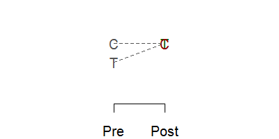
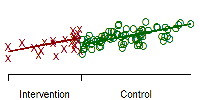
Below is a schematic graph of a randomized experiment. You take a group of 100 patients and randomly assign 50 of them to the treatment and 50 to the control. The red letter C represents the mean of the 50 control subjects and the green letter T represents the mean of the 50 treatment subjects. The means are identical (within sampling error, of course) prior to the intervention ("Pre" on the x axis). After the intervention ("Post" on the x axis), the means differ. The size of this difference in means is the estimated effect of the treatment or intervention.
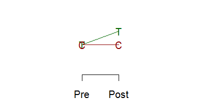
Now, if you randomize, you really don't need to take a measurement at baseline.
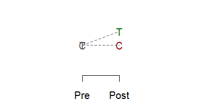
Randomization assures comparability, so any difference seen must be due to the intervention. Now getting a baseline measurement is always a good idea, even in a randomized experiment because it offers an important quality check of the success of the randomization, and having a baseline can improve precision. For non-randomized experiments, of course, you need the baseline, because imbalances at baseline can produce an atefactual response
or can mask a true response
In many settings, you control when the intervention occurs, but you can't control it at a fine enough level to allow randomization. For example, you make a change in training or education practices at a hospital. You can't randomly assign half of the health care professionals to the training. They work in such close proximity that the changes in the trained group will rub off on the control group. Or you change the environment, such as the location of the desk where patients are screened in an emergency room. You can't randomly shift the desk back to its old spot for half of the arriving patients. So the intervention has to be applied in an all or nothing fashion.
Now you could still randomize if you had ten hospitals, and you randomly select five for your intervention and five for your control group. But it's hard enough to get a study going at a single hospital, and trying to coordinate at multiple sites is a problem. So what you end up with in many cases is a pre/post design with no concurrent control group.
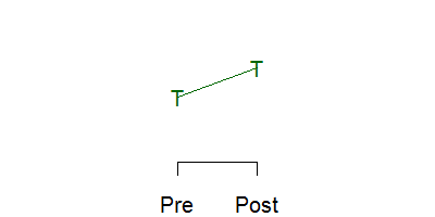
This is a very weak research design, but it is commonly used. If the change you see is very large, if the effect has a solid and scientifically plausible explanation, and if the result is consistent with other studies, then even a weak design like this can have credibility.
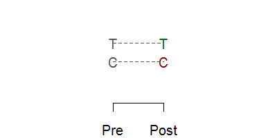
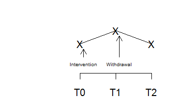
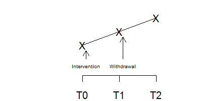
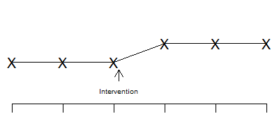
There are some good alternatives, however, to a pre/post design with no concurrent control group. A very simple alternative is called the withdrawal design or the ABA design. You make an assessment at T0 while still under the control conditions. Then you switch to the treatment and make an assessment at T1. Then you withdraw the treatment (switch back to the control condition) and make an assessment at T2.
The graph above shows a positive effect in a withdrawal design. You see an improvement when you intervene and that improvement disappears when you withdraw that intervention.
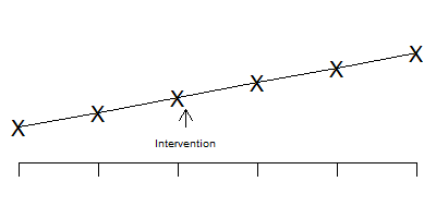
In contrast, this figure shows a negative effect in a withdrawal design. Something else was going on at the time that the intervention occurred because when the intervention was withdrawn, the effect persisted. This is not a perfect method, of course. It is possible that there is a carry-over effect from the intervention that persists even when the intervention is withdrawn.
A simple example of the withdrawal design is described in the book, The Lucifer Effect: Understanding How Good People Turn Evil, by Philip Zimbardo. He described an experiment (not his infamous prison experiment) that used a withdrawal design. A researcher wanted to show how anonymity increases the tendency to engage in violent and aggressive actions. He set up an experiment with school children at a Halloween Party. They had a choice between several games some of which were cooperative and some of which were aggressive and competitive. The children were assessed at the start of the party, before they had donned their costumes. After they had donned their costumes (which were designed to provide them with a high degree of anonymity), they were assessed again. The degree of engagement in aggressive and competitive activities increased when the children had greater anonymity. Now you might think of an alternative explanation for this finding, because maybe the children got wilder as the party went on. To discredit this alternative explanation, they then asked the children to remove their costumes and assessed them a third time. The aggression and competition dropped to the level prior to donning costumes.
The withdrawal design can be extended to have a re-introduction of the intervention after withdrawal (an ABAB design) or an introduction of a second intervention after withdrawal (an ABAC design). These designs are also very common in single subject research designs.
The withdrawal design is a very simple example of using more than one control group in a research design to overcome some of the weaknesses caused by inability to randomize.
Another design used in this setting is the interrupted time series.
Notice that the time series is stable and flat prior to the intervention, shows a jump after the intervention, and then stabilizes again.
In contrast, the pattern shown above indicates that the change seen after the intervention is just part of a temporal trend that is unrelated to the intervention itself.
The interrupted time series becomes even more effective if you have an intervention that is phased in at several different time points.
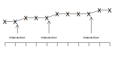
Notice in the graph above that the improvements all occur concurrently with the phases of the intervention. It's possible that one jump might have been associated with a temporal factor unassociated with the intervention, but all three jumps coinciding with all three phases of the intervention?
Another design worth considering is the regression discontinuity design. Suppose we have a baseline measure of severity of illness and this is reasonably predictive of your long-term outcome.
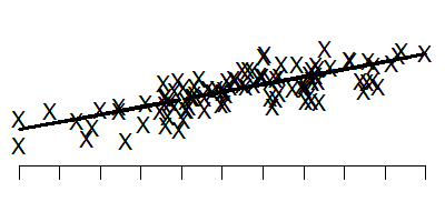
This graph shows the baseline measure on the horizontal axis and the long-term outcome on the vertical axis. Note that low values on the baseline tend to lead to low values on the long term outcome.
Suppose you could not randomize the intervention, but we could give the intervention only to those patients who were most severely ill at baseline. That means that if you were below a certain threshold would get the intervention and if you were above that threshold, you wouldn't get the intervention. If the intervention were successful, the outcomes might look something like this.
The red X's represent the treatment group and the green O's represent the control group. Notice that there is a discontinuity at the threshold.
If you restrict your attention to only those intervention and control patients near the threshold, then you are looking at a group of patients that are all reasonably close to the same baseline value. But the discontinuity (if it exists) will make the intervention group have large values for the long term outcome.
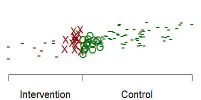
In this graph, the dashes represent patients with/without the intervention that are not followed for long term follow-up. By looking only at patients very close on either side of the threshold, you get a reasonably fair comparison of the intervention itself. Notice that if we had included all the red dashes, that would have dragged down the intervention mean. Likewise, including all the green dashes would have pulled up the control mean.
None of these designs are perfect. But when you don't have the option of randomizing half of your patients to a concurrent control group, these designs are all worth considering. They are easy to implement and offer a better alternative than a simple pre/post test design without a concurrent control group.
Did you like this article? Visit http://www.pmean.com/category/QualityControl.html for related links and pages.
--> What percentage of medical care is evidence based? I frequently encounter a claim like "only 10 to 20% of medical care has a valid scientific basis." The percentages vary, but they all paint a very bad picture of medical care. When you look closely at the data, though, you will find that things are a bit more complex than that.
First of all, what does it mean to say that a particular medical care choice has no valid scientific basis? One standard would be that no randomized controlled trial has been published establishing the efficacy of the medical care in question. That is an inappropriate standard, however, that was satirized by an article "Parachute use to prevent death and major trauma related to gravitational challenge: systematic review of randomised controlled trials" which drew this conclusion.
As with many interventions intended to prevent ill health, the effectiveness of parachutes has not been subjected to rigorous evaluation by using randomised controlled trials. Advocates of evidence based medicine have criticised the adoption of interventions evaluated by using only observational data. We think that everyone might benefit if the most radical protagonists of evidence based medicine organised and participated in a double blind, randomised, placebo controlled, crossover trial of the parachute.
Did you notice how the authors twisted the knife in at the end? The radical protagonists should participated in a randomized trial, but not just any randomized trial. They should be in a crossover trial, to insure that every single one of the radical protagonists experiences both the parachute arm and the placebo arm of the study.
So any evaluation of the scientific basis for medical decision making needs to factor in all those interventions which have been established without the need for randomized trials. An article by Robert Imrie and David Ramey in The Scientific Review of Alternative Medicine provides some nice examples of these interventions
Examples of such interventions include blood transfusions, starting the stopped hearts of victims with heart attacks, antibiotics for meningitis, or a tourniquet for a gushing wound.
How would you estimate the percentage of medical care that is evidence based? It's actually quite easy, though a bit labor intensive. Watch some physicians as they make decisions or take a sample of their case notes, record the decisions that were made, do a literature search, and then evaluate the proportion of those decisions that are evidence based. This has been done in many fields, and the percentage of decisions that are evidence based varies from 45% to 97% (median 78%). If you restricted the percentage to those that are supported by randomized trials the percentages are lower (11% to 50%, median 38%). The actual citations can be found in the Imrey and Ramey article.
So why is such a pessimistic percentage like 10% to 20% cited repeatedly? A large part of it is that some people have an axe to grind. They advocate an area such as alternative medicine where the evidence base is weak and they want to combat those who demand a greater level of proof before adopting practices in that area. So they counterattack by seizing on a number that implies problems in the backyard of their critics. If the percentage of decisions that are evidence based in traditional medicine are so low, then how can you complain about the lack of evidence in my area? This is the "so's your mother" defense (more formally known as the tu quoque fallacy).
Another factor is that some people just take a subjective assessment and state it as if it were an empirically proved fact. There's a joke that 79.2% of all statistics are made up on the spot. Even if the assessment was properly labelled as a subjective assessment, this qualifier often gets lost when the percentage is repeated in different places.
Often a statistic like this mutates from a different statistic altogether. Imrie and Ramey track down the "only 10 to 20%" to a study looking at prescription practices of 19 British doctors in 1960 and 1961. This paper was not really intended to look at medical practices in general, but rather in the use of generic versus proprietary drugs. But the statistic struck a chord with a lot of people and got repeated until it entered into our subconscious minds.
The bottom line is that although the practice of medicine is not perfect, a large proportion of medicine is based on a solid evidentiary foundation.
Did you like this article? Visit http://www.pmean.com/category/CriticalAppraisal.html for related links and pages.
--> Honorable mention in the "Applications of R in Business" contest
Back in October 2011, I entered a programming contest sponsored by Revolution Analytics, "Applications of R in Business." I'm not much of an R programmer, but I had written a function in R to preduct the duration of a clinical trial using a Bayesian model. I dusted off the code, added a few comments and submitted it at
--> http://www.inside-r.org/howto/predict-duration-your-clinical-trial
I was pleasantly surprised (shocked, actually) to find out that my submission had won an honorable mention. This includes a $1,000 check and all the bragging rights that come with being an R geek. You can read about the contest and see my name and the name of the other winners at
--> http://www.revolutionanalytics.com/news-events/news-room/2012/revolution-analytics-announces-application-of-r-in-business-contest-winners.php
--> Monthly Mean Article (peer reviewed): Adam La Caze, Benjamin Djulbegovic, Stephen Senn. What does randomisation achieve? Evidence Based Medicine. 2012;17(1):1 -2. Excerpt: "What are the benefits of random allocation in clinical studies? John Worrall, a philosopher of science, recently questioned whether evidence-based medicine's advice to base therapeutic decisions on the results of randomised controlled trials (RCTs) could be justified.1 2 Here we provide a response to Worrall and others who challenge the epistemological value of RCTs." [Accessed on January 25, 2012]. http://ebm.bmj.com/content/17/1/1.short.
Did you like this article? Visit http://www.pmean.com/category/RandomizationInResearch.html for related links and pages.
--> Monthly Mean Article (popular press): Harriet A. Washington. Non-Consenting Adults Slate. 2012. Abstract: "The Nuremberg Code, set up to protect the human subjects of research, is being routinely ignored." [Accessed on February 2, 2012]. http://www.slate.com/articles/health_and_science/new_scientist/2012/01/the_nuremberg_code_set_up_to_protect_the_human_subjects_of_research_is_being_routinely_ignored_.html.
Did you like this article? Visit http://www.pmean.com/category/EthicsInResearch.html for related links and pages.
--> Monthly Mean Book: Carol Tavris, The Mismeasure of Woman. From the back cover: "When 'man is the measure of all things,' woman is forever trying to measure up. In this enlightening book, Carol Tavris unmasks the widespread but invisible custom -- pervasive in the social sciences, medicine, law, and history -- of treating men as the normal standard, women as abnormal. Tavris expands our vision of normalcy by illuminating the similarities between women and men and showing that the real differences lie not in gender, but in power, resources, and life experiences." Personal note: the title is a take-off on another excellent book by Stephen Jay Gould, The Mismeasure of Man. Both books show how investigator perspectives can produces serious biases in seemingly objective research methods.
Did you like this book? Visit http://www.pmean.com/category/HumanSideStatistics.html for related links and pages.
--> Monthly Mean Definition: What is a rug plot? A rug plot is a simple graphical display that shows the distribution of values for a single variable. You draw a thin vertical line segment at every value occuring in your data set.
![]()
This plot shows where points tend to cluster together and highlights outliers as well. Frequently a rug is placed at the bottom of a scatter plot or other graph to emphasize the general distribution.
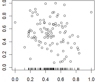
In this plot, you could have also placed a sideways rug plot on the y-axis.
Did you like this article? Visit http://www.pmean.com/category/GraphicalDisplay.html for related links and pages.
--> Monthly Mean Quote: "Of course, from the quasi-experimental perspective, just as from that of physical science methodology, it is obvious that moving out into the real world increases the number of plausible rival hypotheses. Experiments move to quasi-experiemtns and on into queasy experiments, all too easily." Donald T. Campbell, in Methodology and Epistemology for Social Science: Selected Papers, page 322.
--> Monthly Mean Video: Trend and variation, http://www.youtube.com/watch?v=e0vj-0imOLw
Description: "Animated short on statistics from Norwegian infotainment program Siffer. Produced by TeddyTV for NRK. Animation by Ole Christoffer Haga."
Did you like this video? Visit http://www.pmean.com/category/LinearRegression.html for related links and pages.
--> Monthly Mean Website: David Spiegelhalter, Mike Pearson, Owen Smith, Arciris Garay-Arevalo, Ian Short, Hauke Riesch, Owen Walker, Madeleine Cule, Hayley Jones. Understanding Uncertainty. Excerpt: "Welcome to the site that tries to make sense of chance, risk, luck, uncertainty and probability. Mathematics won't tell us what to do, but we think that understanding the numbers can help us deal with our own uncertainty and allow us to look critically at stories in the media. " [Accessed on February 6, 2012]. http://understandinguncertainty.org.
Did you like this website? Visit http://www.pmean.com/category/CriticalAppraisal.html for related links and pages.
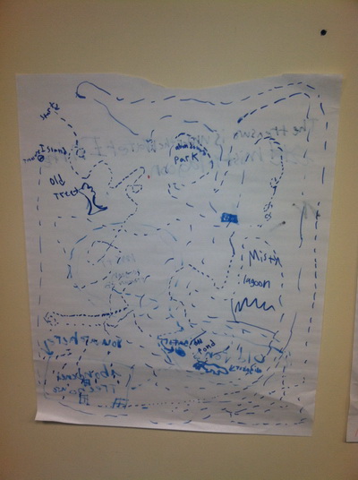
--> Nick News: Nick's treasure map
Here is a picture of Nick showing a treasure map he drew.
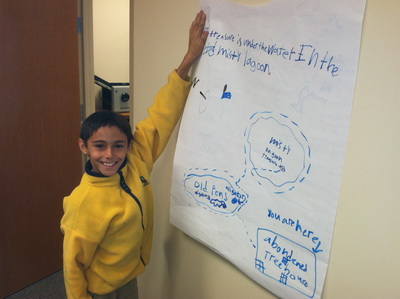
You start at the abandoned tree house. If you can get by the alligators in the old pond, you will find treasure under the water in the misty lagoon.
Here's an even more elaborate treasure map.
Don't ask me to decipher it. You can find another elaborate picture, this of an army battle scene, and some nearly indestructible block forts at
--> http://www.pmean.com/personal/battles.html
--> Very bad joke: A weighted random number generator...
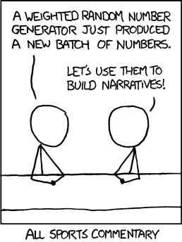
This cartoon was created by Randall Munroe and is published under an open source license. The original version can be found at:
--> http://xkcd.com/904/
--> Tell me what you think. How did you like this newsletter? Give me some feedback by responding to this email. Unlike most newsletters where your reply goes to the bottomless bit bucket, a reply to this newsletter goes back to my main email account. Comment on anything you like but I am especially interested in answers to the following three
questions.
--> What was the most important thing that you learned in this newsletter?
--> What was the one thing that you found confusing or difficult to follow?
--> What other topics would you like to see covered in a future newsletter?
I received feedback from two people. Both liked the discussion about unrealistic sample sizes and properly specifying the minimum clinically important difference. I got compliments as well on my explanation about regression models and my discussion of conflicting results from two different programs.
I also got some comments on Fisher's exact test that went into a bit more detail than my newsletter did. First, with today's computers you don't need to limit Fisher's exact test to small sample sizes. It works just fine even with cell sizes approaching 100. There are some criticisms of Fisher's exact test because it treats both the row totals and column totals as fixed. It also has some critics because the discrete nature of the test can sometimes produce conservative results. The discrete distribution means that your alpha level moves in jumps when you adjust the decision rule and sometimes you can't find a decision corresponding exactly to an alpha level of 0.05. Finally, Fisher's exact test has properties close to that of the continuity adjusted chi-square test, which is good if you like the continuity correction. I don't like the continuity correction, but I do appreciate the reminder.
--> Join me on Facebook, LinkedIn, and Twitter. I'm just getting started with social media. My Facebook page is www.facebook.com/pmean, my page on LinkedIn is www.linkedin.com/in/pmean, and my Twitter feed name is @profmean. If you'd like to be a Facebook friend, LinkedIn connection (my email is mail (at) pmean (dot) com), or tweet follower, I'd love to add you. If you have suggestions on how I could use these social media better, please let me know.
What now?
Sign up for the Monthly Mean newsletter
Review the archive of Monthly Mean newsletters
![]() This work is licensed under a
Creative
Commons Attribution 3.0 United States License.
This work is licensed under a
Creative
Commons Attribution 3.0 United States License.