
[The Monthly Mean] December 2011 -- Unrealistic scenarios for sample size calculations
The Monthly Mean is a newsletter with articles about Statistics with occasional forays into research ethics and evidence based medicine. I try to keep the articles non-technical, as far as that is possible in Statistics. The newsletter also includes links to interesting articles and websites. There is a very bad joke in every newsletter as well as a bit of personal news about me and my family.
Welcome to the Monthly Mean newsletter for December 2011. If you are having trouble reading this newsletter in your email system, please go to www.pmean.com/news/201112.html. If you are not yet subscribed to this newsletter, you can sign on at www.pmean.com/news. If you no longer wish to receive this newsletter, there is a link to unsubscribe at the bottom of this email. Here's a list of topics.
--> Unrealistic scenarios for sample size calculations
--> Understanding multivariate regression models, Part 1.
--> Discrepancies in the chisquare test
--> Monthly Mean Article (peer reviewed): Data sharing: not as simple as it seems
--> Monthly Mean Article (popular press): The Placebo Debate: Is It Unethical to Prescribe Them to Patients?
--> Monthly Mean Book: Risk Adjustment for Measuring Healthcare Outcomes
--> Monthly Mean Definition: What is Fisher's Exact Test?
--> Monthly Mean Quote: "Statistics are no substitute..."
--> Monthly Mean Website: The Statistics Teachers Network
--> Nick News: Nick rides the gravity bike
--> Very bad joke: Rows and flows of lines and...
--> Tell me what you think.
--> Join me on Facebook, LinkedIn and Twitter
--> Unrealistic scenarios for sample size calculations. I'm not a doctor, so when someone presents information to me about the minimum clinically important difference (a crucial component of any sample size justification), I should just accept their judgement. After all, I've never spent a day in a clinic in my life (at least not on the MD side) so who am I to say what's clinically important. Nevertheless, sometimes I'm presented with a scenario where the minimmum clinically important difference is so extreme that I have to raise a question. Here's a recent example.
Someone is planning a study of pain relief. A standard drug is being compared to a combination of that drug and a second new drug. The outcome is the proportion of patients who needed additional analgesic relief, which is a binary outcome. It's odd that the researcher is not using a continuous outcome, like pain measured on the visual analog scale, but I didn't comment on that. What I did comment on though, was the researchers expectations for the proportion needing extra analgesic relief in both groups. In the first group, he expects 30% of the patients to need additional analgesic relief. In the second group, he expects 0% to need additional analgesic relief. 0% seems like a really extreme value to me. I'd be very surprised if there were absolutely no treatment failures in the second group. No drug, even in combination with another drug, is perfect, is it?
But a more important question is why this researcher chose 0% for the expected proportion in the second group. What you are supposed to specify in a sample size calculation like this is the minimum clinically important difference. That's the difference that is just barely large enough to get the attention of the clinical community and to convince them to change their clinical practices. Any difference smaller than the minimum clinically important difference is clinically trivial and would represent a change so small that there would be no desire to change your clinical practice.
I'd be very surprised that someone would not adopt the combination therapy if it cut the proportion of patients needing additional analgesic relief in half from 30% to 15%. Wouldn't that be a large enough difference to change your practice? If not, wouldn't a three fold reduction be clinically important. You're reducing the need for additional analgesic medication from 30% to 10%. I'd be shocked if that was considered a clinically trivial change.
I suspect that the researcher is not using the minimum clinically important difference, but is rather using the difference that he expects to see or the difference seen in a closely related study. Now, I don't know enough to answer a question like this, but I can still raise the question. It's important to see how the person answers the question. If they are able to make a strong and coherent argument, then I'm glad to do the sample size calculation for them. But if they hem and haw and offer a weak justification, then I stand my ground.
This article is adapted from a webpage on my new website:
--> http://www.pmean.com/11/unrealistic.html
Did you like this article? Visit http://www.pmean.com/category/ClinicalImportance.html for related links and pages.
--> Understanding multivariate regression models, Part 1. This is the first in a series of articles about interpreting multivariate regression models. This article reviews interpretation of the simple (univariate) linear regression model and the multivariate linear regression model. The second article will discuss interpretation of univariate and multivariate logistic regression models. There may be additional parts discussing Poisson regression and Cox regression and multicollinearity.
When I ask most people to remember their high school algebra class, I get a mixture of reactions. Most recoil in horror. A few people say they liked that class. Personally, I thought that algebra, and all the other math classes I took were great because they didn't require writing term papers.
One formula in algebra that most people can recall is the formula for a straight line. Actually, there are several different formulas, but the one that most people cite is Y = m X + b where m represents the slope, and b represents the y-intercept (we'll call it just the intercept here). They can also sometimes remember the formula for the slope: m = Δy / Δx. Note that the Greek symbol, delta (Δ), may not appear on your screen or your printout or it may look like a totally different letter or symbol.
In English, we would say that the slope is the change in y divided by the change in x. In linear regression, we use a straight linear to estimate a trend in data. We can't always draw a straight line that passes through every data point, but we can find a line that "comes close" to most of the data. This line is an estimate, and we interpret the slope and the intercept of this line as follows:
--> The slope represents the estimated average change in Y when X increases by one unit.
--> The intercept represents the estimated average value of Y when X equals zero.
Be cautious with your interpretation of the intercept. Sometimes the value X=0 is impossible, implausible, or represents a dangerous extrapolation outside the range of the data.
The graph shown below represents the relationship between mother's age and the duration of breast feeding in a research study on breast feeding in pre-term infants.
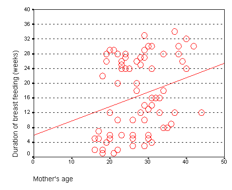
From this graph, you can see that the line crosses the vertical axis (y-axis) at about 6. You can also calculate a slope from this graph. Notice that the line is at about 14 weeks for a 20 year old mom and is at about 22 weeks for a forty year old mom. The change in y (22 - 14 = 8) divided by the change in x (40 - 20 = 20) is 0.4 weeks per year.
The intercept, 6, represents the estimated average duration of breast feeding for a mother that is zero years old. This is an impossible value, so the interpretation of the intercept is not useful. What is useful is the interpretation of the slope, approximately 0.4. The estimated average duration of breast feeding increases by 0.4 weeks for every extra year in the mother's age. Although there are examples of young mothers who breast feed for a long time and old mothers who breast feed for only a short time, the general tendency is to see an increase in breast feeding duration as the mother's age increases. The slope quantifies this general tendency.
This is the output from SPSS. Note that intercept is about 6 (actually 5.920) which is the value that we saw on the graph. The slope is about 0.4 (actually 0.389) which again matches what we estimated from the graph. The 95% confidence interval for the slope is 0.066 (converting the scientific notation value of 6.62E-02 to an ordinary decimal) to 0.71. Since this interval contains only positive values, we have statistically significant evidence of a positive relationship between mother's age and duration of breast feeding. The positive trend that we see here could not be easily explained by sampling error. But also notice that the lower limit of the confidence interval is very close to zero, so this is a borderline result.
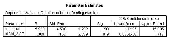
When X is categorical, the interpretation changes somewhat. Let's look at the simplest situation, a binary variable. A binary variable can have only two possible categories. Some examples are live/dead, treatment/control, diseased/healthy, male/female. We need to assign number codes to the categories. Most people assign the codes 1 and 2, but it is actually better to assign the codes 0 and 1.
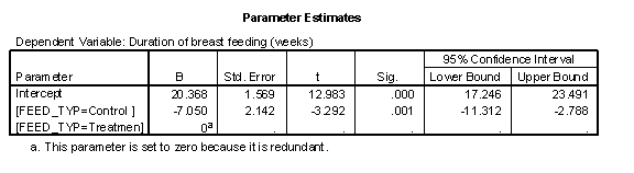
In a study of breast feeding, we have a treatment group and a control group. Let us label the treatment group as 1 and the control group as 0. The outcome variable is the age when breast feeding stopped.
The control group had a mean duration of breast feeding just a bit larger than 13. The mean for the treatment group is just a bit larger than 20. Notice that the regression line shown above connects the two means.
In this situation, the intercept, 13, represents the average duration for the control group. The slope is 7, which is the change in the average duration when we move from the control group to the treatment group.
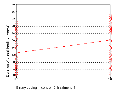
We could have just as easily labeled the treatment group as 0 and the control group as 1. If we did that, we would get a graph that looks like the following:
Here, the intercept, 20, represents the mean of the treatment group. The slope, -7, represents the change in average duration as we move from the treatment group to the control group. It is actually this reverse coding that SPSS chooses as a default.
Neither coding is correct or incorrect. Just make sure that you understand the difference. If you get a slope that is in the opposite direction of what you expected, perhaps it is because your software is using a different coding than what you expected. So here is the general interpretation of the regression coefficients when the independent variable (G) is binary:
--> The slope represents the estimated average difference in Y between the two levels of G.
--> The intercept represents the estimated average value of Y at the reference category of G.
The trick is to figure out which of the two categories of G is the reference category. If the computer package chooses the wrong reference value, you can either recode your data to force it to choose the opposite category as the reference category, or you can switch the sign of the estimate produced by the statistical software.
When you have two or more variables in a linear regression model, the interpretation changes in a subtle way. If you have the independent variables X1 and X2 in a model predicting Y, the interpretations of the intercept and the two slope terms are:
--> The first slope represents the estimated average change in Y when X1 increases by one unit and X2 is held constant.
--> The second slope represents the estimated average change in Y when X2 increases by one unit and X1 is held constant.
--> The intercept represents the estimated average value of Y when X1 and X2 both equal zero.
Of particular interest is the case where you have a continuous independent variable X and a binary independent variable G. The interpretation of the coefficients are:
--> The slope for X represents the estimated average change in Y when X increases by one unit and the relative mix of categories in G is held constant.
--> The slope for G represents the estimated average change in Y when moving from one level of G to the other and X is held constant.
--> The intercept represents the estimated average value of Y when X equals zero and G is fixed at the reference category.
Here's an example using duration of breast feeding as the dependent variable and both mother's age and feeding type as independent variables.
This graph that shows the relationship between mother's age (MOM_AGE) and duration of breast feeding (AGE_STOP). But in this graph, the control infants (denoted by red circles) are distinguished from the treatment infants (denoted by black pluses).
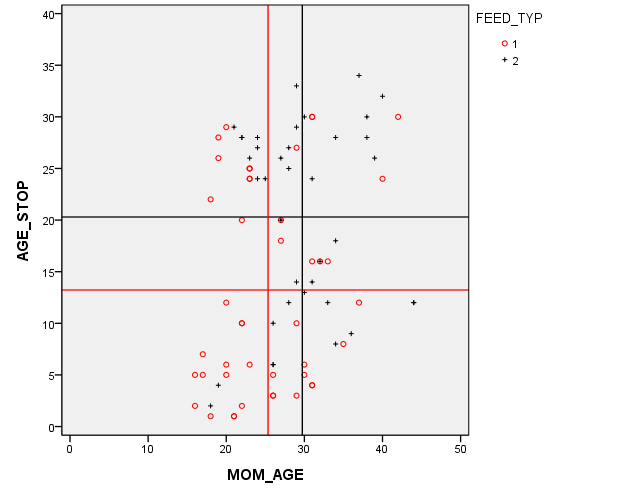
The red and black horizontal lines are located at the average breast feeding durations for the control and treatment groups (13 weeks and 20 weeks respectively). This 7 week gap is what we noticed in the earlier graphs. But there's a complication here. The red and black vertical lines are located at the average mother's age for the control and treatment groups (25 and 29 years, respectively). This four year gap is troublesome. You need to worry about whether the seven week difference in breast feeding duration between the control and treatment groups is an artefact produced by the older and more experienced mothers in the treatment group.
Now this is a randomized study, but sometimes even in a randomized study, you can a large imbalance in a key covariate just by chance. It's important to make an appropriate adjustment for this chance imbalance.
What you'd like to see is the effect of treatment group while holding age constant. That's exactly what a multiple linear regression model provides.
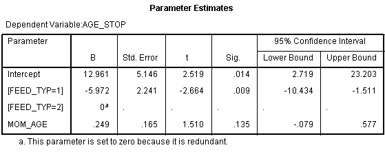
The intercept is 12.961. This means that the estimated average duration of breast feeding is about 13 weeks for a mother in FEED_TYP=2 (treatment group) who is 0 years old. The slope for FEED_TYP=1 is -5.972. This means that the estimated average duration of breast feeding decreases by 6 weeks when you switch from the treatment group to the control group. The slope for FEED_TYP=2 is set to zero because this is the reference group. The slope for MOM_AGE (mother's age) is 0.249. The estimated duration of breast feeding increases by about a quarter of a week for each year increase in the mother's age, holding the mix of treatment and control moms constant.
Compare these to the univariate regression models. The slope for mother's age was 0.4 in the univariate model, but that was artificially high because the mix of treatment and control mothers varies with mother's age. When you hold the mix of treatment and control moms constant over age, the effect is somewhat smaller. Likewise the original estimated difference in the average duration of breast feeding was 7 weeks in the univariate model. One of those weeks was an artefact of the difference in mother's age. This makes sense. Since each year of mother's age increases the duration of breast feeding by a quarter of a week, a four year gap, could account for one of the seven weeks difference.
Now notice that the effect of mother's age in this regression model is not statistically significant. You should include the variable in the model, though, because it does have an impact on your estimates. There's a problem with only adjusting for statistically significant covariates, it leads to residual confounding.
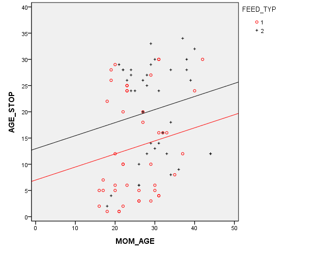
Here's a graph showing the multivariate model. There are two lines. Each has the same slope (0.25). The intercept for the black line (treatment group) is about 13 and the intercept for the red line (control group) is about 6 weeks lower at 7. Because the lines are parallel, this 6 week gap is constant across the entire age range.
Did you like this article? Visit http://www.pmean.com/category/LinearRegression.html for related links and pages.
--> Discrepancies in the chisquare test. I was working with two researchers on a project and they got different results for their chisquare tests. See if you can find out what went wrong.
Here's the output from Statistica.
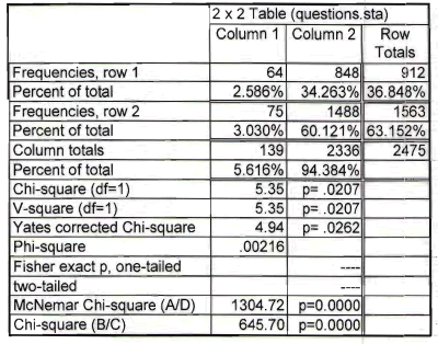
The chisquare statistics is 5.35 and the p-value is 0.0207.
Here's the output from SPSS.
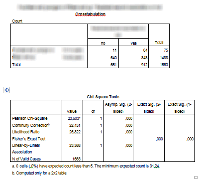
The chisquare statistic is 23.603 and the p-value is 0.000. Now obviously the discrepancy occurs because the numbers in the table are different, but why did two people working with the same data set enter different data into their programs? Can you figure it out?
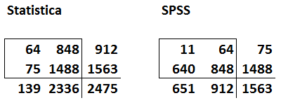
If you need a hint, here's the table from the first and second tables shown side by side.
Have you figured it out yet?
Look for common numbers in the tables. Notice that the first row of data in Statistica is the same as the second column of data in SPSS.
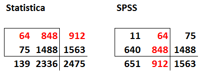
Also notice that the second row of data in Statistica is the third column (the totals) for the data in SPSS.
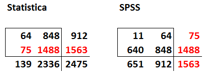
So the problem is that the data input into Statistica represents the number with a particular outcome (row 1) and the total (row 2). You need to make one of the rows the number with a particular outcome and the other the number without the particular outcome. Otherwise, you end up double counting some of the data.
The other tip-off as to which table is correct is the grand total. The true sample size in this problem is 1,563 which matches the number in the lower right hand corner of the SPSS table. The data is entered into Statistica, has an incorrect grand total of 2,475 because some patients contribute to the counts in both the first and the second rows in the Statistica table.
Note that this is not a criticism of Statistica. It would have done just fine if the data were entered properly. Also, it's not a criticism of one of the two researchers. It's an easy mistake to make. When you are entering data into a two by two table, be sure that a patient can belong to only one of the four cells in the table. If a patient can potentially contribute to the count in more than one cell, then you have artificially inflated your sample size and your chisquare statistic will be invalid.
This article is adapted from a webpage on my new website:
--> http://www.pmean.com/11/discrepancy.html
--> Monthly Mean Article (peer reviewed): Journal article: Neil Pearce, Allan H Smith. Data sharing: not as simple as it seems. Environmental Health: A Global Access Science Source. 2011;10(1):107. ABSTRACT: "In recent years there has been a major change on the part of funders, particularly in North America, so that data sharing is now considered to be the norm rather than the exception. We believe that data sharing is a good idea. However, we also believe that it is inappropriate to prescribe exactly when or how researchers should preserve and share data, since these issues are highly specific to each study, the nature of the data collected, who is requesting it, and what they intend to do with it. The level of ethical concern will vary according to the nature of the information, and the way in which it is collected - analyses of anonymised hospital admission records may carry a quite different ethical burden than analyses of potentially identifiable health information collected directly from the study participants. It is striking that most discussions about data sharing focus almost exclusively on issues of ownership (by the researchers or the funders) and efficiency (on the part of the funders). There is usually little discussion of the ethical issues involved in data sharing, and its implications for the study participants. Obtaining prior informed consent from the participants does not solve this problem, unless the informed consent process makes it completely clear what is being proposed, in which case most study participants would not agree. Thus, the undoubted benefits of data sharing doe not remove the obligations and responsibilities that the original investigators hold for the people they invited to participate in the study." [Accessed on December 26, 2011]. http://www.ehjournal.net/content/10/1/107/abstract.
Did you like this article? Visit http://www.pmean.com/category/PrivacyInResearch.html for related links and pages.
--> Monthly Mean Article (popular press): Elaine Schattner. The Placebo Debate: Is It Unethical to Prescribe Them to Patients? The Atlantic, December 19, 2011. Excerpt: "You might wonder, lately, if placebos can confer genuine health benefits to some people with illness. If you're reviewing a serious publication like the New England Journal of Medicine, you could be persuaded by results of a recent article on giving placebos to asthma patients in a randomized clinical trial. The topic has blossomed since 2008, when PLoS One reported on the use of mock treatments, without concealment, in people with irritable bowel syndrome. In that small study, participants experienced symptomatic relief even though they knew they were getting bogus remedies. Now, upon perusing the New Yorker, you might be mesmerized by Michael Specter's intriguing story on the history of placebos and burgeoning, research-minded attention to this highly-debatable subject at the intersection of health care, science, and medical ethics."
--> http://www.theatlantic.com/health/archive/2011/12/the-placebo-debate-is-it-unethical-to-prescribe-them-to-patients/250161/
Did you like this article? Visit http://www.pmean.com/category/PlaceboControlledTrials.html for related links and pages.
--> Monthly Mean Book: Lisa Iezzoni. Risk Adjustment for Measuring Healthcare Outcomes. This book is the Bible of risk adjustment. Dr. Iezzoni offers pragmatic advice about how and when to use risk adjustment. The book leaves out most of the mathematical details, which some might argue is an advantage and others might argue is a disadvantage.
Did you like this book? Visit http://www.pmean.com/category/ModelingIssues.html for related links and pages.
--> Monthly Mean Definition: What is Fisher's Exact Test? Fisher's Exact test is a procedure that you can use for data in a two by two contingency table. It is an alternative to the Chi-square test. A two by two contingency table arises in a variety of contexts, most often when a new therapy is compared to a standard therapy (or a control group) and the outcome measure is binary (live/dead, diseased/healthy, infected/uninfected, etc.). Fisher's Exact Test is based on exact probabilities from a specific distribution (the hypergeometric distribution). The Chi-square test relies on a large sample approximation. Therefore, you may prefer to use Fishers Exact test in situations where a large sample approximation is inappropriate.
There's really no lower bound on the amount of data that is needed for Fisher's Exact Test. You do have to have at least one data value in each row and one data value in each column. If an entire row or column is zero, then you don't really have a 2 by 2 table. But you can use Fisher's Exact Test when one of the cells in your table has a zero in it. Fisher's Exact Test is also very useful for highly imbalanced tables. If one or two of the cells in a two by two table have numbers in the thousands and one or two of the other cells has numbers less than 5, you can still use Fisher's Exact Test.
For very large tables (where all four entries in the two by two table are large), your computer may take too much time to compute Fisher's Exact Test. In these situations, though, you might as well use the Chi-square test because a large sample approximation is very reasonable.
Most of the material for this article appears at my old website:
--> http://www.childrensmercy.org/stats/ask/fishers.aspx
--> http://www.childrensmercy.org/stats/weblog2007/DifferencesBetweenTests.aspx
Did you like this article? Visit http://www.pmean.com/category/LogisticRegression.html for related links and pages.
--> Monthly Mean Quote: "Statistics are no substitute for judgment." Henry Clay. as quoted at
--> http://www.brainyquote.com/quotes/keywords/statistics_2.html
--> Monthly Mean Website: The Statistics Teachers Network. Excerpt: "The Statistics Teacher Network is a newsletter published three times a year by the American Statistical Association - National Council of Teachers of Mathematics Joint Committee on Curriculum in Statistics and Probability for Grades K-12."
--> http://www.amstat.org/education/stn/
Did you like this website? Visit http://www.pmean.com/category/TeachingResources.html for related links and pages.
--> Nick News: Nick rides the gravity bike. One of the exhibits at Science City that Nicholas has never been able to ride before is Newton' gravity bike. It requires that the rider be at least 53 inches tall. The gravity bike runs along a wire suspended high in the air. It has very heavy weights attached ten feet below it that makes the bike perfectly stable across the high wire. Last Sunday, Nick measured himself and he had just barely reached the 53 inch limit. So off he went on the gravity bike. Here's a picture.

--> Very bad joke: There's a very cute treatise about Statistics written by Robert Dawson and set to the tune of Joni Mitchell's "Both Sides Now." Here are the first few lines. "Rows and flows of lines and spots, Histograms and digidots, Box-and-whiskers, quantile plots I've looked at stats that way." Read the rest at
--> http://www.lablit.com/article/646
--> Tell me what you think. How did you like this newsletter? Give me some feedback by responding to this email. Unlike most newsletters where your reply goes to the bottomless bit bucket, a reply to this newsletter goes back to my main email account. Comment on anything you like but I am especially interested in answers to the following three
questions.
--> What was the most important thing that you learned in this newsletter?
--> What was the one thing that you found confusing or difficult to follow?
--> What other topics would you like to see covered in a future newsletter?
I received feedback from one person, who liked the article on dropouts and the book recommendation (The Emperor of All Maladies. A Biography of Cancer).
--> Join me on Facebook, LinkedIn, and Twitter. I'm just getting started with social media. My Facebook page is www.facebook.com/pmean, my page on LinkedIn is www.linkedin.com/in/pmean, and my Twitter feed name is @profmean. If you'd like to be a Facebook friend, LinkedIn connection (my email is mail (at) pmean (dot) com), or tweet follower, I'd love to add you. If you have suggestions on how I could use these social media better, please let me know.
What now?
Sign up for the Monthly Mean newsletter
Review the archive of Monthly Mean newsletters
![]() This work is licensed under a
Creative
Commons Attribution 3.0 United States License.
This work is licensed under a
Creative
Commons Attribution 3.0 United States License.