[Previous issue] [Next issue]
Monthly Mean newsletter, September/October 2009
You are viewing an early draft of the Monthly Mean newsletter for
September/October 2009.
The monthly mean for September/October is 15.75.
Welcome to the Monthly Mean newsletter for September/October 2009. If you
are having trouble reading this newsletter in your email system, please go
to
www.pmean.com/news/2009-09.html. If you are not yet subscribed to this
newsletter, you can sign on at
www.pmean.com/news. If you no longer wish to receive this newsletter,
there is a link to unsubscribe at the bottom of this email. Here's a list of
topics.
Lead article: Can I stop this study early?
2. The third deadly sin of researchers: gluttony.
3. Ban the bar! Pitch the pie!
4. Monthly Mean Article (peer reviewed): Statistics in Medicine
-- Reporting of Subgroup Analyses in Clinical Trials
5. Monthly Mean Article (popular press): Don�t Blame Flu Shots
for All Ills, Officials Say
6. Monthly Mean Book: Statistical Rules of Thumb
7. Monthly Mean Definition: Normal probability plot
8. Monthly Mean Quote: An undefined problem...
9. Monthly Mean Website: Freakonomics blog
10. Nick News: Nicholas and a very busy week in October
11. Very bad joke: A statistician had twins...
12. Tell me what you think.
13. Upcoming statistics webinars.
1. Lead article: Can I stop this study early?
I got an email from a researcher on a project I was peripherally involved
with awhile back. Here's what she wrote (with a few details removed to
protect anonymity).
As you all are aware, enrollment for the BLANK study has been slower
than anticipated. However, due to a high suspicion that patients in the
CONTROL arm were having more complications (more rescue therapy) and less
improvement, we have decided to look at the data prior to reaching our
initial proposed N=140. We had 79 patients enrolled. We found that
significantly more patients in the TREATMENT arm reported that their main
symptom was better at 24 hours than the CONTROL arm (p=0.02). Also, we had 6
patients need some kind of rescue, 5 of those were in the CONTROL arm (this
approached statistical significance, p=0.08). Therefore, I am writing to see
if you agree with stopping the study at this point. Please let me know at
your earliest convenience.
I am always willing to offer an opinion, but first I wanted to confirm
that there was no official guidelines for early stopping in the protocol
that was submitted to the IRB and that there was no formal data safety and
monitoring committee. If that turns out to be the case, then any choice made
at this point will be somewhat arbitrary from a statistical perspective.
There is no magic number that can be calculated post hoc that will provide
definitive guidance here.
First and foremost, you need to acknowledge that the primary investigator
has the right (and the duty) to stop a study if he/she a strong gut feeling
that continuing the study is bad for the patients enrolling in the study. I
would never use a statistical argument to overrule someone's gut feeling,
though I would be glad to discuss whether the data tends to support their
gut or not. Early stopping often involves a tradeoff between patient safety
and scientific integrity, and I would almost always side with patient
safety.
I would not let failure to pre-specify stopping rules be a barrier
either. It's a bad idea for a researcher to fail to anticipate and document
in the protocol reasons for early stopping, but we should not punish future
patients because of this oversight. There is an implicit stopping rule that
exists for every protocol, whether it is stated or not. Any research
protocol can be terminated if, in the opinion of the principle investigator,
further continuance of the study would put some or all of the future
patients at an unnecessary level of risk. The principal investigator does
not need the approval of a statistician, the IRB, or any other party to
invoke this rule, though consultation with various people is always
reasonable.
If I were asked about post hoc justification for early stopping, I would
try first to create a plausible set of stopping rules that was as
independent of the current data analysis as possible. This is impossible to
do perfectly, but a good standard for post hoc justification is any rule
that would have been likely to have been received well if it had been
proposed during the protocol development stage.
Finally, stopping a study permanently is a pretty serious decision, but I
certainly would suggest that a temporary freeze of the study (no enrollment
of new patients) is a safe and judicious action to take while discussions
are ongoing.
2. The third deadly sin of researchers: gluttony
Researchers will often pile the data analysis high on a plate with
limited data. There's only so much data analysis, however, that can be
conducted on a given amount of data. When you try to do more than this, your
data analysis will have poor replicability.
If you think about it, poor replicability is about the worst thing you
can accuse a data analysis of. Research attempts to make generalizations and
poor replicability strikes at the heart of generalization.
How can you tell if the data analysis is too complex for a limited data
set. One rough rule of thumb is that you should have 10-15 observations for
each variable in the data analysis. A variable is "in the data analysis" if
it is incorporated into any of the screening steps that are used to hone in
on a final data model. Thus if you look at ten independent variables and
only two make it into your final data model, then you still need 100 to 150
observations.
For logistic regression, the ratio of 10-15 relates not to the number of
observations, but rather to the number of observations with the rarer of the
two possible outcomes. It doesn't matter if you have thousands of
observations. If one of the two possible outcomes is rarer then it is the
number of these outcomes that determines how complex your statistical model
can be.
The same general rule holds true for survival data analysis. If you have
500 observations, but 450 of them are censored values, then the number of
potential predictor variables is somewhere between 50/10 = 5 and 50/15 = 3.
Another form of gluttony is including many different outcome measures in
the same data set. Suppose that you are interested in whether a toxic
exposure is associated with cancer. If you liked, you could look at bladder
cancer, breast cancer, liver cancer, lung cancer, pancreatic cancer,
prostate cancer, skin cancer, and that funny thing dangling down in the back
of your throat cancer.
Unless some attempt is made to identify a small number of these outcomes
are primary (with the others relegated to a secondary data analysis), then
the net effect is to dilute the credibility of your research findings. In
the cancer study above, either pick a particular organ that you think is
likely to be most affected by your toxic exposure, or just get a count of
all cancer types combined.
There's a saying in statistics that if you torture your data long enough,
it will confess to something. Don't keep piling on the analyses if the size
of your data set doesn't warrant it.
3. Ban the bar! Pitch the pie!
This is an outline of a speech that I gave to Bluejacket Toastmasters
on June 5, 2003. It was published at my old website (www.childrensmercy.org/stats/model/barpie.asp)
and is a fun little article with a bit of useful advice about displaying
data.
I work a lot with numbers and I've found
that there is usually a good way to display those numbers and a bad way.
Here's an example.

It's a pie chart with bright bold colors and a deep 3-D effect. Is this a
good way to display the data? WRONG! You should pitch the pie.
Here's another example.
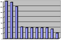
It's a bar chart with big bold purple bars. Is this a good way to display
the data? WRONG AGAIN! You should ban the bar.
These charts are useful once in a while, but most of the time all you
need is the numbers themselves. You don't have to surround them in a cloak
of fancy colors and graphic effects. The numbers by themselves are often all
that you need.
But you can't just toss the numbers onto a sheet of paper and hope that
it will work out well. You have to plan things. There are two things that
can help:
- a little bit of rounding, and
- a little bit of re-ordering.
Shown below is a table loosely adapted from a web page on pet care. I've
taken a few liberties with some of the numbers to simplify this discussion,
but the numbers are fairly close to the values on that web page.
1includes items like cost of the pet, initial shots, litter box,
collar, aquarium, etc.
2yearly cost. This cost will vary based on the size of the pet.
The initial cost would include the cost of the pet, litter box for a cat,
collar and leash for a dog, aquarium for fish, and so forth. These are also
averages and would not apply to someone who gets diamond studded collars for
their pets. Also the average food cost for a small Yorkie is not going to
compare the average food cost for a big Siberian Husky.
Look at this table and tell me what patterns you see. A few patterns
might appear
- snakes and lizards are more expensive than I would have thought.
- hermit crabs and rodents are fairly inexpensive.
But it takes a lot of squinting and staring to discover these patterns.
This table needs some work. The first thing is to do some rounding.
Rounding is important because it reduces the strain on your brain. You don't
have to work so hard to uncover patterns in the data.
When you look at a table of numbers, the first thing you often do is to
make comparisons. These comparisons often involve an implicit subtraction.
For example, you might wonder to yourself "How much difference is there
between the average vet bills for a dog and for a cat?" The respective
numbers are
317.24
193.08
Take some time to subtract here. This would tell you how much you would
save on yearly vet bills if you got a cat instead of a dog.
Let's see, four minus eight is ummm, borrow the one, ow, ow, ow, my brain
hurts.
You can simplify life by rounding the data to one or two significant
figures. Here are the rounded costs
320
190
If I asked you to subtract those two numbers, you should be able to tell
me the answer quickly and painlessly--130. My wife, an avid dog lover, would
tell you that dogs are worth every penny!
When you round, you lose a little bit in precision. In this example,
we're off by about six dollars or so. But the small loss in precision is
more than made up for by the big gain in comprehension. People I work with
often don't like to round their numbers. It took a lot of effort to get that
317.24, by golly, and I don't want to throw any of that away. Sometimes they
will round their numbers but not enough. "Why can't I keep a third
digit?" they ask. It turns out that the third digit will give you brain
pain.
There's a reason for this. Inside your brain is a spot for short term
memory storage. It can usually hold about four pieces of information without
a problem. Anything more causes an overload and slows things down. A pair of
two digit numbers will fit into short term memory very easily, but a pair of
three digit numbers will not.
In the vet costs example, rounding to three significant figures means
rounding to the nearest dollar rather than to the nearest ten spot. This
leads to the following subtraction.
317
193
Ow, ow, ow, my brain hurts again.
When you arrange these numbers, try to anticipate the possible
comparisons and then place the numbers close to one another. You have a
choice here. You can orient the numbers horizontally,
320 190
by placing them within the same row. You could also orient the numbers
vertically,
320
190
by placing them in the same column.
Which orientation is best for subtracting? The vertical orientation
appears far more natural for doing a subtraction. Also be sure to place the
larger number above the smaller one. If you had the smaller one on top
190
320
it doesn't work as well.
Try to sort your numbers from high to low. If you have more than one
column of numbers, use the first column, use the last column, or use the
average of all the columns. It doesn't matter too much. A few of your
numbers might not be in perfect order, but these deviations are actually
interesting, as you will see in the example below. Sorting by one of the
columns will do a lot for your data, and if almost always better than the
usual approach of alphabetizing by labels.
Have you ever seen a list of numbers for each of the fifty states. It's
almost always alphabetical, but most of the time this places states next to
one another that have almost nothing in common. Alaska is always between
Alabama and Arkansas. Wisconsin is always between West Virginia and Wyoming.
There is nothing to recommend this approach. Sure you can find your own
state quickly, but then can you find other states that are similar to your
state?
A better approach would be to sort the states by some criteria. List the
states with the largest square miles at the top (Alaska, Texas, California)
and put the states with the smallest square miles at the bottom
(Connecticut, Delaware, Rhode Island). Or list the states with the most
people at the top (California, Texas, New York) and with the fewest people
at the bottom (Alaska, Vermont, Wyoming).
Here is the same table reworked. I rounded each value, and re-oriented the
table so that the costs for each type of pet fell into the same column. I
also sorted the numbers based on the initial cost.
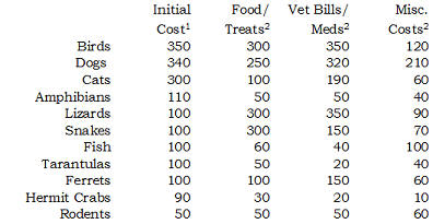
1includes items like cost of the pet, initial shots, litter box,
collar, aquarium, etc.
2yearly cost. This cost will vary based on the size of the pet.
This table is a lot easier to look at. You might notice a few new
patterns that weren't so obvious before.
- Birds, dogs, and cats all have about the same initial cost, but cats
have far smaller yearly costs.
- Lizards and snakes may not cost a lot at first, but they are expensive
to feed.
- Fish don't cost that much to buy and to feed, but have a lot of
miscellaneous costs, probably due to aquarium upkeep.
You will probably notice other interesting patterns.
Summary: If you are displaying numbers, pitch the pie and ban the bar.
Most of the time you are better off displaying the numbers themselves. Just
be sure to do a little bit of rounding and re-ordering first.
References: All of the ideas described above were championed by A.S.C.
Ehrenberg three decades ago. You can find more details in his book.
A Primer in Data Reduction. A.S.C. Ehrenberg (1982) New
York: John Wiley & Sons.
The web site where I got the numbers from is
How Much Does it Cost to Own a Pet? Steph Bairey. Accessed on
2003-06-04. www.practical-pet-care.com/article_view.php?ver=22
The numbers on the web page were already rounded, so I had to "unround"
them for this example by adding a small random amount to each value. I also
replaced some of the zero values by a slightly larger number and made some
other minor adjustments. The costs reflected in my tables, however, are very
close to the ones on the web.
4. Monthly Mean Article (peer-reviewed): Statistics in Medicine --
Reporting of Subgroup Analyses in Clinical Trials
Wang R, Lagakos SW, Ware JH, Hunter DJ, Drazen JM. Statistics in
Medicine -- Reporting of Subgroup Analyses in Clinical Trials. N
Engl J Med. 2007;357(21):2189-2194. Excerpt: Medical research relies on
clinical trials to assess therapeutic benefits. Because of the effort and
cost involved in these studies, investigators frequently use analyses of
subgroups of study participants to extract as much information as possible.
Such analyses, which assess the heterogeneity of treatment effects in
subgroups of patients, may provide useful information for the care of
patients and for future research. However, subgroup analyses also introduce
analytic challenges and can lead to overstated and misleading results. This
report outlines the challenges associated with conducting and reporting
subgroup analyses, and it sets forth guidelines for their use in the
Journal. Although this report focuses on the reporting of clinical trials,
many of the issues discussed also apply to observational studies.
Available at: http://content.nejm.org/cgi/content/full/357/21/2189 [Accessed September
3, 2009].
5. Monthly Mean Article (popular press): Don�t Blame Flu Shots for
All Ills, Officials Say
McNeil, Jr. DG. Don�t Blame Flu Shots for All Ills, Officials Say.
The New York Times. September 28, 2009. [Accessed October 26, 2009].
Available at:
www.nytimes.com/2009/09/28/health/policy/28vaccine.html
One of the hardest things to do is to sort out adverse reactions
associated with a treatment when those adverse reactions also occur
naturally to those who aren't treated. It gets worse with vaccination
programs. The large number of people being vaccinated creates an increased
tendency for unfortunate but spurious findings to arise. This article talks
about some of those unfortunate findings with previous vaccination programs
and what the government is trying to do with the current round of flu
vaccinations to help sort out the spurious findings from the real findings.
6. Monthly Mean Book: Statistical Rules of Thumb
Gerald Van Belle (2008), Statistical Rules of Thumb, Second
Edition, Wiley Interscience: New York NY. ISBN: 0470144483. I wrote
a review for this book which was published in the Journal of
Biopharmaceutical Statistics, Volume 19, Issue 4 (July 2009), 752-754. It's
one of my favorite books, so I was thrilled when I was offered the chance to
review this. Here's an excerpt from the review.
Experienced statisticians will see a few surprises among these
rules of thumb, but most of the time, you'll just nod your head in
agreement. The real value of the book to an experienced statistician is
the careful way that Dr. van Belle supports all of these rules. A new
statistician would find great benefit in this book because it offers
pragmatic advice obtained through the collective experience of many
statisticians. Learn these rules, and you will come across as wise beyond
your years. Sections on The Basics (Chapter 1); Design, Conduct, and
Analysis (Chapter 8); and especially Consulting (Chapter 10) are of
particular interest to beginners.
I like this book a lot, and much of the appeal comes from the
audacity of the premise. Can the practice of statistics be captured in a
few pithy statements that are simple and memorable? Of course not, is the
first reaction of those of us proud of the depth and intricacies of
statistical practice. But when you read through this book, you see that a
lot of what we do has been summarized well. Perhaps the best endorsement
of this book that I can offer is that I use these rules of thumb all the
time in my consulting practice.
www.informaworld.com/smpp/section?content=a912536459&fulltext=713240928
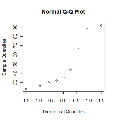
7. Monthly Mean Definition: Normal probability plot
The normal probability plot, sometimes called the qq plot, is a graphical
way of assessing whether a set of data looks like it might come from a
standard bell shaped curve (normal distribution). To compute a normal
probability plot, first sort your data, then compute evenly spaced
percentiles from a normal distribution. Optionally, you can choose the
normal distribution to have the same mean and standard deviation as your
data, or you can save some time by using evenly spaced percentiles from a
standard normal distribution. Finally, plot the evenly spaced percentiles
versus the sorted data. A reasonably straight line indicates a distribution
that is close to normal. A markedly curved line indicates a distribution
that deviates from normality.
Here's an example. The following data set represents a simulation from a
non-normal distribution.
31 88 23 44 35 26 66 92 32
Sort the data.
23 26 31 32 35 44 66 88 92
Calculate evenly spaced percentiles. There are several formulas that will
produce evenly spaced percentiles. I like the formula i/(n+1). With 9
observations, that would produce the 10th, 20th, 30th,...90th percentiles.
Another commonly used formula for evenly spaced percentiles is (i-0.5)/10.
This would produce the 6th, 17th, 28th, 39th, 50th, 61st, 72, 83rd, and 94th
percentiles. Don't worry about the different formulas. In practice, they
produce very similar results.
Here are the percentiles from the standard normal distribution.
-1.28 -0.84 -0.52 -0.25 0.00 0.25 0.52 0.84 1.28
Here are the percentiles from a normal distribution with the same mean
and standard deviation as the data. I line these up with the sorted values
23 26 31 32 35 44 66 88 92 (sorted values)

    14 26 35 42 49 55 63 71 83 (normal percentiles)
Here's how R produces a normal probability plot.
You can also get a normal probability plot in PASW (formerly known as
SPSS). On my website, I show how to interpret a normal probability plot,
including what particular deviations from a straight line can tell you about
the type of non-normality in your data. I also show a real world example of
a normal probability plot using PASW.
8. Monthly Mean Quote: An undefined problem...
An undefined problem has an infinite number of solutions. - Robert A.
Humphrey. As quoted in www.wxpnews.com/archives/wxpnews-401-20091020.htm.
9. Monthly Mean Website: Freakonomics blog
I'm not a big fan of the authors of Freakonomics, Steven D. Levitt and
Stephen J. Dubner, for a variety of reasons, but they do have an interesting
blog on the New York Times. Often the issues they talk about are more
statistical than economic, though there is a fuzzy dividing line between the
two topics. The best part of the blog is when they highlight interesting
research of others. http://freakonomics.blogs.nytimes.com/
10. Nick News: Nicholas and a very busy week in October
Nicholas has had a pretty busy October, and it is not over yet. In the
span of four days he starred as a bumble bee in a second grade school play,
visited the Moon Marble Company, attended the Kansas City Renaissance
Festival, took his own pictures at a wedding, and played at the Pumpkin
Patch Festival at the Deanna Rose Farmstead. Here is one picture of his
adventures. Look for more pictures at
www.pmean.com/personal/OctoberFun.html.

11. Very bad joke: A statistician had twins...
A statistician had twins. She was delighted. She rang the minister who
was also delighted. "Bring them to church on Sunday and we'll baptize them,"
said the minister. "No," replied the statistician. "Baptize one. We'll keep
the other as a control."
Please note that I made a minor editorial change to emphasize that both
men and women can be statisticians. Originally published in STATS: The
Magazine For Students of Statistics, Winter 1996, Number 15. Quoted at www.workjoke.com/statisticians-jokes.htm.
12. Tell me what you think.
How did you like this newsletter? I have three short open ended questions
at
You can also provide feedback by responding to this email. My three
questions are:
- What was the most important thing that you learned in this
newsletter?
- What was the one thing that you found confusing or difficult to
follow?
- What other topics would you like to see covered in a future
newsletter?
Two people provided feedback to the last newsletter. I got positive
comments about my article on weighted means and the JAMA article about
changes to the primary outcome measure. Both were confused by the article
on Bayesian data analysis. One had difficulty with interpreting
conditional probability, especially with the order (A given B versus B
given A). In spite of this, I was encouraged to write more about Bayesian
statistics.
13. Upcoming statistics webinars.
I will be giving three webinars (web seminars) on Statistics in November.
These webinars are on three consecutive Wednesdays (November 4, 11, and 18)
from 11am to noon Central Standard Time (CST). All of my statistics webinars
provide an elementary introduction to the topic with little or no
mathematics required. There are no pre-requisites for these webinars and
they can be taken in any order.
Free to all! The first three steps
in data entry, with examples in PASW/SPSS, Wednesday, November 4,
2009, 11am-noon, CST. Abstract: This one hour training
class will give you a general introduction to data management using PASW
(formerly known as SPSS) software. This class is useful for anyone who needs
to enter or analyze research data. Students should know how to use a mouse
and how to open applications within Microsoft Windows. No statistical
experience is necessary. There are three steps that will help you get
started with data entry for a research project. First, arrange your data in
a rectangular format (one and only one number in each intersection of every
row and column). Second, create a name for each column of data and provide
documentation on this column such as units of measurement. Third, create
codes for categorical data and for missing values. This class will show
examples of data entry including the tricky issues associated with data
entry of a two by two table and entry of dates.
What do all these numbers mean? Odds ratios, relative risks, and
number needed to treat, Wednesday, November 11, 2009, 11am-noon,
CST. Abstract: This one hour training class will teach you
some of the numbers used in studies where the outcome only has two possible
values (e.g., dead/alive). The odds ratio and the relative risk are both
measures of risk used for binary outcomes, but sometimes they can differ
markedly from one another. The relative risk offers a more natural
interpretation, but certain research designs preclude its computation.
Another measure of risk, the number needed to treat, provides comparisons on
an absolute rather than relative scale and allow you to assess the
trade-offs between effects and harms.
The first three steps in a descriptive data analysis, with
examples in PASW/SPSS, Wednesday, November 18, 2009, 11am-noon,
CST. Abstract: This one hour training class will give you a
general introduction to descriptive data analysis using PASW (formerly known
as SPSS) software. This class is useful for anyone who needs to analyze
research data. Students should know how to use a mouse and how to open
applications within Microsoft Windows. No statistical experience is
necessary. There are three steps that will help you get started with
descriptive data analysis. Get a count of available and missing data,
compute ranges and frequencies, and examine relationships among variables.
There will be a fee for the November 11 and November 18 webinars--only 40
US dollars for a single attendee, 75 US dollars for multiple attendees at
the same site.
More details about these webinars are at
What now?
Sign up for the Monthly Mean newsletter
Review the archive of Monthly Mean newsletters
Take a peek at an early draft of the next
newsletter
Go to the main page of the P.Mean website
Get help
 This work is licensed under a
Creative
Commons Attribution 3.0 United States License. This page was written by
Steve Simon and was last modified on
2017-06-15.
This work is licensed under a
Creative
Commons Attribution 3.0 United States License. This page was written by
Steve Simon and was last modified on
2017-06-15.