The normal probability plot, sometimes called the qq plot, is a graphical way of assessing whether a set of data looks like it might come from a standard bell shaped curve (normal distribution). To compute a normal probability plot, first sort your data, then compute evenly spaced percentiles from a normal distribution. Optionally, you can choose the normal distribution to have the same mean and standard deviation as your data, or you can save some time by using evenly spaced percentiles from a standard normal distribution. Finally, plot the evenly spaced percentiles versus the sorted data. A reasonably straight line indicates a distribution that is close to normal. A markedly curved line indicates a distribution that deviates from normality.
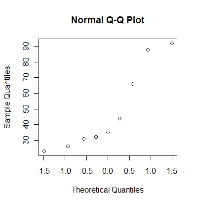
Here's an example. The following data set represents a simulation from a non-normal distribution.
31 88 23 44 35 26 66 92 32
Sort the data.
23 26 31 32 35 44 66 88 92
Calculate evenly spaced percentiles. There are several formulas that will produce evenly spaced percentiles. I like the formula i/(n+1). With 9 observations, that would produce the 10th, 20th, 30th,...90th percentiles. Another commonly used formula for evenly spaced percentiles is (i-0.5)/10. This would produce the 6th, 17th, 28th, 39th, 50th, 61st, 72, 83rd, and 94th percentiles. Don't worry about the different formulas. In practice, they produce very similar results.
Here are the percentiles from the standard normal distribution.
-1.28 -0.84 -0.52 -0.25 0.00 0.25 0.52 0.84 1.28
Here are the percentiles from a normal distribution with the same mean and standard deviation as the data. I line these up with the sorted values
23 26 31 32 35 44 66 88 92 (sorted values)

14 26 35 42 49 55 63 71 83 (normal percentiles)
Here's how R produces a normal probability plot.
You can also get a normal probability plot in PASW (formerly known as SPSS). PASW plots the data on the horizontal (X) axis and the evenly spaced percentiles on the vertical (Y) axis, so be careful.
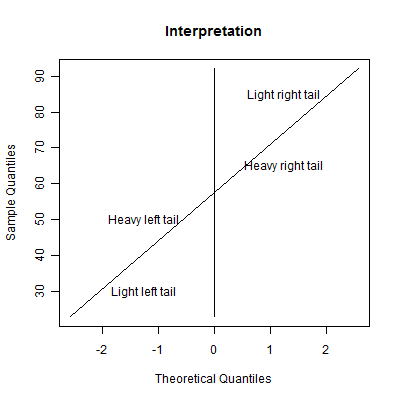
The graph shown above provides a method for interpreting a normal probability plot. This interpretation is valid when the normal probability plot has the evenly spaced percentiles on the horizontal (X) axis. If you system plots the evenly spaced percentiles on the vertical (Y) axis, then swap the adjective "heavy" and "light".
A heavy tail means that this side of the distribution produces outliers at a greater rate than you would expect from a normal distribution. A light tail means that this side of the distribution produces outliers at a reduced rate from what you would expect with a normal distribution. A light tail often means that all the observations are piled up near a boundary for the distribution.
Here are some patterns to look for.
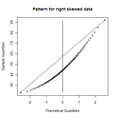
This is a skewed right distribution. It has a heavy right tail and a light left tail. This means that the distribution is likely to produce outliers on the right side only. It might also indicate a distribution where most of the data piles near a lower boundary.
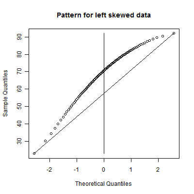
This is a skewed left distribution. It has a heavy left tail and a light right tail. This means that the distribution is likely to produce outliers on the left side only. It might also indicate a distribution where most of the data piles near an upper boundary.
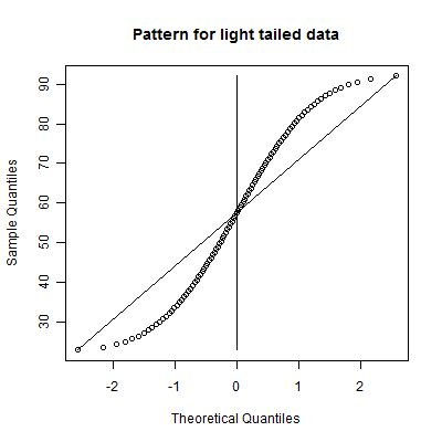
This is a symmetric light tailed distribution. It has a light tail on both sides. It might indicate a distribution where most of the data piles near an upper and a lower boundary.
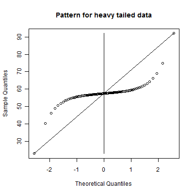
This is a symmetric heavy tailed distribution. It has heavy tails on both sides. It is a distribution which produces frequent outliers on both the low and the high end.
There are two more patterns that you can look for.
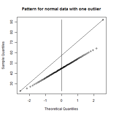
While you could call this a skewed right distribution, notice that the data falls on a straight line excluding a single very large data value. This is an example of a normal distribution with a single outlier on the high end.
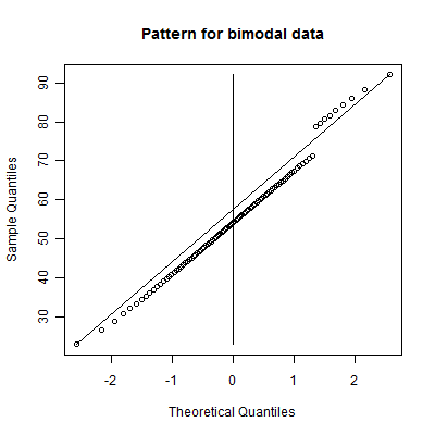
Notice two distinct lines with a jump. This is an example of a bimodal distribution, a mixture of two normal distributions. You might call this an example of a distribution with a cluster of outliers on the high end. Note that the two lines have roughly the same slope. This is a hint that you have a mixture of two normal distributions with roughly the same standard deviation. If the two slopes are quite different, then perhaps you have a mixture of two distributions with different standard deviations.
The above examples are idealized curves. Your data will probably have many small bumps and squiggles in it. Don't over-interpret any small deviations from a straight line. Only note when there is a marked and consistent deviation from a linear pattern, and even then be cautious in your conclusions.
Here's an example of the use of a normal probability plot in a real world example. I use data on housing prices in Albuquerque in some of the classes I teach. An interesting exercise is to fit a linear regression model to predict the price of the home using the size of the home in square feet. It's a pretty nice relationship, with larger houses having higher prices and smaller houses having lower prices. In any linear regression model, it is important to examine the residuals. The residuals represent the different between what you observed for the outcome variable and what the linear regression model would predict. If there is a pattern in the residuals, this indicates a deficiency in the linear regression model, or perhaps from a more optimistic perspective, an opportunity to develop a more complex and better model that will provide predictions with even greater accuracy.
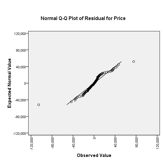
A normal probability plot of the residuals identifies two outliers. These
represent a house where the prediction is a lot smaller than the actual price (a
large positive residual) and a house where the prediction is a lot larger than
the actual price (a large negative residual). The remainder of the houses have
predictions which fall into a nice bell shaped distribution.
Further work identifies the two houses. The first house is the largest in the sample (3,750 square feet) but it has a rather average price ($129,500). The model grossly overpredicted the price of this house ($234,907). The second house in the sample has a more average size (2,116 square feet) but an unusually high price ($210,000). The model grossly underpredicted the price of this house ($134,634). What makes these two houses special. That would require an investigation beyond the data given here, but if you could find out what factors cause such a large error in prediction, you could end up with a much better prediction equation.