[Previous issue] [Next issue]
[The Monthly Mean] May/June 2009, Risk adjustment using Analysis of
Covariance
You are viewing an early draft of the Monthly Mean newsletter for
May/June 2009. I hope to send this newsletter out sometime between the first
and the fifth of the month.
The monthly mean for May/June is 15.25.
Welcome to the Monthly Mean newsletter for May/June 2009. If you are having
trouble reading this newsletter in your email system, please go to
www.pmean.com/news/2009-05.html. If you are not yet subscribed to this
newsletter, you can sign on at
www.pmean.com/news. If you no longer wish to receive this newsletter, there is a link to unsubscribe at the bottom
of this email. Here's a list of topics.
- Risk adjustment using Analysis of Covariance
- The first deadly sin of researchers: pride
- Is this a case control design?
- Monthly Mean Article: Design, analysis, and presentation of
crossover trials
- Monthly Mean Blog: FiveThirtyEight: Politics Done Right
- Monthly Mean Book: Statistical Issues in Drug Development
- Monthly Mean Definition: What is a mosaic plot?
- Monthly Mean Quote: Two quotes this month
- Monthly Mean Website: Neural correlates of interspecies
perspective taking in the post-mortem Atlantic Salmon: An argument for
multiple comparisons correction
- Nick News: Newton says goodbye after 20 years
- Very bad joke: Two statistics are in a bar
- Tell me what you think.
1. Risk adjustment using Analysis of Covariance
In the January newsletter, I explained the difference between crude and
adjusted estimates, and illustrated how to produce an adjusted estimate using
Analysis of Covariance on a data set of housing prices in Albuquerque, New
Mexico. I want to revisit this concept using a larger data set. In future
newsletters, I want to discuss alternatives to Analysis of Covariance, such as
reweighting, case mix index, and propensity scores. This work was part of a
project I am helping with: the adjustment of outcome measures in the National
Database of Nursing Quality Indicators. The work described in this article was
supported in part through a grant of the American Nursing Association.
There's an interesting data set on the web, that shows average faculty
salaries for all of the colleges and universities in each of the 50 states plus
the District of Columbia. There is a wide disparity in salaries, with KS and WV
having averages salaries of 35 thousand dollars and CA having an average salary
of 54 thousand dollars. The colleges and universities are categorized as
Division I, IIA, or IIB. Across the entire U.S., the percentage of I, IIA, and
IIB colleges and universities are 16%, 32%, and 53%, respectively. Note that
rounding causes the percentages to add up to more than 100%. Rounding will
affect some of the calculations below slightly as well, but do not materially
change any of the conclusions.
Note that each state has a different distribution of I, IIA, and IIB compared
to the entire U.S., and this may account for some of the disparities seen in
average salaries. There are other factors that would account for some of
these differences as well, but I wanted to show the process of getting an
adjusted estimate in a very simple setting.
WV has a very high percentage of IIB (88%), far more than the national
average. The salaries at IIB
colleges and universities are lower than I and IIA. Could the very low average
salary in WV be an artefact of the disproportionately high number of IIB
colleges and universities?
Analysis of Covariance is one method to answer this question. I ran the
ANCOVA model in SPSS, but it can be run in pretty much any decent statistical
software program. In SPSS, I used the General Linear Model with SALARY as the
dependent variable, STATE as a fixed factor, and indicator variables for IIA and
IIB in the covariate box.
SPSS can produce a table of adjusted salaries, though it is not a default
option. SPSS will also produce
coefficients for each of the two indicators and these allow you to understand
exactly how the adjustment is done.
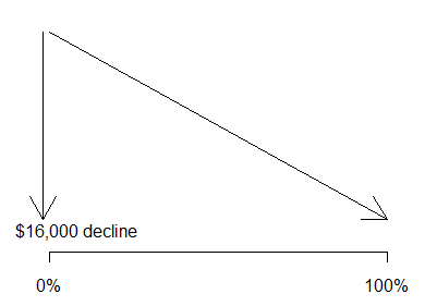
The coefficients for the IIA / IIB indicators are -10,325 and -16,222. These
values tell you that the salary for category IIA is about 10K dollars lower on
average than for category I.
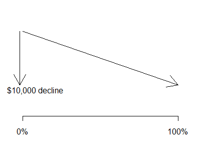
The salary for category IIB is about 16K
dollars lower on average than for category I. Both of these estimates adjust for
state-to-state differences.
The traditional interpretation of a regression coefficient is that it
represents the estimated average change in the dependent variable when the
independent variable increases by one unit. For an indicator, this means a shift
from 0% in a particular category and 100% in the reference category to 100% in
the particular category and 0% in the reference category. In most statistical
adjustments we don�t want to shift by this extreme but rather by a smaller
amount.
What would happen if we took the proportion of IIA schools in WV and
increased it from 6% (the WV proportion) to 22% (the US proportion)? Such a
change would lead to an estimated $2,600 decline in average salary.

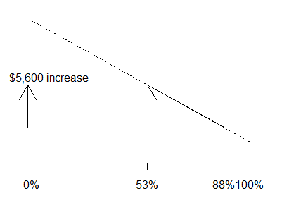
What would happen if we decreased the proportion of IIB schools from 88% (the
WV proportion) to 53% (the US proportion)? This would lead to an estimated
$5,600 increase in average salary.
The total effect of both changes is to increase the average salary by $3,000.
The adjusted salary for WV, $38,000 is still below the national average, but not
by as much as the raw data ($35,000) would have you believe.
2. The first deadly sin of researchers, pride
Two years ago, I wrote on my webpages about the seven deadly sins of
researchers.
Here I want to elaborate on each of these sins in detail. The first deadly
sin of researchers is pride. Researchers often think they know better than
anyone else how to do research, so they ignore existing precedents in designing
their studies.
One of the best examples of this appears in a large scale review by Ben
Thornley and Clive Adams of research on schizophrenia. You can find the full
text of this article on the web at
bmj.com/cgi/content/full/317/7167/1181
and it is well worth reading. Thornley and Adams looked at the quality of
clinical trials for treating schizophrenia and summarized 2,000 studies
published between 1948 through 1997. The research covered a variety of
therapies: drug therapies, psychotherapy, policy or care packages, or physical
interventions like electroconvulsive therapy. Thornley and Adams found that
researchers did not measure these patients consistently. In the 2,000 studies,
the researchers used 640 ways to measure the impact of the interventions. There
were 369 measures that were used in one study and never used again. Granted,
there are a lot of dimensions to the schizophrenia and there were measures of
symptoms, behavior, cognitive functioning, side effects, social functioning, and
so forth. Still, there is no justification for using so many different
measurements.
When someone comes to me with a survey, I ask if there is an existing survey
that can be adapted to this particular research setting. It may not be a perfect
survey, but it is "battle tested" and it simplifies the task of summarizing the
entire research record down the road.
3. Is this a case-control design?
Here's a question I got by email.
I have a stats study design question. If I were to look at the association
of curly hair for instance with a rash on the forehead, I pick a case control
study design. When I analyze this I find that 45% of kids in the clinic
(surprise) had curly hair. But I look at two groups curly vs non curly and the
outcome of interest is the rash on the forehead, instead of cases vs controls
so now, has this become an observational study instead of case control? Hope I
am making sense, this is only a theoretical question.
You're confusing observational and cohort study, I think. Both case control
and cohort studies are observational studies, as are cross-sectional and
historical control studies.
Let's review the terminology. There are two types of variables in an
observational study. Exposure variables describe some of the potential causes
and outcome variables describe some of the potential effects. When you select
a group of patients who have a rash, you are selecting according to an
outcome, not an exposure. So you might think that this is a case control
design.
But wait! Where's your control group. Did you select a control group? In a
case control study, you would have selected a group of patients who do NOT
have a rash. You didn't do this (naughty, naughty you!). You just noted that
in the case group, the proportion of curly hair was extremely high (45%). Much
too high to be due to chance, or so you think, because the incidence of curly
hair is actually much lower in the general population. When you compare a
group of cases (or a cohort group for that matter) to numbers in the general
population, you are using a historical controls design.
Now all of the sudden the experiment morphs. You are now comparing curly hair
kids to straight hair kids. Except, you're not thinking about the outcome
here. You're still looking at kids who show up at the clinic with a rash, so
100% of the curly hair kids in your data set have a rash and 100% of the
straight hair kids in your data set have a rash. That doesn't lead to a very
interesting comparison.
Now, perhaps what you were thinking of doing was selecting all patients in
your clinic, finding which ones have rashes, which ones don't, which ones have
curly hair, and which ones have straight hair. Since you are selecting a
single group and assessing both exposure and outcome at the same time, it's a
cross-sectional study.
No, that wasn't it either? What you were really thinking of doing was
selecting a group of kids who have rashes, finding a comparable number of
matched controls at your clinic, and then looking at their hair? Okay, now
that's a classic case-control study.
The difference is subtle. The terminology is frequently used incorrectly, even
by seasoned professionals. I offer a few more hints about this at
www.pmean.com/09/CaseControl.html.
4. Monthly Mean Article: Design, analysis, and presentation of
crossover trials.
Mills E, Chan A, Wu P, et al. Trials. 2009;10(1):27. Available at:
www.trialsjournal.com/content/10/1/27 [Accessed May 20, 2009].
Excerpt: Reports of crossover trials frequently omit important
methodological issues in design, analysis, and presentation. Guidelines for
the conduct and reporting of crossover trials might improve the conduct and
reporting of studies using this important trial design.
5. Monthly Mean Blog:
FiveThirtyEight: Politics Done Right,
Nate Silver, Sean Quinn.
This looks like a blog about U.S. politics, but it's really a blog about
political polling. During the 2008 U.S. presidential campaign, this site
aggregated all the state polls to come up with a simulated electoral college
result. The methodology is interesting and represents a meta-analysis of sorts
for political polls. The site is currently tracking the 2010 U.S. Senate
elections to try to forecast which state elections are likely to lead to a
change in party. www.fivethirtyeight.com
6. Monthly Mean Book: Statistical Issues in Drug
Development, 2nd ed., by S. Senn
I wrote a review of this book for the Journal of Biopharmaceutical Statistics
and then paid a hefty fee to get the review published under an open source
license. You can find the review at
Here's a few excerpts from the review:
The first five chapters of Statistical Issues in Drug Development offer a
very general perspective, including a nice historical overview. The discussion
of the proper role of a statistician in a pharmaceutical company will help
others to appreciate the depth and breadth of our contributions, but Dr. Senn
also holds us to a very high standard. I was humbled, for example, by a
discussion on page 58 of how a statistician familiar with pulmonary function
testing might be well-positioned to discuss the implications on design and
sample size when peak expiratory flow is substituted for forced expiratory
volume. I've worked with such measures for more than two decades, but I doubt
that I have sufficient medical appreciation of these tests to discuss this topic
at the level suggested here.
The remaining 20 chapters of the book cover specific topics such as
baseline adjustments, subgroup analysis, multiplicity, intention-to-treat
analysis, multicenter trials, equivalence studies, meta-analysis, cross-over
trials, n-of-1 trials, sequential trials, dose-finding,
pharmacokinetics/dynamics, pharmacoepidemiology, and pharmacoeconomics. A new
chapter in the second edition covers pharmacogenetics.
One needs to be careful in describing the audience for a book like this. A
practicing statistician will find that this book does not cover any particular
topic in the level of detail that such a person needs. You won't be able to
properly design and analyze a group sequential trial, for example, after reading
the chapter on this topic. What this book provides is a gentle introduction to
an area, an outline of the major controversies in that area, and references for
anyone who wants to dig further. If you are moving into an area of drug
development that is new to you, (say, dose-finding) then this book can jump
start your transition, but this won't be the book that you constantly reach for
as you hone your skills.
Statisticians with limited experience in drug development will greatly
benefit from seeing the careful layout of controversies that are unique to this
arena. I especially loved the description of the controversies associated with
intention-to-treat analysis and random effects in a multicenter trial.
Another possible audience is researchers who want to develop a greater
degree of sophistication in their work by better understanding the statistical
issues associated with the design and analysis of drug development studies. You
may want this book, just to help answer questions from some of your more
sophisticated clients. To help some of the math-phobic clients, Dr. Senn
segregates most formulas to an appendix at the end of the chapter.
It won't help, though, for your unsophisticated clients. This is not a Statistics for Idiots book. Even with the mathematics
removed, the intellectual caliber required to appreciate this book is still
substantial.
7. Monthly Mean Definition: What is a mosaic plot?
A mosaic plot is a graphical display that allows you to examine the
relationship among two or more categorical variables. This type of plot does
not appear commonly in the research literature, but it should be used more
often.
The mosaic plot starts as a square with length one. The square is divided
first into vertical bars whose widths are proportional to the probabilities
associated with the first categorical variable. Then each bar is split
horizontally into bars that are proportional to the conditional probabilities
of the second categorical variable. Additional splits can be made if wanted
using a third, fourth variable, etc.
Here is an example of a simple mosaic plot. There is a publicly available
data set on the mortality rates aboard the Titanic, which are influenced
strongly by age, sex, and passenger class. If you wanted to compare the
mortality rates between men and women using a mosaic plot, you would first
divide the unit square according to the overall proportion of males and
females.
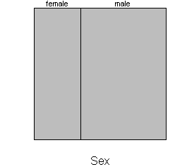
Roughly 35% of the passengers were female, so the first split of the mosaic
plot is 35/65. Next, split each bar vertically according to the proportion
who lived and died.
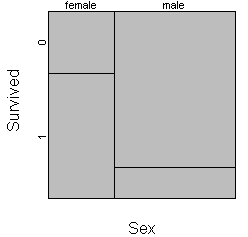
If the two horizontal lines were touching, then that shows that the
proportion surviving is the same in each gender. Here there is a large
displacement which reflects the fact that 2/3 of the women survived and only 1/6
of the men survived.
Most implementations of the mosaic plot offer as a default a small margin
around each cell to make the graph easier to read.
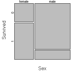
You should consider carefully the choice of which variable to split the unit
square first. Here is the same mosaic plot where the unit square is split first
by survival status and then by gender.
About two thirds of the Titanic passengers died. The fatalities were mostly
men (82%) and the survivors were mostly women (68%). The choice here is not too
much different than the choice of using row percentages or column percentages in
a cross-tabulation.
Here's a different mosaic plot that looks at mortality by passenger class.
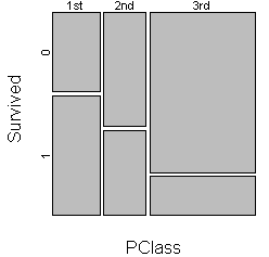
The probability of surviving went down as passenger class went from 1st to
2nd to 3rd. The third class passengers were in the lower and less easily
evacuated areas of the ship and some of the gates in the third class area were
locked while 1st and 2nd class passengers were boarding the lifeboats.
You can get a three dimensional view of sex, passenger class, and survival by
splitting vertically by sex, horizontally by passenger class, and vertically
again by survival.
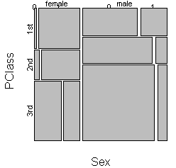
This plot is worth staring at for a while. It shows that while women fared
better than men, this was far more true in first and second class than in third
class. You will get a different perception of the patterns in the data if you
exchange the order of categorical variables, so it worth trying the three
dimensional mosaic plot several different ways.
Mosaic plots are not available in most statistical software packages, which
is a shame. Like boxplots, they can be a bit confusing when you first see them,
but they can be very helpful in assessing the trends and patterns among
multliple categorical variables.
This definition is taken almost verbatim from a page at my old website:
It's not self-plagiarism, it's trusting the only reliable source.
8. Monthly Mean Quote: Two quotes this month.
When you can measure what you are speaking about, and express it in numbers,
you know something about it; but when you cannot measure it, when you cannot
express it in numbers, your knowledge is of a meagre and unsatisfactory kind.
Lord Kelvin as cited at
physicsworld.com/cws/article/indepth/32214.
Sackettisation ... the artificial linkage of a publication to the
evidence-based medicine movement in order to improve sales. David Sackett as
cited at
bmj.bmjjournals.com/cgi/content/full/320/7244/1283
9. Monthly Mean Website:
Neural
correlates of interspecies perspective taking in the post-mortem Atlantic
Salmon: An argument for multiple comparisons correction. Craig M.
Bennett, Abigail A. Baird, Michael B. Miller, and George L. Wolford.
This is a poster presentation intended to make you laugh and make you think
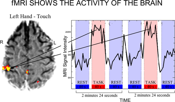
at the same time. It discusses a technique known as functional magnetic
resonance imaging (fMRI). This technique provides a non-invasive way to measure
brain activity. The data from an fMRI scan is four dimenional, the three spatial
dimensions of the brain plus the time dimension. Those regions of the brain that
show a large change in activity between an intervention (the display of an image
perhaps) and a resting state are highlighted in bright colors.
Source: Robinson R. fMRI Beyond the Clinic: Will It Ever Be Ready for Prime
Time? PLoS Biol. 2004;2(6):e150. Available at:
dx.doi.org/10.1371/journal.pbio.0020150 [Accessed July 1, 2009].
The problem is that there is so much data in an fMRI scan that statistical
tests may tend to yield too many false positives. Bennett et al illustrate this
by putting a dead fish (post-mortem Atlantic Salmon) into an fMRI experiment.
The dead salmon was forced to watch a series of images and the fMRI highlighted
certain regions of the fish brain where differential activity was found.
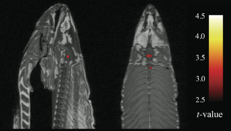
A re-analysis of the data using two popular corrections for multiple
comparisons yielded fully negative results. The lesson is to tread cautiously
when analyzing high dimensional data.
10. Nick News: Newton says goodbye after 20 years
While I have spent most of my time talking about Nicholas, he is not the only
member of the "family." When we got married in 2002, Cathy brought a dog,
Shauna, into the relationship, and Steve brought a cat, Newton. At the time, I joked
that we had a blended family. Both cat and dog were "only children" so it took a
while for them to get used to one another. After a year, though, they became
best friends. Newton had always had trouble adjusting to other cats, but Shauna
seemed to bring out the best in her. Shauna liked it because the food we got for
Newton was a whole lot more interesting than her stuff.
Nicholas joined the mix in 2004, so he's really the third child. He learned
pretty quickly how to pet a dog and how to pet a cat, and even took Shauna on
some walks.
Both pets were quite old, and Shauna died in 2006, leaving Newton as the only
animal member of the family. Newton did seem to miss Shauna but at her age, it
would have been cruel to introduce a young energetic puppy or kitten into the
mix. It was better to let Newton nap through her retirement years.
Newton, who was small for a cat at 6 pounds started to decline in health, and
lost much of her weight. She dropped down to 4 pounds, and was just skin and
bones. Still, she seemed to hold up well with the help of the Johnson County Cat
Clinic.
She celebrated her 20th birthday in February 2009. In April, she had a bad
stroke. Her hind legs were very weak and she couldn't stand without a pronounced
lean to the left. We took Newton in to be put to sleep.
Here's a picture of Newton soaking up the sun.

Here's a picture of Shauna resting on Mom and Dad's bed.

We probably won't be getting any new pets until Nicholas is older and better able
to assume most of the responsibilities of pet ownership.
11. Very bad joke: Two statistics are in a bar
Two statistics are in a bar, talking and drinking. One statistic turns to
the other and says "So how are you finding married life?" The other statistic
responds, "It's okay, but you lose a degree of freedom."
This joke has been around for a while. I cited it on my old website back in
1999
but you can also find variants at
12. Tell me what you think.
How did you like this newsletter? I have
three short open ended questions that I'd like to ask. It's totally optional on your part. Your responses will
be kept anonymous, and will only be used to help improve future versions of
this newsletter.
I got several nice comments about the March/April newsletter. There was
appreciation for the explanation of GEE models, the rule of 15 for logistic
regression, and the loss of power caused by dichotomization. Someone pointed
out that the Java application on dichotomization is also available at
www.bolderstats.com/jmsl/doc/medianSplit.html.
I probably need to explain GEE models in more detail, though, and further
clarify the Bayesian approach. There was a suggestion to explain what
heterogeneity is. I presume this is heterogeneity in meta-analysis.
What now?
Sign up for the Monthly Mean newsletter
Review the archive of Monthly Mean newsletters
Go to the main page of the P.Mean website
Get help
 This work is licensed under a
Creative
Commons Attribution 3.0 United States License. This page was written by
Steve Simon and was last modified on
2017-06-15.
This work is licensed under a
Creative
Commons Attribution 3.0 United States License. This page was written by
Steve Simon and was last modified on
2017-06-15.