[Previous issue] [Next issue]
[The Monthly Mean] May/June 2010--The FTC calls me about small sample size
issues
Welcome to the Monthly Mean newsletter for May 2010. If you are having
trouble reading this newsletter in your email system, please go to
www.pmean.com/news/201005.html. If you are not yet subscribed to this
newsletter, you can sign on at
www.pmean.com/news. If you no longer wish to receive this newsletter, there is a link to unsubscribe at the bottom
of this email. Here's a list of topics.
Lead article: The FTC calls me about small sample size issues
2. Positive and negative predictive values
3. Understanding the interaction of two continuous variables
4. Monthly Mean Article (peer reviewed): Overdiagnosis in Cancer
5. Monthly Mean Article (popular press): The Data-Driven Life
6. Monthly Mean Book: Voodoo Histories
7. Monthly Mean Definition: What is socioeconomic status
8. Monthly Mean Quote: When we meet a fact...
9. Monthly Mean Unsung Hero Award: Martin Holt
10. Monthly Mean Website: Centre for Multilevel Modelling (CMM)
11. Nick News: Nicholas buys and builds his own basketball hoop
12. Very bad joke: Three people are brought in...
13. Tell me what you think.
14. Upcoming statistics webinars
15. Join me on Facebook and LinkedIn
1. The FTC calls me about small sample size issues
I was involved in an interesting court case two years ago, very indirectly,
and it raises some important issues about small sample sizes. I didn't want to
write about it while it was happening, to avoid problems with violations of
confidentiality. With the lapse of time, though, and with careful writing, I
hope I won't betray anyone's secrets.
A manufacturer of some sort of nutritional supplement was making an
advertising claim based on a paper published in the peer-reviewed literature.
The Federal Trade Commission disputed this claim and said it was not supported
by this particular study. The study in question was a randomized study, which is
pretty good, but the sample size was quite small, around a dozen patients total.
The results did achieve statistical significance. That sounds good, statistical
significance makes a small sample size choice look not so bad in retrospect.
There's another problem, though, with small sample sizes in a randomized study.
Randomization relies on the law of large numbers. Just as ten flips of a coin
will not guarantee a perfectly even distribution of heads and tails throughout
the sequence, a randomized study of a small number of patients will not
guarantee an equal mixture of very sick and mildly ill patients in the treatment
and control group. Some degree of covariate imbalance can creep in.
So the question becomes, how large does the sample size need to be in order
to insure that chance equalizes out the key covariates. This was studied in
- L M Hsu. Random sampling, randomization, and equivalence of contrasted
groups in psychotherapy outcome research. J Consult Clin Psychol.
1989;57(1):131-7. Abstract: "Random sampling and random assignment
(randomization) are some of the most popular methods of equating contrasted
groups on pre-existing nuisance variables. However, the small samples
typically used in psychotherapy outcome studies raise some questions about the
extent to which these methods eliminate the pretreatment nonequivalence of
groups in this area of research. This article identifies conditions under
which equivalence is likely (and unlikely) to be attained with simple random
sampling and randomization in psychotherapy efficacy studies of the kind
examined in recent meta-analyses. Some consequences of nonequivalence are
viewed as manifestations of Simpson's paradox. Misinterpretations of estimates
of the relative efficacy of treatments are expected in view of belief in the
law of small numbers. The minimum sample sizes needed to protect against
nonequivalence are compared with those needed to satisfy several other
criteria." [Accessed February 18, 2009]. Available at:
http://www.ncbi.nlm.nih.gov/pubmed/2647799.
This paper used simulation to see how often a serious imbalance in covariates
would occur in spite of randomization. With a total sample size of 10, there was
a 50% probability that a single key categorical covariate would show serious
imbalance (twice as many of one category in the treatment group as in the
control group). A total sample size of 40, however, would protect against
serious imbalance even with two or three key categorical covariates. This is all
described in Chapter 1 of my book, Statistical Evidence.
I got a call from a lawyer at the Federal Trade Commission (FTC) who wanted
to use my book as an argument that you can't make a claim based on a sample size
of a dozen patients, even with randomization. I don't see the world as starkly
as that. A small sample size is a problem because of what Hsu has shown, but it
is just one of many factors that need to be considered. I tried to explain this,
though I'm not sure how successful I was.
Then I get a call from a lawyer representing the manufacturer. He said that
he was worried that the FTC lawyer was twisting my arguments and taking them out
of context. So I explained the same thing to this lawyer. I kept on getting
phone calls back and forth from the competing lawyers, each trying to get me to
testify on their side.
The lawyers for the company did offer to pay me to serve as an "expert
witness" on this case, and I saw the cash register ringing in the back of my
head. But thankfully, I asked to look at the paper in question first.
A small sample size is not an automatic disqualification, if the other
aspects of the research are carefully handled. A weak study can still be
persuasive if you can find sufficient corroborating evidence. But this paper had
a lot of problems with it, not just the small sample size. So I tried to
patiently explain in a conference call what those other problems were. There was
nothing at all, in my opinion, for any sort of efficacy claim that this company
might try to make. It was a very short phone call.
If I wanted to, I could have billed the company lawyer for my time spent on
reviewing the paper, and I'm sure they would have paid. But my heart wasn't in
it. I just let the matter drop. I have no idea how the case ended up.
The moral for this is that the adversarial nature of our legal system tends
to seek out extreme opinions. A muddler and a middle of the road person like me
will never do that well in such a system.
2. Positive and negative predictive values
In the February/March 2010 issue of The Monthly Mean, I talked about
sensitivity and specificity. Here, I want to define two more important terms
associated with diagnostic tests, the positive and negative predictive value.
As a quick review, a diagnostic test is an inexpensive, fast, and/or
convenient way to determine whether a patient has a disease. To assess the
performance of a diagnostic test, a gold standard is also evaluated at the same
time. The gold standard is an expensive, slow, or inconvenient way to assess
disease, but the gold standard is generally presumed to measure the disease
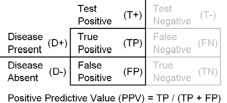
without error. The positive predictive value (PPV) of a test is the probability
that the patient has the disease when restricted to those patients who test
positive.
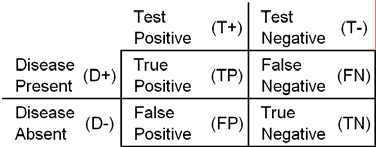
In many settings, the diagnostic test can produce only two results: a
positive result (T+) or a negative result (T-). The gold standard frequently
indicates only two results as well: either the presence (D+) or absence (D-) of
disease. You can display these results in a two by two table.
If the description so far seems a bit simplistic, that's true. There are
settings where the diagnostic test can have three or more results, for example,
and this does not complicate things too much. I'll talk about this case in a
future newsletter.
More troublesome is when the gold standard is imperfect and does not classify
without some error. This case needs to be handled with great caution.
The positive predictive value (PPV) of a test is the probability that
the patient has the disease when restricted to those patients who test positive.
Do not calculate the positive predictive value on a sample where the
prevalence of the disease was artificially controlled. For example, the PPV is
meaningless in a study where you artificially recruited healthy and diseased
patients in a one to one ratio.
The positive predictive value usually suffers greatly when examining a
population where the prevalence of the disease is rare. Here's an example that
shows why this is the case.
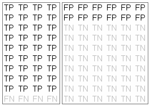
In the above diagram, patients with disease are on the left side, those
testing positive (true positives) at the top and those testing negative (false
negatives) at the bottom. You can see that the test does pretty well with patients who have
the disease, since true positives outnumber false negatives by 9 to 1. This
corresponds to a sensitivity of 90%. Healthy patients are on the right side of
the diagram, with those testing positive (false positives) at the top and those
testing negative (true negatives) at the bottom. The test does reasonably well
with healthy patients, though not quite as well as with diseased patients. For
every eight patients who test negative in this group, there are only two who
test positive. This corresponds to a sensitivity of 80%.
In a clinical setting, of course, you do not know the result of the gold
standard. So the natural question to ask is what conclusions might you draw if a
patient tests positive. Among the patients who test positive, 36 are true
positives and only 12 are false positives. So you would estimate the probability
that this particular patient has a disease at 75%.
Consider a case, though, where the prevalence of the disease is much lower.
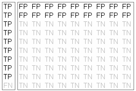
In the above diagram, the prevalence is 10% not 40%. The sensitivity and
specificity are still the same, but with the much smaller pool of patients with
the disease, the 9 true positives are swamped by the 18 false positives. So a
positive result would lead to an estimated 67% probability that the patient is
healthy!
It's hard to illustrate here, but when the prevalence sinks to 1% or 0.1%
even the most sensitive and specific test will have the same type of problem.
When you are using a diagnostic test in the real world, you need to estimate
the general prevalence of the disease, but with possible modifications to
account for the demographics of the patient you are looking at (males are more
likely to have asthma than females, for example) and modifications to account
for where you are currently practicing medicine (primary care doctors see a
broadly diffuse group of patients and would expect lower prevalence than in a
secondary or tertiary care setting).
3. Understanding the interaction of two continuous
variables
I was asked to help on a research project that involves the interaction of
two continuous variables. To make any progress, I had to explain what an interaction between two continuous
variables in a linear regression model really means. In this case, it was
believed that one variable was an effect modifier. That means that the
relationship between two primary variables changes depending on what the value
of the effect modifier would be. Here's a simple example.
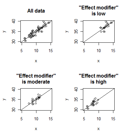
The upper left panel of this plot shows all of the data. There is a
moderately strong positive association between the two variables. The upper
right panel looks at a subset of the data where the "effect modifier" is low.
The two lower panels look at a subset of the data where the "effect modifier
is moderate or high. Although the data may shift around from side to side,
notice that the same moderately strong positive association persists within
each subgroup. This is an example where the "effect modifier" is not really an
effect modifier (which is why I put that term in quotes). Contrast the above
with a different example.
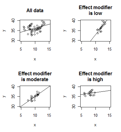
Here the nature of the relationship between X and Y changes, depending on
the value of the effect modifier. There is a strong linear relationship
between X and Y when
the effect modifier is low and a weak linear relationship when the effect
modifier is high. You can construct more extreme examples than this, such as
there being a positive relationship between X and Y for one value of the
effect modifier and a negative relationship between X and Y for a different
value of the effect modifier.
I don't mean to imply that interactions and effect modifiers are
interchangeable terms. An interaction actually can represent something much
broader in scope than an effect modifier.
So how do you fit an interaction model in linear regression? The answer is
multiplication. A two variable model without an interaction is defined as
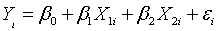
where β0 represents the intercept,
β1 represents the slope for the first independent variable, and β2
represents the slope for the second independent variable. A two variable model
with an interaction is defined as
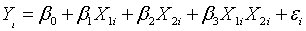
where β3 represents the interaction
effect of the two independent variables. It is easier to understand the
interaction term, though, if you center the data (subtract away the means of the
independent variables) before you multiply them together.

Focus your attention solely on this product term
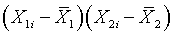
This product will produce positive values if both terms are positive or
both terms are negative. So the product term is positive if both independent
variables are simultaneously above average or if both independent variables
are simultaneously below average. Think of these as concordant pairs of
independent variables. Likewise, the product term is negative if one
independent variables is above average and the other one is below average.
Think of these as discordant pairs of independent variables.
If the coefficient associated with the interaction term is positive (a
positive interaction) that indicates an additional boost in the regression
model for the concordant pairs of independent variables above and beyond the
effect of each variable separately. This can sometimes be thought of as
synergy or the whole being greater than the sum of the parts. This
interpretation, however, may be overly simplistic in some contexts, so be
cautious and think before you automatically claim that a positive interaction
is evidence of synergy.
A negative term (a negative interaction) indicates an
additional boost in the regression model for the discordant pairs of
independent variables above and beyond the effect of each variable separately.
This can sometimes be thought of as antagonism. One variable works well (has a
positive effect) in the absence of the other variable, and vice versa, but
when both variables are large, they compete with one another and largely
cancel each other out. Again, this is a possible interpretation, but it may
not fit in all contexts.
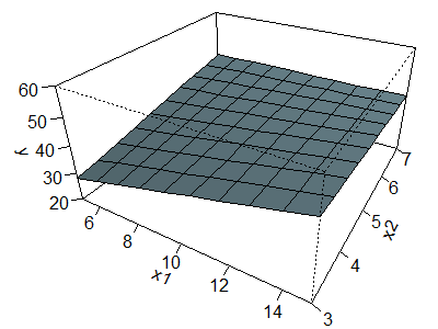
Here is a geometrical perspective on
interactions. First, examine the surface shown below, which corresponds to no
interaction.
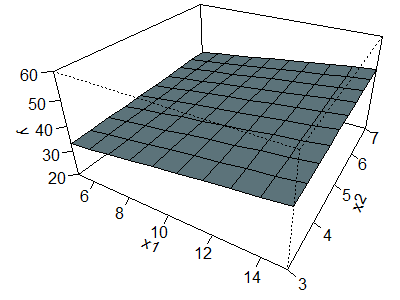
The equation for this surface is
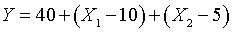
The equation tells you to start at 40. Add one for each unit that X1
is above average or subtract one for each unit that X1 is below
average. Do a comparable addition/subtraction for X2. The left
corner of the surface, corresponding to X1 = 5 (5 units below
average) and X2 = 3 (2 units below average) produces a value of 40
- 5 - 2 = 33. The corner of the surface all the way in the rear, corresponding
to X1 = 5 and X2 = 7 produces a value of 40 - 5 + 2 =
37. The corner of the surface sticking out in the front, corresponding to X1
= 15 and X2 = 3 produces a value of 40 + 5 - 2 = 43. Finally, the
right corner, corresponding to X1 = 15 and X2 = 7
produces a value of 40 + 5 + 2 = 47.
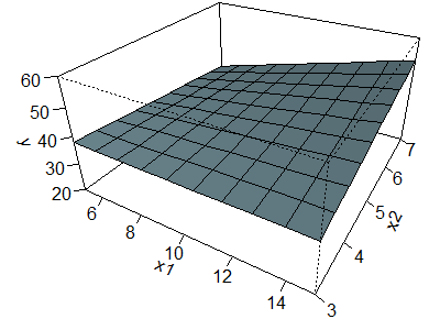
The surface shown above is called a plane. It can be thought of as a series
of parallel lines in the X1 direction and also as a series of
parallel lines in the X2 direction. For example, when you travel
from the left corner to the front corner, you see an increase from 33 to 43
and when you travel from the back corner to the front corner you see a similar
shift from 37 to 47.
The surface shown above is comparable to the first set of plots shown at
the very beginning of this page. In that data set, there was the same
moderately strong positive association for low, medium, and high values of the
effect modifier.
Now let's examine a surface with a positive interaction.
The equation for this surface is

The product term tells you to calculate the extent to which X1
and X2 are above/below average, multiply those extents and add half
of that amount to Y. So the left corner, corresponding to X1 = 5 (5
units below average) and X2 = 3 (2 units below average) produces a
product of (-5)(-2) = 10. Add half of this (5) to Y in addition to the amount
you would add/subtract based on the individual values of X1 and X2.
Thus, the left corner is now 38 instead of 33. Similarly the right corner is
now 52 instead of 47. The discordant corners: the front and back corners
corresponding to X1 above average, X2 below average and
vice versa, see a decline of 5. These values are now 38 instead of 43 and 32
instead of 37.
Imagine a flat sheet of paper hovering at an angle in the air. Now push the
two concordant corners upward and flex the two discordant corners downward at
the same time. It curves the surface into a shape somewhat evocative of a
saddle. It may not be too apparent in this particular figure because of the
orientation and the relatively small magnitude for the interaction term.
With this surface, you can no longer see a series of parallel lines in the
X1 or X2 direction. The relationship between X1
and Y when X2 = 3, corresponding to the line connecting the left
and front corners is a perfectly flat relationship since the values at those
two corners are both 38. The relationship between X1 and Y when X2
= 7, corresponding to the line connecting the back and right corners, in
contrast is very steep, the values increase from 32 at the back corner to 52
at the right corner.
Now take a look at a surface corresponding to a negative interaction.
The equation for this surface is

This formula produces the opposite effect. The concordant corners (the left
and right corners) are pushed down by 5 units and the discordant corners are
pushed up by 5 units. The values for the left, right, front, and back corners
are 28, 42, 48, and 42, respectively.
Again with this surface, you can no longer see a series of parallel lines
in the X1 or X2 direction, but the pattern is different.
The relationship between X1 and Y when X2 = 3 is steep
since the values change from 28 at the left corner to 48 at the front corner.
The relationship between X1 and Y when X2 = 7,
corresponding to the line connecting the back and right corners, in the one
that is flat now, since the value is 42 at both the back and right corners.
Go back and look at the data for the second example. The relationship
between X and Y was strongest when the effect modifier was low and weakest
when the effect modifier was high. This suggests antagonism, or a negative
interaction similar to the one shown just above.
4. Monthly Mean Article (peer reviewed): Overdiagnosis in
Cancer
H. Gilbert Welch, William C. Black. Overdiagnosis in Cancer. J. Natl.
Cancer Inst. 2010:djq099. Abstract: "This article summarizes the phenomenon
of cancer overdiagnosis--the diagnosis of a "cancer" that would otherwise not go
on to cause symptoms or death. We describe the two prerequisites for cancer
overdiagnosis to occur: the existence of a silent disease reservoir and
activities leading to its detection (particularly cancer screening). We
estimated the magnitude of overdiagnosis from randomized trials: about 25% of
mammographically detected breast cancers, 50% of chest x-ray and/or
sputum-detected lung cancers, and 60% of prostate-specific antigen-detected
prostate cancers. We also review data from observational studies and
population-based cancer statistics suggesting overdiagnosis in computed
tomography-detected lung cancer, neuroblastoma, thyroid cancer, melanoma, and
kidney cancer. To address the problem, patients must be adequately informed of
the nature and the magnitude of the trade-off involved with early cancer
detection. Equally important, researchers need to work to develop better
estimates of the magnitude of overdiagnosis and develop clinical strategies to
help minimize it." [Accessed April 28, 2010]. Available at:
http://jnci.oxfordjournals.org/cgi/content/abstract/djq099v1.
5. Monthly Mean Article (popular press): The Data-Driven
Life
Gary Wolf. The Data-Driven Life. The New York Times. 2010. Excerpt:
"And yet, almost imperceptibly, numbers are infiltrating the last redoubts of
the personal. Sleep, exercise, sex, food, mood, location, alertness,
productivity, even spiritual well-being are being tracked and measured, shared
and displayed. On MedHelp, one of the largest Internet forums for health
information, more than 30,000 new personal tracking projects are started by
users every month. Foursquare, a geo-tracking application with about one million
users, keeps a running tally of how many times players �check in� at every
locale, automatically building a detailed diary of movements and habits; many
users publish these data widely. Nintendo�s Wii Fit, a device that allows
players to stand on a platform, play physical games, measure their body weight
and compare their stats, has sold more than 28 million units." [Accessed May
1, 2010]. Available at:
http://www.nytimes.com/2010/05/02/magazine/02self-measurement-t.html.
6. Monthly Mean Book: Voodoo Histories
David Aaronovitch. Voodoo Histories. Random House; 2010. Note: This
book is not directly about Statistics. It covers a closely related topic,
critical thinking. This book shows how people will selectively comb through the
evidence to fashion rather bizarre theories. Excerpt: "Our age is obsessed by
the idea of conspiracy. We see it everywhere - from Pearl Harbour to 9/11, from
the assassination of Kennedy to the death of Diana. Bookshop shelves threaten to
collapse under the weight of texts devoted to proving myriad conspiracy theories
true, while even quality newspapers and serious TV channels are prepared to give
them credence. For David Aaronovitch, there came a time when he started to see a
pattern. These theories used similar dodgy methods with which to insinuate their
claims: they linked themselves to the supposed conspiracies of the past (it
happened then so it can happen now); they carefully manipulated their evidence
to hide its holes; they relied on the authority of dubious academic sources.
Most importantly, they elevated their believers to membership of an elite - a
group of people able to see beyond lies to a higher reality. But why believe
something that entails stretching the bounds of probability so far? Surely it is
more likely that men did actually land on the moon in 1969 than that thousands
of people were enlisted to fabricate a deception that they did. In this
entertaining and enlightening book - aimed to provide ammunition for those who
have found themselves at the wrong end of a conversation about moon landings or
twin towers - Aaronovitch carefully probes and explodes a dozen of the major
conspiracy theories. In doing so, he looks at why people believe them, and makes
an argument for a true scepticism: one based on a thorough knowledge of history
and a strong dose of common sense."
7. Monthly Mean Definition: What is socioeconomic status?
I'm not an expert on socioeconomic status (SES) but when someone asked me how
to best measure it, I did a bit of research. SES is an aggregate measure of an
individual or family that incorporates three major factors:
- income,
- education, and
- occupation.
Typically, these three factors are all indicating roughly the same thing,
but in today's economy, you may see someone with a PhD serving up fries at
McDonald's.
Other items might be an indirect indicator of SES. A person's insurance
status, for example, could be used with no insurance or government subsidized
insurance being a marker of lower SES. Home ownership could be an indicator of
higher SES. Geographic location could also be an indirect indicator of SES, as
certain areas tend to have a higher concentration of well paid, highly
educated individuals.
SES is an important variable in many health research studies, because SES
is strongly associated with many health outcomes. If you fail to account for
SES properly in these studies, then effects due to differences in SES may be
falsely attributed to other factors.
8. Monthly Mean Quote: When we meet a fact...
"When we meet a fact which contradicts a prevailing theory, we must accept
the fact and abandon the theory, even when the theory is supported by great
names and generally accepted" Claude Bernard, as quoted at
http://en.wikipedia.org/wiki/Claude_Bernard.
9. Monthly Mean Unsung Hero Award: Martin Holt
Martin Holt started an Internet discussion group, MedStats in 2005. You can
participate in the discussion via email or you can go to a website to read and
comment:
http://groups.google.com/group/MedStats. It is amazingly difficult to run a
group like this and to enforce a reasonable set of ground rules on what types of
messages are appropriate/inappropriate. Without those rules, however, the
MedStats discussion group would descend into chaos. Dr. Holt has done an
admirable job navigating the group through many controversies and has done this
with a touch that is neither too firm nor too soft. I learn a lot by reading the
questions that people pose, trying to answer some of them in a short but
coherent response, and watching as others provide answers to questions in areas
that I know relatively little about. MedStats is a valuable resource in my
continuing professional education and it is made possible through the tireless
efforts of Dr. Holt.
10. Monthly Mean Website: Centre for Multilevel
Modelling (CMM)
Hilary Browne. Centre for Multilevel Modelling (CMM). Excerpt: "The
Centre for Multilevel Modelling (CMM) is a research centre based at the
University of Bristol within the Graduate School of Education, the School of
Geographical Sciences and the Department of Clinical Veterinary Science and
forming part of the The Bristol Institute of Public Affairs (BIPA)" [Accessed
December 5, 2009]. Available at:
http://www.cmm.bristol.ac.uk/.
11. Nick News: Nicholas buys and builds his own
basketball hoop
Here's a picture of Nicholas taking a shot at his new basketball hoop. He
helped buy it and helped put it together. Read the full story at
*
www.pmean.com/personal/Hoop.html

As a bonus, take a look at the pictures of the Back Porch Cloggers, a group
I belong to.
*
www.pmean.com/personal/Cloggers.html

If you're in the Kansas City area, come see us perform at the Deanna Rose
Children's Farmstead on Saturday, June 12 at 11am. We'll be performing at the
dairy barn.
12. Very bad joke: Three people are brought in...
Three people are brought in for a job interview, a lawyer, an economist,
and a statistician. The interviewer asks the lawyer "What is one plus one?"
The lawyer responds, "In matters of commerce, the abiding precedent is a
Supreme Court ruling in 1867 that established prima facie evidence that one
plus one equals two. The interviewer was impressed. She then brought in the
economist and asked "What is one plus one?" The economist replied, "If you
believe in the efficient markets hypothesis, then you must hold that one plus
one equals two." The interviewer was even more impressed with this answer.
Then she brought in the statisticians and asked "What is one plus one". The
statistician looks all around, gets up and shuts the door to the office and
then quietly whispers "What do you want it to be?"
I can't claim credit for this. It is an old joke and you can find
variations of it where the third job candidate is an economist, an
epidemiologist, etc.
13. Tell me what you think.
How did you like this newsletter? I have three short open ended questions at
*
https://app.icontact.com/icp/sub/survey/start?sid=6342&cid=338122
You can also provide feedback by responding to this email. My three
questions are:
- What was the most important thing that you learned in this newsletter?
- What was the one thing that you found confusing or difficult to follow?
- What other topics would you like to see covered in a future newsletter?
Only one person provided feedback to the last newsletter. That person liked
the articles I had highlighted (Can we rely on the best trial? A comparison of
individual trials and systematic reviews, and Convincing the Public to Accept
New Medical Guidelines). That person also suggested that I review some more
basic review topics like Type I and Type II errors. I do have definitions of
these two terms at my old website:
*
www.childrensmercy.org/stats/definitions/typei.htm
*
www.childrensmercy.org/stats/definitions/typeii.htm
but I still like the suggestions and will try to elaborate more on these
definitions in a future newsletter.
14. Upcoming statistics webinars
I messed up in May with one of my webinars and want to apologize to those
people who I failed to properly notify about connection details and those who
had to endure some bugs caused, in part, by my lack of preparation. I'm going
to simplify the webinar process and try to avoid future problems. If you are
ever confused, however, about how to connect to one of my webinars, please
consult the main webinar page.
* www.pmean.com/webinars
As a way of making it up to those people inconvenienced by the previous
webinar I will offer it again as a bonus webinar on July 14. The two July
webinars, by the way, complement each other very nicely and represent some of
my best material. I will also offer my always popular webinar on data entry
and data management in August.
Webinar #1: The first three steps in a linear regression analysis with
examples in IBM SPSS. Wednesday, July 14, 11am CDT.
Webinar #2: The first three steps in a logistic regression analysis with
examples in IBM SPSS. Thursday, July 15, 11am CDT.
Webinar #3: Data entry and data management issues with examples in IBM SPSS.
To sign up for any of these, send me an email with the date of the webinar
in the title line (e.g., "July 14 webinar").
15. Join me on Facebook and LinkedIn
I'm just getting started with Facebook and LinkedIn. My personal page on
Facebook is
* www.facebook.com/pmean
and there is a fan page for The Monthly Mean
*
www.facebook.com/group.php?gid=302778306676
I usually put technical stuff on the Monthly Mean fan page and personal stuff
on my page, but there's a bit of overlap.
My page on LinkedIn is
* www.linkedin.com/in/pmean
If you'd like to be a friend on Facebook or a connection on LinkedIn, I'd
love to add you.
What now?
Sign up for the Monthly Mean newsletter
Review the archive of Monthly Mean newsletters
Go to the main page of the P.Mean website
Get help
 This work is licensed under a
Creative
Commons Attribution 3.0 United States License. This page was written by
Steve Simon and was last modified on
2017-06-15. Need more
information? I have a page with general help
resources. You can also browse for pages similar to this one at
Category: Website details.
This work is licensed under a
Creative
Commons Attribution 3.0 United States License. This page was written by
Steve Simon and was last modified on
2017-06-15. Need more
information? I have a page with general help
resources. You can also browse for pages similar to this one at
Category: Website details.