Monthly Mean newsletter, December 2009
Welcome to the Monthly Mean newsletter for December 2009. This newsletter was sent out on January 18, 2010. If you are not yet subscribed to this newsletter, you can sign on at www.pmean.com/news. If you no longer wish to receive this newsletter, there is a link to unsubscribe at the bottom of this email. Here's a list of topics.
Lead article: Are we statisticians gods?
2. What size difference should you use in your power calculation?
3. Risk adjustment using propensity scores
4. Monthly Mean Article (peer reviewed): Eligibility Criteria of Randomized Controlled Trials Published in High-Impact General Medical Journals: A Systematic Sampling Review
5. Monthly Mean Article (popular press): Making Health Care Better
6. Monthly Mean Book: The Statistical Evaluation of Medical Tests for Classification and Prediction
7. Monthly Mean Definition: What is an ROC curve?
8. Monthly Mean Quote: Random selection is ...
9. Monthly Mean Website: R-SAS-SPSS Add-on Module Comparison
10. Nick News: Nicholas the sledder
11. Very bad joke: A lightbulb randomization joke
12. Tell me what you think.
13. Upcoming statistics webinars
14. Special message to my loyal readers.
1. Are we statisticians gods?
Before you think that I am being vain and/or sacrilegious, the characterization of statisticians as gods was one that someone else provided.
I was helping someone who wanted to consider an alternative statistical analysis to the one used by the principal investigator (PI). I was happy to help and would have offered advice about why my approach may be better, but I was warned that the PI considers the analysis chosen to be ordained by the "Statistic Gods" at her place of work.
I'm not sure what to make of the words "Statistic Gods". It or some similar term has been used to describe me. I find myself surprisingly reluctant to dissuade someone from this belief. Perhaps it is good for business if people falsely believe that I have divine powers.
But somehow I find the characterization a bit bothersome as well. It is an abdication of responsibility of the scientists who won't take the time and learn what I learned. Instead they just give up and attribute my acquired knowledge as something that can only be obtained through supernatural means. I also wonder if such an attitude is a barrier to establishing a truly professional collaboration.
Maybe I'm just irritated that someone other than me is accorded a status worthy of worship.
I've mentioned this story at the beginning of some of the webinars that I've taught. I want to encourage people to think of Statistics not as some magic incantation that only a select group of people can apply. Statistics is not any harder than anything else you've learned.
If you have problems understanding Statistics, perhaps the fault lies not in you, but in the person who taught you. There is a lot of literature out there suggesting that we statisticians do not teach our subject very well. I also think that you need to have a second series of statistics courses after you've actually had to deal with real research data in real research projects. The courses seem too abstract until you actually see it in use.
So stop treating Statistics as something magical and mysterious. It took me a lot of hard work to understand what I know about Statistics, but it was hard work rather than any inborn talent that made me learn. If you devote the time and energy, you can learn Statistics too.
2. What size difference should you use in your power calculation?
A question came up about how to decide the minimum clinically significant difference in a power calculation. The minimum clinically significant difference is boundary between "dud" and "dazzle" or the dividing line between "yawn" and "yipee." More rigorously, the minimum clinically significant difference is the boundary between a difference so small that no one would adopt the new intervention on the basis of such a meager changer and a difference large enough to make a difference (that is, to convince people to change their behavior and adopt the new therapy).
Establishing the minimum clinically relevant difference is a tricky task, but it is something that should be done prior to any research study.
For binary outcomes, the choice is not too difficult in theory. Suppose that an intervention "costs" X dollars in the sense that it produces that much pain, discomfort, and inconvenience, in addition to any direct monetary costs. Suppose the value of a cure is kX where k is a number greater than 1. A number less than 1, of course, means that even if you could cure everyone, the costs outweigh the benefits of the cure.
For k>1, the minimum clinically significant difference in proportions is 1/k. So if the cure is 10 times more valuable than the costs, then you need to show at least a 10% better cure rate (in absolute terms) than no treatment or the current standard of treatment. Otherwise, the cure is worse than the disease.
It helps to visualize this with certain types of alternative medicine. If your treatment is aromatherapy, there is almost no cost involved, so even a very slight probability of improvement might be worth it. But Gerson therapy, which involves, among other things, coffee enemas, is a different story. An enema is reasonably safe, but is not totally risk free. And it involves a substantially greater level of inconvenience than aromatherapy. So you'd only adopt Gerson therapy if it helped a substantial fraction of patients. Exactly how many depends on the dollar value that you place on having to endure a coffee enema, which I will leave for someone else to quantify.
There may be side effects associated with the treatment that only occur in a fraction of the patients receiving the treatment. You should also consider that the costs associated with certain side effects of a treatment may vary from person to person. In both cases, the calculations are complicated somewhat, but still possible in theory.
Now after taking all the time to list this elaborate framework, I must admit that no one does any of this, including me. What people do is that they select the minimum clinically significant difference using a SWAG (if you don't know this acronym, you'll have to look it up, as I am too reserved to spell out this acronym here).
This material is part of a webpage about the first three steps in sample size calculations, which can be found at
In addition to this guidance on selecting the minimum clinically significant difference, that webpage talks about the other two steps: defining a research hypothesis and providing an estimate of variation for your outcome measure).
3. Risk adjustment using propensity scores
Propensity scores offer a way to redress the imbalances in many data sets, the imbalances that produce an apples to oranges comparison. The idea is to create a model that predicts the degree of imbalance between two groups using logistic regression. The predicted probability of group membership is the propensity score, which you then use to match or stratify.
The logistic model used to create the propensity score does not include the outcome variable, which seems counter-intuitive. But the goal of a propensity score model is to create a composite variable which measures imbalance. Stratifying or matching on this composite variable removes the effects of the imbalance.
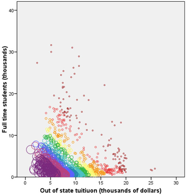
I will illustrate propensity score methods on a problem discussed in earlier newsletters, coming up with a "fair" comparison of average faculty salaries at colleges and universities in a given state. There is substantial variation in the statewide average salaries, but some of this variation is due to differences at the colleges and universities from one state to another. In previous examples, I showed how to adjust for the differing proportions of Division I, IIA, and IIB colleges from state to state. For propensity score modeling, I want to look at two other variables: the size of the school as measured by the number of full time students and the cost of the school as measured by the out of state tuition. In practice, propensity scores work well when there are a large number of variables whose impact on the outcome and whose degree of imbalance are difficult to characterize. But it is easier to illustrate a propensity score model with only two covariates.
In West Virginia (WV), schools tend to be smaller and less expensive than the national average, but not by a large amount. The propensity score will be larger for small and inexpensive schools and smaller for big and expensive schools. By matching on propensity scores, you will assure that schools in WV are compared to schools outside of WV that are also small and inexpensive.
The figure shown above illustrates the distribution of propensity scores across the two variables. Smaller circles and circles closer to orange/red on the rainbox specturm represent small propensity scores. Larger circles and circles closer to blue/purple on the rainbox spectrum represent large propensity scores. Large values for the propensity score appear in the lower left hand portion of the graph. You can use this propensity score to find comparable colleges and universities in other states that have roughly the same size and expense.

The figure shown above indicates the 15 WV schools plus sign) and four schools matched for each WV school based on the propensity score (black filled circles). Colleges and universities not selected for matching are shown as gray open circles. The distribution of the WV schools and the matching schools is roughly balanced. The mean size is 2.8 thousand students in the WV schools, 2.6 thousand students in the matching schools. Comparing this to the size of all schools (4.0 thousand students), you can see that a straight up comparison could be seriously biased. The cost of out of state tuition is 7.9 thousand in the WV schools, 8.0 thousand in the matching schools. If all schools were used, the average tuition would be 9.5 thousand.
The average salary in the WV schools is $35K, and the average salary in the matched schools is $40K. This shows that WV salaries lag behind a set of schools of comparable size and cost, but this lag is not as extreme as the comparison to all schools outside WV, where the salary is $43K.
Now there is nothing stopping you from matching directly using both size and cost. In this simple example, that might lead to better results. The complexity occurs when there are dozens of variables to consider. The logistics of directly matching across dozens of variables are frightful to behold. Propensity score matching also has the advantage of prioritizing the matching to those variables which contribute most to the imbalance between the two groups.
Although I do not show an example here, it is possible to use the propensity score analysis to create strata. These strata will be reasonably homogenous among all the covariates which show serious imbalance. The major advantage of using propensity scores to develop strata is that it works well with a large number of covariates. Since the propensity score is effectively a composite score of the covariates, it reduces a multidimensional problem to a single dimensional problem.
It is also possible to treat the propensity score as a single covariate in an analysis of covariance model. You need to be cautious about extrapolations, however. If the propensity score of the two groups do not substantially overlap, you will end up making an inappropriate extrapolation of your data.
What are the strengths and weaknesses of propensity score adjustments? Propensity scores are moderately complex. They require a statistical software program to compute the propensity scores and the process of finding the closest matches based on propensity scores is somewhat tedious. Once you have the matching observations, though, the calculations are easy�compare the average of the group in question to the average of the matched observations. Propensity scores work with both continuous and categorical covariates. They only make adjustments for variables that are imbalanced across the groups.This work was part of a project I am helping with: the adjustment of outcome measures in the National Database of Nursing Quality Indicators. The work described in this article was supported in part through a grant of the American Nursing Association.
4. Monthly Mean Article (peer reviewed): Eligibility Criteria of Randomized Controlled Trials Published in High-Impact General Medical Journals: A Systematic Sampling Review.
Harriette G. C. Van Spall, Andrew Toren, Alex Kiss, Robert A. Fowler. Eligibility Criteria of Randomized Controlled Trials Published in High-Impact General Medical Journals: A Systematic Sampling Review. JAMA. 2007;297(11):1233-1240. Abstract: "Context: Selective eligibility criteria of randomized controlled trials (RCTs) are vital to trial feasibility and internal validity. However, the exclusion of certain patient populations may lead to impaired generalizability of results. Objective: To determine the nature and extent of exclusion criteria among RCTs published in major medical journals and the contribution of exclusion criteria to the representation of certain patient populations. Data Sources and Study Selection: The MEDLINE database was searched for RCTs published between 1994 and 2006 in certain general medical journals with a high impact factor. Of 4827 articles, 283 were selected using a series technique. Data Extraction: Trial characteristics and the details regarding exclusions were extracted independently. All exclusion criteria were graded independently and in duplicate as either strongly justified, potentially justified, or poorly justified according to previously developed and pilot-tested guidelines. Data Synthesis: Common medical conditions formed the basis for exclusion in 81.3% of trials. Patients were excluded due to age in 72.1% of all trials (60.1% in pediatric populations and 38.5% in older adults). Individuals receiving commonly prescribed medications were excluded in 54.1% of trials. Conditions related to female sex were grounds for exclusion in 39.2% of trials. Of all exclusion criteria, only 47.2% were graded as strongly justified in the context of the specific RCT. Exclusion criteria were not reported in 12.0% of trials. Multivariable analyses revealed independent associations between the total number of exclusion criteria and drug intervention trials (risk ratio, 1.35; 95% confidence interval, 1.11-1.65; P = .003) and between the total number of exclusion criteria and multicenter trials (risk ratio, 1.26; 95% confidence interval, 1.06-1.52; P = .009). Industry-sponsored trials were more likely to exclude individuals due to concomitant medication use, medical comorbidities, and age. Drug intervention trials were more likely to exclude individuals due to concomitant medication use, medical comorbidities, female sex, and socioeconomic status. Among such trials, justification for exclusions related to concomitant medication use and comorbidities were more likely to be poorly justified. Conclusions: The RCTs published in major medical journals do not always clearly report exclusion criteria. Women, children, the elderly, and those with common medical conditions are frequently excluded from RCTs. Trials with multiple centers and those involving drug interventions are most likely to have extensive exclusions. Such exclusions may impair the generalizability of RCT results. These findings highlight a need for careful consideration and transparent reporting and justification of exclusion criteria in clinical trials." [Accessed January 15, 2010]. Available at: http://jama.ama-assn.org/cgi/content/abstract/297/11/1233.
5. Monthly Mean Article (popular press): Making Health Care Better
David Leonhardt. Making Health Care Better. The New York Times. November 8, 2009. Description: This article profiles Brent James. chief quality officer at Intermountain Health Care, and his pioneering efforts to rigorously apply evidence based medicine principles. It highlights some of the quality improvement initiatives at Intermountain and documents the resistance to change among many doctors at Intermountain. [Accessed January 14, 2010]. Available at: http://www.nytimes.com/2009/11/08/magazine/08Healthcare-t.html.
6. Monthly Mean Book: The Statistical Evaluation of Medical Tests for Classification and Prediction
Margaret Sullivan Pepe, The Statistical Evaluation of Medical Tests for Classification and Prediction, Oxford University Press, ISBN: 0198565828. This book provides a comprehensive overview of the statistical issues associated with medical diagnostic testing. It includes all the technical details that an expert would need, but it is still very readable.
7. Monthly Mean Definition: What is an ROC curve?
To understand an ROC curve, you first have to accept the fact that MDs like to ruin a nice continuous outcome measure by turning it into a dichotomy. For example, doctors have measured the S100 protein in serum and found that higher values tend to be associated with Creutzfeldt-Jakob disease. The median value is 395 pg/ml for the 108 patients with the disease and only 109 pg/ml for the 74 patients without the disease. The doctors set a cut off of 213 pg/ml, even though they realized that 22.2% of the diseased patients had values below the cut off and 18.9% of the disease-free patients had values above the cut off.
The two percentages listed above are the false negative and false positive rates, respectively. If we lowered the cut off value, we would decrease the false negative rate rate, but we would also increase the false positive rate. Similarly, if we raised the cut off, we would decrease the false positive rate, but we would increase the false negative rate.
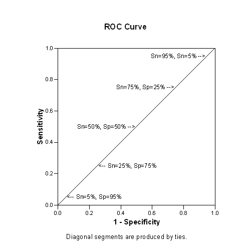
An ROC curve is a graphical representation of the trade off between the false negative and false positive rates for every possible cut off. Equivalently, the ROC curve is the representation of the tradeoffs between sensitivity (Sn) and specificity (Sp).
By tradition, the plot shows the false positive rate on the X axis and true positive rate (1 - the false negative rate) on the Y axis. You could also describe this as a plot with 1-Sp on the X axis and Sn on the Y axis. Why did they do it this way instead of just plotting Sp vs Sn? It relates to some historical precedents involving radio signal detection.
So how can you tell a good ROC curve from a bad one? All ROC curves are good, it is the diagnostic test which can be good or bad. A good diagnostic test is one that has small false positive and false negative rates across a reasonable range of cut off values. A bad diagnostic test is one where the only cut offs that make the false positive rate low have a high false negative rate and vice versa.
We are usually happy when the ROC curve climbs rapidly towards upper left hand corner of the graph. This means that 1- the false negative rate is high and the false positive rate is low. We are less happy when the ROC curve follows a diagonal path from the lower left hand corner to the upper right hand corner. This means that every improvement in false positive rate is matched by a corresponding decline in the false negative rate.
You can quantify how quickly the ROC curve rises to the upper left hand corner by measuring the area under the curve. The larger the area, the better the diagnostic test. If the area is 1.0, you have an ideal test, because it achieves both 100% sensitivity and 100% specificity. If the area is 0.5, then you have a test which has effectively 50% sensitivity and 50% specificity. This is a test that is no better than flipping a coin. In practice, a diagnostic test is going to have an area somewhere between these two extremes. The closer the area is to 1.0, the better the test is, and the closer the area is to 0.5, the worse the test is.
Area under the curve does have one direct interpretation. If you take a random healthy patient and get a score of X and a random diseased patient and get a score of Y, then the area under the curve is an estimate of P[Y>X] (assuming that large values of the test are indicative of disease).
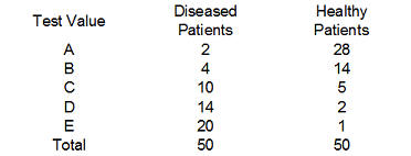
Show me an example of an ROC curve. Consider a diagnostic test that can only take on five values, A, B, C, D, and E. We classify diseased (D+) and healthy (D-) patients by this test and get the following results:
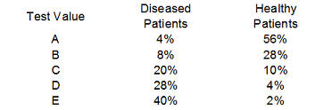
Convert these numbers to percentages,
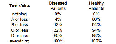
and then to cumulative percentages.
We add a row (nothing) to represent the cumulative percentage of 0% which will end up corresponding to a diagnostic test where all the results are considered positive regardless of the test value. The last row could have been labeled "E or less" but I chose the label "everything" since it represents the other extreme, where all the results are considered negative regardless of the test value.
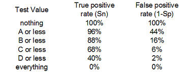
Finally, compute the complementary percentages (100% - the current entry). This produces the table shown above. The entries in the "Test Value" column represent the values of the diagnostic test that correspond to a negative result. The percentages in the middle column represent the true positive rate or the sensitivity of the test. The percentages in the right column correspond to the false positive rate of 1-Sp.
This table includes two extreme cases for the sake of completeness. If you never classify a test as negative (the "nothing" entry), then you will have a 100% true positive rate among those with the disease (Sn=1), but also a 100% false positive rate among those who are healthy (Sp=0). Conversely, if you always classify a test as negative, you will have a 0% true positive rate among those with the disease (Sn=0), but you will have a 0% false positive rate among those who are healthy (Sp=1). Neither extreme would probably be used in a practical setting; if you always classified a test as positive (or negative) that would mean that you are ignoring the test results entirely.
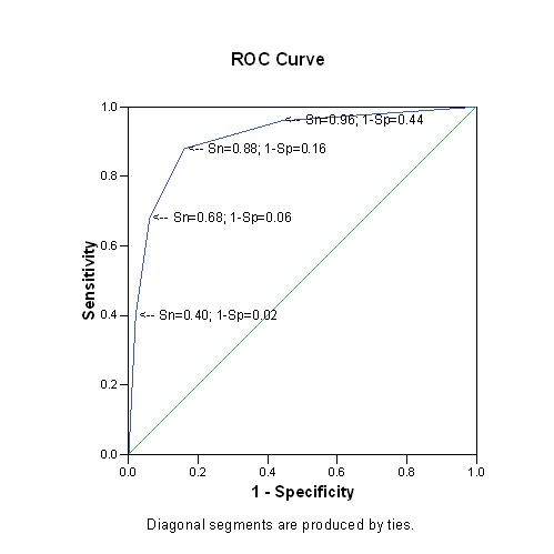
Here is what the graph of the ROC curve would look like.

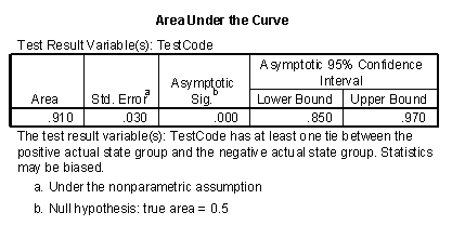
Here is information about Area Under the Curve. This area (0.91) is quite good; it is close to the ideal value of 1.0 and much larger than worst case value of 0.5.
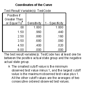
Here are the actual values used to draw the ROC curve (I selected the "Coordinate points of the ROC Curve" button in SPSS).
Here is the same ROC curve with annotations added
Shown below is an artificial ROC curve with an area equal to 0.5. Notice that each gain in sensitivity is balanced by the exact same loss in specificity and vice versa. Also notice that this curve includes the point corresponding to 50% for both sensitivity and specificity. You could achieve this level of diagnostic ability by flipping a coin. Clearly, this curve represents a worst case scenario.
What's a good value for the area under the curve? Deciding what a good value is for area under the curve is tricky and it depends a lot on the context of your individual problem. One way to approach the problem is to examine what some of the likelihood ratios would be for various areas. A good test should have a LR+ of at least 2.0 and a LR- of 0.5 or less. This would correspond to an area of roughly 0.75. A better test would have likelihood ratios of 5 and 0.2, respectively, and this corresponds to an area of around 0.92. Even better would be likelihood ratios of 10 and 0.1, which corresponds roughly to an area of 0.97. So here is one interpretation of the areas:
- 0.50 to 0.75 = fair
- 0.75 to 0.92 = good
- 0.92 to 0.97 = very good
- 0.97 to 1.00 = excellent.
These are very rough guidelines; further work on refining these would be appreciated.
Does the ROC curve tell you the best possible cutoff for a diagnostic test? Some people have argued that the "best" cutoff for a diagnostic test corresponds to the point on the ROC curve closest to the upper left hand corner. While this value would maximize the sum of sensitivity and specificity, there is no valid basis for believing that such a maximization produces the "best" cutoff. A careful consideration of what the "best" cutoff would be depends on the prevalence of the disease in the population being tested, as well as the costs associated with a false positive diagnosis and the costs associated with a false negative diagnosis.
This newsletter article is an update of a webpage I published nine years ago at my old website:
8. Monthly Mean Quote: Random selection is ...
"Random selection is too important to be left to chance" Robert R. Coveyou, as quoted at www.lsv.ens-cachan.fr/~goubault/ProNobis/scientificpartonly.pdf
9. Monthly Mean Website: R-SAS-SPSS Add-on Module Comparison
Robert Muenchen. R-SAS-SPSS Add-on Module Comparison. Excerpt: "R has over 3,000 add-on packages, many containing multiple procedures, so it can do most of the things that SAS and SPSS can do and quite a bit more. The table below focuses only on SAS and SPSS products and which of them have counterparts in R. As a result, some categories are extremely broad (e.g. regression) while others are quite narrow (e.g. conjoint analysis). This table does not contain the hundreds of R packages that have no counterparts in the form of SAS or SPSS products. There are many important topics (e.g. mixed models) offered by all three that are not listed because neither SAS Institute nor IBM's SPSS Company sell a product focused just on that." [Accessed January 14, 2010]. Available at: http://r4stats.com/add-on-modules.
10. Nick News: Nicholas the sledder
We had a very white Christmas in Kansas City and it was perfect sledding weather. Nicholas heard from a friend about a great sledding hill near Cleveland Chiropractic College, so we checked it out. He had a great time. Dad mostly stood around and watched. Nicholas did get Dad up for one sledding run. Getting uphill was quite treacherous, but the downhill part almost made it worthwhile.
More sledding pictures can be found at
11. Very bad joke: A lightbulb randomization joke
Here's a lightbulb randomization joke that I created myself: take to in How many a screw does statisticians it lightbulb?
12. Tell me what you think.
How did you like this newsletter? I have three short open ended questions at
You can also provide feedback by responding to this email. My three questions are:
- What was the most important thing that you learned in this newsletter?
- What was the one thing that you found confusing or difficult to follow?
- What other topics would you like to see covered in a future newsletter?
Only two people provided feedback to the last newsletter. The Stephen Jay Gould article "The median is not the message" and the description of Kaplan-Meier curves drew praise. One person liked the simple explanation about the case mix index but the other person thought it was confusing. I got the excellent suggestion to talk about problems associated with missing data. It will take some effort, but I'll see what I can do.
13. Upcoming statistics webinars
Free to all! The first three steps in a descriptive data analysis, with examples in IBM SPSS Statistics, Thursday, January 21, 2010, 11am-noon, CST. Abstract: This one hour training class will give you a general introduction to descriptive data analysis using IBM SPSS software. The first three steps in a descriptive data analysis are: (1) know how much data you have and how much data is missing; (2) compute ranges or frequencies for individual variables; and (3) compute crosstabs, boxplots, or scatterplots to examine relationships among pairs of variables. This class is useful for anyone who needs to analyze research data.
Free to all! What do all these numbers mean? Sensitivity, specificity, and likelihood ratios, Wednesday, February 17, 11am-noon, CST.
Abstract: This one hour training class will give you a general introduction to numeric summary measures for diagnostic testing. You will learn how to distinguish between a diagnostic test that is useful for ruling in a diagnosis and one that is useful for ruling out a diagnosis. You will also see an illustration of how prevalence of disease affects the performance of a diagnostic test. Please have a pocket calculator available during this presentation. This class is useful for anyone who reads journal articles that evaluate these tests.
14. Special message to my loyal readers.
The Monthly Mean has been and will always be sent to you advertising-free and at no cost. I do this to help publicize my consulting business, but I need a larger audience to justify all the uncompensated work that I put into this newsletter. If you would like to see The Monthly Mean continue, please forward this to others who you think might enjoy the newsletter as much as you do and encourage them to sign up. There is a convenient FORWARD link at the bottom of this email. My goal is to have 1,500 subscribers by the end of this year, and I can only do it with your help.
What now?
Sign up for the Monthly Mean newsletter
Review the archive of Monthly Mean newsletters
![]() This work is licensed under a
Creative
Commons Attribution 3.0 United States License. This page was written by
Steve Simon and was last modified on
2017-06-15. Need more
information? I have a page with general help
resources. You can also browse for pages similar to this one at
Category: Website details.
This work is licensed under a
Creative
Commons Attribution 3.0 United States License. This page was written by
Steve Simon and was last modified on
2017-06-15. Need more
information? I have a page with general help
resources. You can also browse for pages similar to this one at
Category: Website details.