
P.Mean >> Statistics webinar >> The first three steps in a linear regression analysis, with examples in PASW/SPSS (to be presented in November 2009).
This talk uses material from my old website
as well as some new material.
Content: This training class will give you a general introduction in how to use SPSS software to compute linear regression models. Linear regression models provide a good way to examine how various factors influence a continuous outcome measure. There are three steps in a typical linear regression analysis:
- Fit a crude model
- Fit an adjusted model
- Check your assumptions
These steps may not be appropriate for every linear regression analysis, but they do serve as a general guideline. This class will provide hands-on experiences using SPSS software. You will use two SPSS data sets for practice exercises: bf.sav and housing.sav.
Objectives: In this class you will learn how to:
- interpret the slope and intercept in a linear regression model;
- compute a simple linear regression model; and
- make statistical adjustments for covariates.
Teaching strategies: Didactic lectures and individual computer exercises.
IRB Education Credits: This class does not qualify for IRB Education Credits (IRBECs).
Outline:
- Definition: Categorical data
- Definition: Continuous data
- Description of the breast feeding data set
- Description of the Albuquerque housing data set
- Practice exercises
- Interpreting linear regression coefficients
- Guidelines for linear regression models
- SPSS dialog boxes for linear model examples
What is categorical data?
Data that consist of only small number of values, each corresponding to a specific category value or label. Ask yourself whether you can state out loud all the possible values of your data without taking a breath. If you can, you have a pretty good indication that your data are categorical. In a recently published study of breast feeding in pre-term infants, there are a variety of categorical variables:
Breast feeding status (exclusive, partial, and none);
whether the mother was employed (yes, no); and
the mother's marital status (single, married, divorced, widowed).
This webpage was written by Steve Simon on 2002-10-11, edited by Steve Simon, and was last modified on 2008-07-08.
What is continuous data?
Data that consist of a large number of values, with no particular category label attached to any particular data value. Ask yourself if your data can conceptually take on any value inside some interval. If it can, you have a good indication that your data are continuous. In a recently published study of breast feeding in pre-term infants, there are a variety of continuous variables:
This webpage was written by Steve Simon on 2002-10-11, edited by Steve Simon, and was last modified on 2008-07-08.
Description of the breast feeding data set.
The file bf.sav contains data from a research study done at Children's Mercy Hospital and St. Luke's Medical Center. The data comes from a study of breast feeding in pre-term infants. Infants were randomized into either a treatment group (NG tube) or a control group (Bottle). Infants in the NG tube group were fed in the hospital via their nasogastral tube when the mother was not available for breast feeding. Infants in the bottle group received bottles when the mothers were not available. Both groups were monitored for six months after discharge from the hospital.
Variable list
- MomID Mother's Medical Record Number
- BabyID Baby's Medical Record Number
- FeedTyp Feeding type (Bottle or NG Tube)
- BfDisch Breastfeeding status at hospital discharge (Excl, Part, None)
- BfDay3 Breastfeeding status three days after discharge (Excl, Part, None)
- BfWk6 Breastfeeding status six weeks after discharge (Excl, Part, None)
- BfMo3 Breastfeeding status three months after discharge (Excl, Part, None)
- BfMo6 Breastfeeding status six months after discharge (Excl, Part, None)
- Sepsis Diagnosis of sepsis (Yes or No)
- DelType Type of delivery (Vag or C/S)
- MarStat Marital status of mother (Single or Married)
- Race Mother's race (White or Black)
- Smoker Smoking by mother during pregnancy (Yes or No)
- BfDurWk Breastfeeding duration in weeks
- AB Total number of apnea and bradycardia incidents
- AgeYrs Mother's age in years
- Grav Gravidity or number of pregnancies
- Para Parity or number of live births
- MiHosp Miles from the mother's home to the hospital
- DaysNG Number of days on the NG tube.
- TotBott Total number of bottles of formula given while in the hospital
- BirthWt Birthweight in kg
- GestAge Estimated gestational age in weeks
- Apgar1 Apgar score at one minute
- Apgar5 Apgar score at five minutes
Note: as I revise and improve this data set, I may add or remove variables from this list. So if the variables shown above don't match perfectly with the data set you have, don't panic.
Also note that I use different notation ("treatment" instead of "ng tube" and "control" instead of "bottle") in other parts of this website.
Source
Kliethermes PA; Cross ML; Lanese MG; Johnson KM; Simon SD [1999]. Transitioning preterm infants with nasogastric tube supplementation: increased likelihood of breastfeeding. J Obstet Gynecol Neonatal Nurs 28(3): 264-273
Housing data
The file housing.sav (also available as a text file) is "a random sample of records of resales of homes from Feb 15 to Apr 30, 1993 from the files maintained by the Albuquerque Board of Realtors. This type of data is collected by multiple listing agencies in many cities and is used by realtors as an information base." There are 117 records in this database.
Variable Names:
- Price = Selling price (in dollars)
- SquareFeet = Square feet of living space
- AgeYears = Age of home (years)
- NumberFeatures = Number out of 11 features (dishwasher, refrigerator, microwave, disposer, washer, intercom, skylight(s), compactor, dryer, handicap fit, cable TV access
- Northeast = Located in northeast sector of city (Yes or No)
- CustomBuild = Custom built (Yes or No)
- CornerLot = Corner location (Yes or No)
The original data set had selling price in hundreds of dollars, but I found it useful to convert this to dollars. This data set also had a column for annual taxes, which I did not include in this data set.
Source:
http://lib.stat.cmu.edu/DASL/DataArchive.html The Data and Story Library. Link last checked on May 11, 2004. "DASL (pronounced "dazzle") is an online library of datafiles and stories that illustrate the use of basic statistics methods. We hope to provide data from a wide variety of topics so that statistics teachers can find real-world examples that will be interesting to their students. Use DASL's powerful search engine to locate the story or datafile of interest."
Stats #03: Practice Exercises
These exercises refer to two data sets:
- BF.SAV, a study of breast feeding in pre-term infants, which you have read extensively about earlier.
- HOUSING.SAV, a study of housing prices in Albuquerque, NM. You can find a good overview and a text version of this data set on the web at http://lib.stat.cmu.edu/DASL/Stories/homeprice.html.
You will find these data sets in the SPSS Program folder, located in the Classroom Examples folder.
1. In the breast feeding data set (BF.SAV), examine the relationship between the total number of apnea and bradycardia incidents (TOTAL_AB) and the age of the infant at discharge from the hospital (DC_AGE). Although a linear regression model is not ideal for this type of data, you will find some interesting and useful ideas from this analysis.
- Draw a scatterplot with DC_AGE on the X axis and TOTAL_AB on the Y axis.
- Compute a linear regression model using DC_AGE as the independent variable and TOTAL_AB as the dependent variable. Interpret the slope and intercept terms for this model.
2. Using the same data set, examine the relationship between TOTAL_AB and the treatment group variable (FEED_TYP).
- Draw a box plot for this data.
- Compute a linear regression model using TOTAL_AB as the dependent variable and FEED_TYP as the independent variable. Interpret the slope and intercept terms for this model.
3. In the housing data set (HOUSING.SAV), examine the relationship between the square footage of a house (SQFT) and the sales price of the house (PRICE).
- Draw a scatterplot with SQFT on the X axis and PRICE on the X axis. Interpret this plot.
- Compute a linear regression model using SQFT as the independent variable and PRICE as the dependent variable. Interpret the slope and intercept terms for this model. Is the regression model consistent with your graph?
4. In the same data set, examine whether a custom built house (CUST: 1=Yes, 0=No) influences the price of a home.
- Draw a boxplot with PRICE as the variable and CUST as the category axis.
- Compute the means for custom built and non-custom built houses (select ANALYZE | COMPARE MEANS | MEANS from the menu. Place PRICE in the dependent list and CUST in the independent list).
- Compute a regression model with PRICE as the dependent variable and CUST as the covariate. Interpret this model.
- Compute a regression model with PRICE as the dependent variable and CUST as a fixed factor (not a covariate). How does this model differ from the previous one?
5. You are concerned that custom built houses are more expensive, not because they are custom built, but only because they are bigger.
- Draw a boxplot that shows whether custom built houses are bigger than other houses.
- Compute the mean square footage between custom built and normal houses.
- Fit a regression model with PRICE as the the dependent variable, CUST as the fixed factor, and SQFT as the covariate. Contrast this model to the model that uses SQFT alone to predict PRICE and to the model that uses CUST alone to predict PRICE.
6. Infants with low birth weights and early gestational ages tend to have more problems with apnea and bradycardia. Since birth weight and gestational age are so closely related, you are not sure how to separately account for the predictive ability of each variable.
- Draw two scatterplots. For both scatterplots, place the outcome variable TOTAL_AB on the Y axis. On the first scatterplot, use birth weight (BW) on the X axis. On the second scatterplot, use gestational age (GEST_AGE) on the X axis.
- Fit a regression model using TOTAL_AB as the dependent variable and BW as the independent variable. Interpret the slope and intercept from this model.
- Fit a regression model using TOTAL_AB as the dependent variable and GEST_AGE as the independent variable. Interpret the slope and intercept from this model.
- Fit a regression model using both BW and GEST_AGE as independent variables. Interpret the intercept and the two slope terms from this model.
7. Examine the assumptions of the regression model for the housing data, where you used SQFT and CUST to predict PRICE.
- Compute residuals and predicted values from this model.
- Draw a scatterplot with the residuals on the Y axis and the predicted values on the X axis.
- Draw a normal probability plot for the residuals.
8. There are additional residual plots that you can use to check if additional variables should be included in your regression model.
- Draw a scatterplot with the residuals on the Y axis and the number of features of the house (FEAT) on the X axis. A pattern such as a trend would indicate that FEAT provides additional predictive power above and beyond SQFT and CUST.
- Draw boxplots for the residuals with the corner lot variable (COR: 1=Yes, 2=No) as the category axis. If one boxplot is a lot higher/lower than the other, this indicates that COR provides additional predictive power above and beyond SQFT and CUST.
9. A possible violation of the assumptions of the linear regression model is when the variation in the dependent variable is related to one of the fixed factors or to one of the covariates. You draw scatterplots and/or boxplots of the residuals versus the factors and covariates. If the variation in one part of the graph is much different than in another part of the graph, you should investigate further. Generally, you need to look for a very large discrepancy: variation that is 2 or 3 times larger/smaller. Discrepancies of this size warrant further investigation and possible use of more complex regression models.
- Draw a boxplot of the residuals with CUST as the category axis. Compare the size of the two boxplots. Is the a twofold or threefold difference in variations?
- Draw a scatterplot of the residuals on the Y axis and SQFT on the X axis. Compare the variation for small square footage houses to the variation for large square footage houses. Do the larger houses tend to have more variation?
10. For the breast feeding data, fit a regression model using TOTAL_AB as the dependent variable and DC_AGE as the independent variable. As noted earlier, linear regression is not an ideal procedure here.
- Compute the residuals and predicted values from this model.
- Draw two scatterplots, relating the residuals to first BW and then GEST_AGE. For both plots, place the residuals on the Y axis. Compare these to the scatterplots for #6. Why do we see a relationship when we use TOTAL_AB, but this relationship disappears when we use the residuals?
- Draw a scatterplot relating the residuals to DC_AGE. Does a linear function of DC_AGe appear sufficient, or is there an additional non-linear relationship that appears in the residual plot?
Interpreting coefficients in a linear regression model
When I ask most people to remember their high school algebra class, I get a mixture of reactions. Most recoil in horror. About one in every four people say they liked that class. Personally, I thought that algebra, and all the other math classes I took were great because they didn't require writing a term paper.
One formula in algebra that most people can recall is the formula for a straight line. Actually, there are several different formulas, but the one that most people cite is
Y = m X + b
where m represents the slope, and b represents the y-intercept (we'll call it just the intercept here). They can also sometimes remember the formula for the slope:
m = Δy / Δx
In English, we would say that this is the change in y divided by the change in x.
In linear regression, we use a straight linear to estimate a trend in data. We can't always draw a straight line that passes through every data point, but we can find a line that "comes close" to most of the data. This line is an estimate, and we interpret the slope and the intercept of this line as follows:
The slope represents the estimated average change in Y when X increases by one unit. The intercept represents the estimated average value of Y when X equals zero.
Be cautious with your interpretation of the intercept. Sometimes the value X=0 is impossible, implausible, or represents a dangerous extrapolation outside the range of the data.
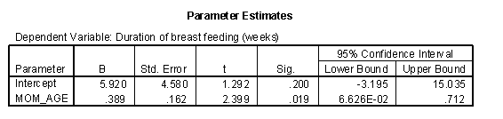
The graph shown below represents the relationship between mother's age and the duration of breast feeding in a research study on breast feeding in pre-term infants.
The regression coefficients are shown below. The intercept, 6, is represented the estimated average duration of breast feeding for a mother that is zero years old. This is an impossible value, so the interpretation is not useful. What is useful, is the interpretation of the slope, approximately 0.4. The estimated average duration of breast feeding increases by 0.4 weeks for every extra year in the mother's age.
When X is categorical, the interpretation changes somewhat. Let's look at the simplest situation, a binary variable. A binary variable can have only two possible categories. Some examples are live/dead, treatment/control, diseased/healthy, male/female. We need to assign number codes to the categories. Most people assign the codes 1 and 2, but it is actually better to assign the codes 0 and 1.
In a study of breast feeding, we have a treatment group and a control group. Let us label the treatment group as 1 and the control group as 0. The outcome variable is the age when breast feeding stopped.
The control group had a mean duration of breast feeding just a bit larger than 13. The mean for the treatment group is just a bit larger than 20. Notice that the regression line shown above connects the two means.
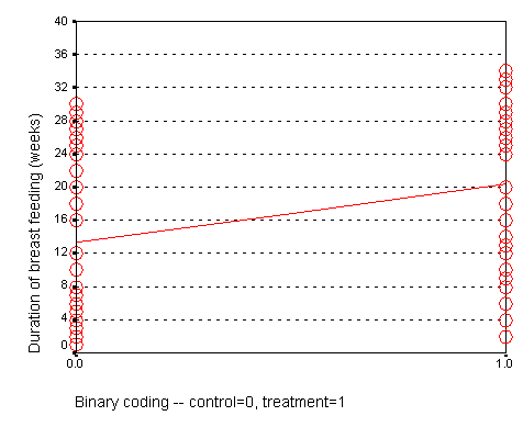
In this situation, the intercept, 13, represents the average duration for the control group. The slope is 7, which is the change in the average duration when we move from the control group to the treatment group.

We could have just as easily labeled the treatment group as 0 and the control group as 1. If we did that, we would get a graph that looks like the following:
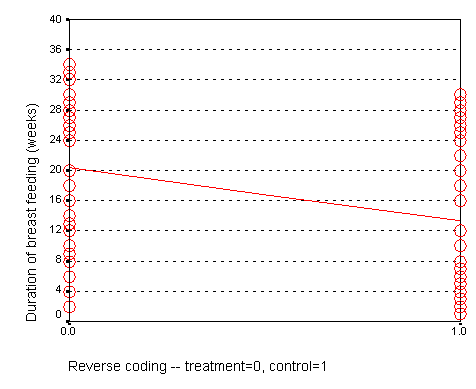
Here, the intercept, 20, represents the mean of the treatment group. The slope, -7, represents the change in average duration as we move from the treatment group to the control group. It is actually this reverse coding that SPSS chooses as a default.

Neither coding is correct or incorrect. Just make sure that you understand the difference. If you get a slope that is in the opposite direction of what you expected, perhaps it is because your software is using a different coding than what you expected.
When we represent a binary variable using 0-1 coding, the slope represents the estimated average change in Y when you switch from one group to the other. The intercept represents the estimated average value of Y for the group coded as zero.
The interpretation of the regression coefficient for a categorical variable with more than two values is a bit trickier, and we will discuss it in a separate handout.
Florida election results example
There has been much discussion of the unusual ballot format in Palm Beach County, Florida and how it may have led several thousand voters to cast their ballots for Buchanan rather than Gore. Greg Adams and Chris Fastnow (http://madison.hss.cmu.edu/) have performed a regression analysis of the county by county returns in Florida. A portion of their analyses is recomputed below using SPSS. My model is slightly different than the model of Adams and Fastnow, but it reaches the same general conclusion: the vote for Buchanan in Palm Beach County, Florida is a couple of thousand votes higher than you would expect, if it behaved similar to other Florida Counties.
The story behind the Palm Beach County vote is quite controversial. I discuss it, not to revive the controversy, but to illustrate some concepts in linear regression. Some background information is at:
- http://www.asktog.com/columns/042ButterflyBallot.html
- http://www.bricklin.com/log/sampleballot.htm
- http://www.cnn.com/2001/ALLPOLITICS/03/11/palmbeach.recount/
- http://elections.fas.harvard.edu/wssmh/
- http://fury.com/galleries/palmbeach/index.php
- http://www.salon.com/politics/feature/2000/11/09/lapore/
- http://www.sbgo.com/election.htm
The ballot in Palm Beach county was (according to some people) confusing, because it used a staggered two page format. The layout would lead some people who thought they were voting for Al Gore to instead cast a ballot for Patrick Buchanan instead. Exactly how confusing the ballot was and is still open to debate. Several statisticians offered analyses that tried to estimate how many votes for Buchanan might actually be votes for Gore. These analyses are far more detailed than what I present here. My analysis is more useful for helping you to understand concepts in regression than for resolving this voting controversy.

The scatter plot shown above shows the number of votes for George Bush in each Florida County versus the number of votes for Patrick Buchanan in the same county.
The regression equation is:
Votes (Buchanan) = 45.3 +0.0049 * Votes (Bush)
Notice that 0.0049 is roughly 1/500. How do we interpret these numbers? The intercept is 45, which means that the estimated average number of votes for Buchanan would be 45 in a county with zero votes for Bush. This is an extrapolation, as every single county in Florida had thousands of votes for Bush. The slope is 1/200, which means that the estimated average number of votes for Buchanan increases by 1/200 for each additional vote for Bush. In other words, each additional 200 votes for Bush is associated with an increase of 1 vote for Buchanan.
We can compute a predicted number of votes for Buchanan for each county by using the above equation. Palm Beach County had 152,846 votes for Bush. So the regression model would predict that Buchanan should get:
45 + 0.0049 * 152,846 = 797.
Thus, if the relationship observed across the entire state held exactly in Palm Beach County, then we would estimate the vote count for Buchanan to be 797.
There were actually 3,407 votes recorded for Buchanan, which is quite a discrepancy from what we predicted. The residual, the difference between what we observed and what would be predicted by the regression model is:
3,407 - 797 = 2,610.
One possible interpretation is that this discrepancy represents an estimate of the number of people who voted incorrectly for Buchanan. Such an interpretation would have to consider other possibilities, though. Is there something unique about Palm Beach County that would cause that county to vote in disproportionate numbers for Buchanan? Buchanan does indeed have some relatives in the area, and although they do not number in the thousands, perhaps they exerted some influence on their community.
Other information might tend to corroborate that a large number of votes were cast erroneously for Buchanan. Some of the highest vote counts for Buchanan were in precincts that were most heavily Democratic. There were also a large number of complaints received by the election board prior to anyone knowing how close the vote count in Florida would be.
There are other models that have been considered for the Palm Beach County vote, and most of them show a similar size discrepancy between the observed vote and the vote that would be predicted the regression model. It would set a dangerous precedent, of course, to use a statistical model to adjust vote counts, so this example is more for understanding what might have gone wrong and the magnitude of the error made.
This webpage was written by Steve Simon on 2002-06-24, edited by Linda Foland and Steve Simon and was last modified on 2008-07-08.
Steps in a typical linear regression analysis (September 21, 1999)
Let no man ignorant of geometry enter - Sign over Plato's Academy in Athens
Linear regression models provide a good way to examine how various factors influence a continuous outcome measure. There are three steps in a typical linear regression analysis.
- Fit a crude model
- Fit an adjusted model
- Analyze predicted values and residuals
These steps may not be appropriate for every linear regression analysis, but they do serve as a general guideline. In this presentation, you will see these steps applied to data from a breast feeding study, using SPSS software.
This presentation can only give the briefest introduction to this area. When I have time, I hope to add additional web pages to provide a more thorough approach to this topic.
Step 1, Fit a crude model
There are two types of models, crude models and adjusted models. A crude model looks at how a single factor affects your outcome measure and ignores potential covariates. An adjusted model incorporates these potential covariaties. Start with a crude model. It's simpler and it helps you to get a quick overview of how things are panning out. Then continue by making adjustments for important confounders.
A crude model for comparing duration of breast feeding to feeding group would be a t-test. I prefer, however, to present a general linear model because it provides a unifying framework for diverse statistical methods like analysis of variance, analysis of covariance, multiple linear regression, repeated measures designs, and t-tests.
Shown below is the table of tests from the general linear model procedure.

The general linear model uses an F test instead of the t test, but in this context, these two tests are mathematically equivalent. The p-value for comparing feeding groups is .001, which indicates a significant difference between the two groups.
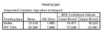
The general linear model also has a table of estimates, which is presented below.

The intercept represents the average duration of breast feeding for the NG tube group. We see that the average duration is 20 weeks for the NG tube group. The (FEED_TYP=1) term is an estimate of how much the average duration changes when we move from the NG tube group to the bottle group. We see that the bottle group has an average duration that is 7 weeks shorter.
Shown below is a table of means from the general linear model.
We see that the difference between the two means is roughly 7 weeks, which confirms the results shown previously.
Step 2, Fit an adjusted model
The previous model was a crude model. We see a seven week difference between the two groups, but could some of all of this difference be due to the fact that the NG tube group had older mothers? To answer this, we need to fit an adjusted model.
Shown below is the table of tests for a general linear model that includes mother's age in the model.
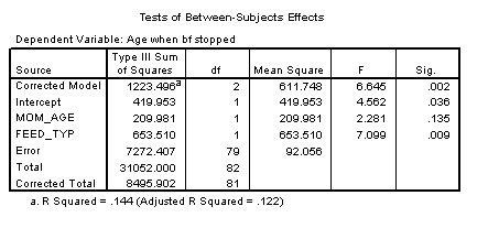
The p-value for feeding group is .009, which is still significant, even after adjusting for the effect of mother's age.
Shown below is the table of estimates from the same general linear model.
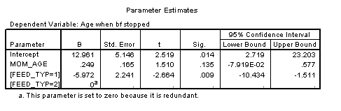
This table shows that the effect of bottle feeding is to decrease duration of breast feeding by about six weeks, after adjusting for mother's age. Each year that a mother is older increase the duration of breast feeding by a quarter of a week.
A previous descriptive analysis of this data revealed that the average age for mothers in the treatment group is 29 years and the average age for mothers in the control group is 25 years. When you see a discrepancy like this in an important covariate, you need to assess whether the four year gap in average ages could account for part or all of the effect of the treatment group.
This analysis shows that the four year gap only accounts for a small portion of the difference. Since each year of age changes the duration by a quarter week, this means that the difference between mother's ages acounts for just one week in the 7 week difference we saw in the crude model.
Shown below is the table of means.
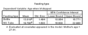
This table now adjusts for mother's age. The mean for the bottle fed group is adjusted upward to what it would be if the average age of the mothers in this group were 27 rather than 25. The mean for the NG tube group is adjusted downward to what it would be if the average age were 27 instead of 29. Note that the adjusted mean duration is half a week higher than the crude mean duration in the bottle group and that the adjusted mean duration is half a week lower than the crude mean duration for the NG tube group. This confirms that the difference between the two feeding groups is roughly 6 weeks, after adjusting for mother's age. This is one week less than the crude model.
This is not the final model. We should examine the effect of delivery type and account for the fact that we have some data on twins. I hope, though, that this presentation gives you a general idea of what crude and adjusted models are.
Step 3, Analyze predicted values and residuals.
A regression model gives you an equation that you can use to compute predicted values and residuals. In the regression model with mother's age and feeding type, the equation (with a bit of rounding) is
age_stop = 13 + 0.25 * age - 6 * feed_typ,
where feed_typ=1 if control, 0 if treatment.
So, for example, if you recruited a mother into the treatment group and she was 30 years old, you would predict the duration of breast feeding to be
predicted age_stop = 13 + 0.25 * 30 - 6 * 0 = 20.5 weeks.
If you recruited a mother into the treatment group and she was 19 years old, you would predict the duration of breast feeding to be
predicted age_stop = 13 + 0.25 * 19 - 6 * 0 = 17.75 weeks.
If you recruited a mother into the control group and she was 37 years old, you would predict the duration of breast feeding to be
predicted age_stop = 13 + 0.25 * 37 - 6 * 1 = 16.25 weeks.
Now it turns out that the first three rows of your data set correspond to the three scenarios described above. The actual values we observed were 30 weeks, 4 weeks, and 12 weeks.
The residual is the difference between what we observed in the data and what the regression model would have predicted. For the first mother in the sample, you can observe that there are 30 weeks of breast feeding, but the model predicted much less, 20.5 weeks. You can compute
residual = 30 - 22.5 = 7.5.
When the residual is positive, your regression model has under-predicted the outcome. With the second mother, your regression model has over-predicted the outcome. The observed value is 4 and the predicted value is 17.75. So you can compute
residual = 4 - 17.75 = -13.75.
This residual is negative. For the third mother, the residual is also negative.
residual = 12 - 16.25 = -4.25.
Most statistical models require certain assumptions to be made about your data. These assumptions can be examined using residuals. If your model is good, the residuals show a random featureless scatter. If instead, they show a systematic trend or pattern, then you can improve by incorporating that trend or pattern into your model.
The simplest plot is a plot of predicted values versus residuals (shown below).
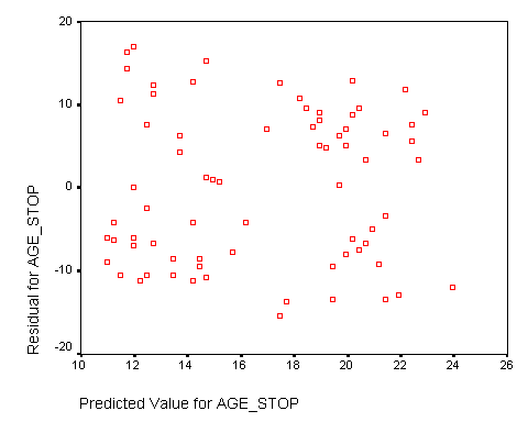
The relatively random scatter of data values provides us with confidence in the assumptions of the linear model. There is no obvious trend or pattern in this plot.
I also looked at the residuals versus the feeding groups and versus mother's age. Both showed no systematic trend or pattern (graphs not shown).
The following plot examines normality of the residuals.
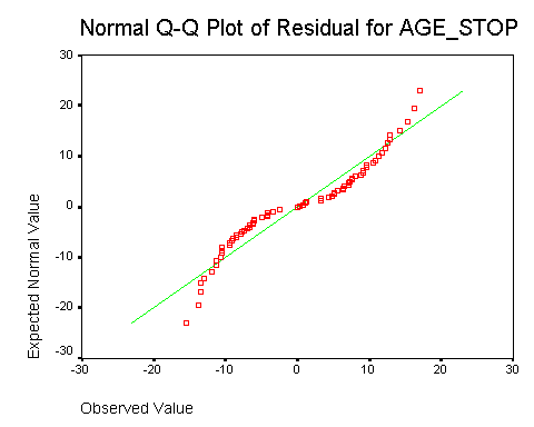
The curved line indicates a non-normal distribution. Further investigation would identify that this distribution is rectangular: it has a sharp lower and upper bound that differs from a bell shaped curve. The design of this study produces these limits because the age at which the mother stops breast feeding can't be shorter than 0 weeks and it can't be longer than the duration of the study (roughly 6 months). In practice, this type of non-normality is not a serious problem.
Summary
There are three steps in a typical linear regression model analysis.
- Fit a crude model.
- Fit an adjusted model.
- Examine predicted values and residuals.
This webpage was written by Steve Simon on 1999-09-21, edited by Steve Simon, and was last modified on 2008-07-08.
SPSS dialog boxes for linear regression models (June 21, 2002)
This handout will show the SPSS dialog boxes that I used to create linear regression examples. I will capitalize variable names, field names and menu picks for clarity.
Fit a general linear model
Select ANALYZE | GENERAL LINEAR MODEL from the menu. For most simple models, you would then select UNIVARIATE from the menu. Select MULTIVARIATE if you wanted to examine the simultaneous effect of more than one dependent variable. Select REPEATED MEASURES if you have multiple measurements per subject with each measurement in its own column. Select VARIANCE COMPONENTS from the menu if you want to estimate multiple sources of variation (e.g., between and within subjects).
When we select UNIVARIATE, we get the following dialog box.
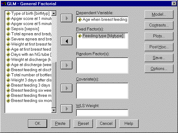
Insert your outcome variable in the DEPENDENT VARIABLE field. If you are examining how a categorical variable influences your outcome, insert that categorical variable in the FIXED FACTOR(S) field. If you are examining how a continuous varaibles influences your outcome, insert that continuous variable in the COVARIATES(S) field.
Some of the tables discussed in this presentation require you to select additional options. Click on the OPTIONS button to get the following dialog box.
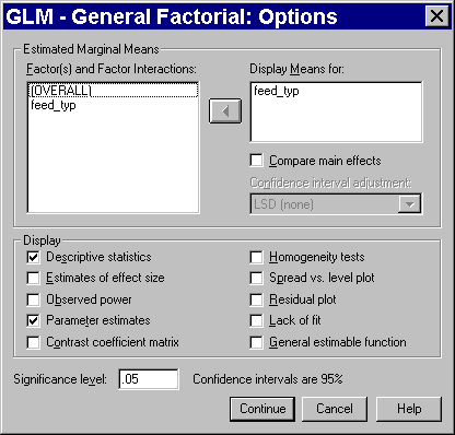
Add your categorical variable to the DISPLAY MEANS FOR field and check the DESCRPTIVE STATISTICS and PARAMETER ESTIMATES options.
Compute residuals.
Residuals are useful for examining the assumptions of your general linear model. Select ANALYZE | GENERAL LINEAR MODEL | GLM - GENERAL FACTORIAL from the SPSS menu. After you have defined your model, click on the SAVE button. You will see the following dialog box:

Check any or all of the option boxes for information that you want stored in your data set. The UNSTANDARDIZED RESIDUALS have the simplest definition, but some of the other types of residuals, especially the STUDENTIZED RESIDUALS and the DELETED RESIDUALS provide a clearer picture when your data set has outliers and influential observations. When you have selected all your options, click the CONTINUE button in this dialog box and the OK button on the previous dialog box.
Here is the data set after we have saved the residuals and predicted variables.
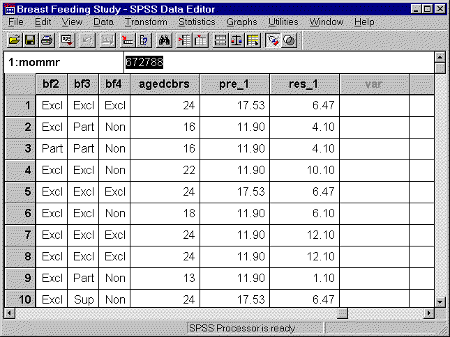
SPSS numbers the newly created columns of data, in case you want to compute residuals from several competing models.
Draw a normal probability plot.
Select GRAPHS | Q-Q from the SPSS menu. You will see the following dialog box:

Select the continuous variable that you want to examine normality for and add it to the VARIABLES box.
What now?
![]() This work is licensed under a
Creative
Commons Attribution 3.0 United States License. This page was written by
Steve Simon and was last modified on
2017-06-15.
This work is licensed under a
Creative
Commons Attribution 3.0 United States License. This page was written by
Steve Simon and was last modified on
2017-06-15.