[1] 0.0 0.3 0.7 1.1 1.6 2.1 2.7 3.5 4.5 6.0One of my favorite graphs is the box plot. It is a visualization of a five number summary. Those five numbers are minimum, 25th percentile, median (aka the 50th percentile), 75th percentile, and maximum. The box in a box plot extends from the 25th to the 75th percentile and a line inside the box represents the median. Then you draw a whisker from the 25th percentile down to the minimum value and another whisker from the 75th percentile up to the maximum value. If there are extreme outliers, those points are highlighted individually.
Sometimes a boxplot might be missing one or both whiskers. Here’s how that can happen.
Start with some artificial data.
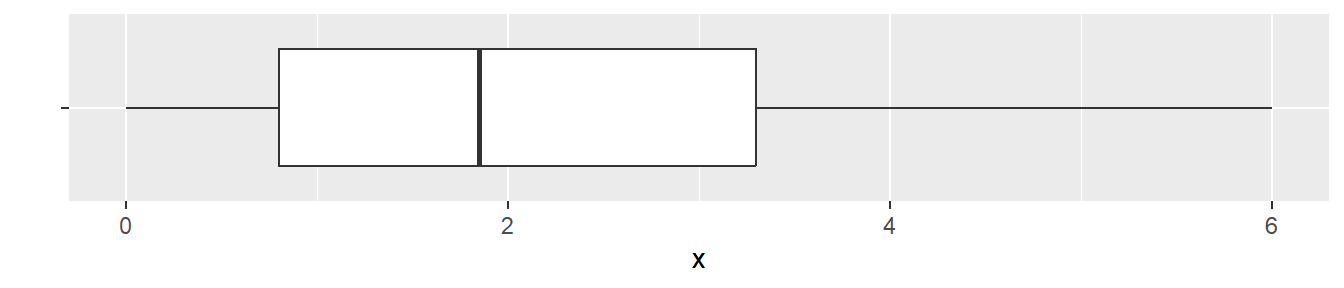
Here is the boxplot.
What happens if there are a lot more values at the minimum?
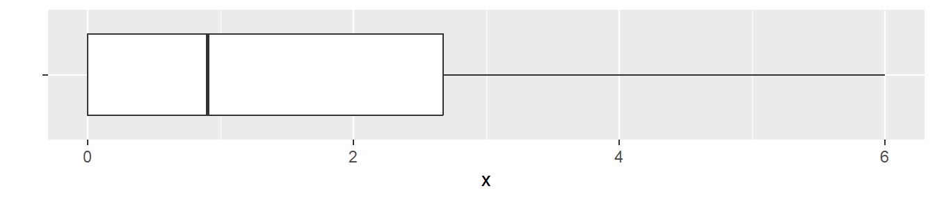
[1] 0.0 0.0 0.0 0.0 0.6 1.2 2.0 2.9 4.1 6.0Here is what the boxplot looks like.
What’s going on here? There is a small difference between the minimum value and the 25th percentile in the first dataset.
  0%  25%  50%  75% 100%
0.00 0.80 1.85 3.30 6.00
For the second data set, a large proportion of values are piled up at zero. This means that there is no difference between the minimum value and the 25th percentile.
   0%   25%   50%   75%  100%
0.000 0.000 0.900 2.675 6.000
The minimum and the 25th percentile are both zero in this dataset. So drawing a whisker from the 25th percentile down to the minimum value means drawing no whisker at all.
In general, a box with no whisker means that at least a quarter of the data is piled up at one extreme.
You can also get a boxplot with no whiskers on either end if the sample size is small (less than five). It may or may not happen depending on how your computer computes percentiles. There are at least a half dozen different ways to compute percentiles. The formulas don’t differ much except for small sample sizes.
An earlier version of this page was published on new.pmean.com.