News: Sign up for "The Monthly Mean," the newsletter that dares to call itself average, www.pmean.com/news.
| P.Mean: Sample chapter: The first three steps in a descriptive data analysis (created 2013-08-01).
News: Sign up for "The Monthly Mean," the newsletter that dares to call itself average, www.pmean.com/news. |
|
Here is a second sample chapter for my book with Oxford University Press. Other material includes a sample chapter on sample size justification, and a glossary of statistical terms.
The first three steps in a descriptive data analysis.
You should always start your data analysis with a descriptive analysis. Sometimes this is all you need, and sometimes this is just preliminary to something bigger. You cannot skip this step. I cannot skip this step. A descriptive analysis does several things.
1. It provides an important check on data quality.
2. It lays the foundation for all of your further work.
3. It will help you decide whether certain planned analyses should be abandoned.
4. It will help orient you when you start running the big analyses.
Here are the first three steps in a descriptive data analysis.
1. Know your count.
2. Compute ranges and frequencies.
3. Examine relationships.
There are additional things that you may need to do, and much depends on your particular problem. But you can start your descriptive data analysis with these three steps.
Know your count.
It seems like a very simple thing, but one thing you need to start with is the count. How many patients or animals or cell cultures do you have? It's an easy question to answer. Look at the number of rows in your data set. Once you have this number, tattoo it on your arm. Every time you run a data analysis of any kind, look at the number provided by that data analysis procedure and compare it to your tattoo. These should agree.
If they don't agree, you need to figure out why they don't agree. Often this discrepancy is caused by missing values. The default option used by many data analysis procedures in many software programs is to exclude any observation if any of the variables used in the analysis are missing. You should think long and hard about missing values. Often the default option for handling missing data makes strong assumptions about your data that may not be justifiable. The alternatives to tossing out missing data (such as multiple imputation and maximum likelihood approaches) are complex and well beyond the scope of this book. But it is worth noting that how you handle missing values will often depend on the reason that the values are missing.
The interesting thing about missing values is that they often degrade your count in a cumulative fashion. As your data analysis procedures get more complex through the use of more and more variables, the degradation in your count can sometimes accelerate out of control. You must know your count and constantly refer back to it as you run your analyses, you will be able to recognize when the degradation in your count caused by missing variables becomes bad enough to take action.
Subset selection can also sometimes cause a discrepancy in counts. In one particular analysis I was working on, the count was 70,412. That was the number of infants born in the state of Missouri during calendar year 1996. But a major aspect of the research was utilization of the emergency room in the first year of the infant's life. A total of 29,637 infants out of the total of 70,412 had one or more visits to the emergency roon in the first year of life. It was very important to know and track both counts. Some analyses were on all infants, and some were restricted to the infants who had visited the emergency room. If you wanted to keep things straight, you were always looking to see whether the analysis was on the 70,412 or on the 29,637. If you accidentally ran an using the subset rather than the full set, you could catch this easily when the data analysis procedure stated that 29,637 observations were processed when you really wanted 70,412 to be processed.
In some data sets, there may be multiple counts because the data has a hierarchical structure. You might, for example, have a study with 55 families and 132 children. you need to know and memorize both counts. Again this helps when you to insure that you are running the proper data set through your data analysis procedures. The average square footage for the family house, for example, would be based on the 55 families and if the data analysis procedure told you it was averaging 132 observations, you'd know that this would produce the wrong statistics.
Compute ranges and frequencies.
Many of the choices you will make in a descriptive data analysis depend on whether the variable is categorical or continuous. Here's a brief reminder about what these terms mean.
Categorical data are data that consist of only small number of values, each corresponding to a specific category value or label. Ask yourself whether you can state out loud all the possible values of your data without taking a breath. If you can, you have a pretty good indication that your data are categorical. In a recently published study of breast feeding in pre-term infants, there are a variety of categorical variables: Breast feeding status (exclusive, partial, and none); whether the mother was employed (yes, no); and the mother's marital status (single, married, divorced, widowed).
Continuous data are data that consist of a large number of values, with no particular category label attached to any particular data value. Ask yourself if your data can conceptually take on any value inside some interval. If it can, you have a good indication that your data are continuous. In a recently published study of breast feeding in pre-term infants, there are a variety of continuous variables: the infant's birth weight in grams; the mother's age in years; and the distance from the mother's home to the hospital in miles.
For some variables, you may have difficulty deciding whether it is categorical or continuous. Don't worry too much about this. Even the experts will disagree among themselves at times about this. If you are unsure, analyze the variable as if it is categorical and then re-analyze the variable as if it is continuous. Usually, it will be come obvious quickly that one of these approaches is superior.
You should compute frequencies for any categorical variable. The freuqency is simply the count of how many observations fall into each category. Look at the list of categories. Are there any categories that you were hoping to see but which did not appear in your data set? Are there any categories that you weren't expecting? Are there any categories that have unexpectedly low counts? What is the most frequently occuring category (the mode)? Was it what you expected?
Along with the counts, you need to compute percentages for each category. A percentage, of course, is just a count divided by a total times 100, but there is a bit of ambiguity here. Is your total all observations or all non-missing observations? It doesn't matter too much at this stage, but do make sure you note the percentage of missing values relative to the total number of observations.
You will ask yourself, what percentage of missing values is large enough to become a problem. This is very specific to the context of your problem. What are the various reasons that a value might be missing? If the missing values were somehow found later, would you expect them to be different than the values that you already have? After saying that it is context dependent, you are probably still wanting a number. So, okay, I'll give you a number. Anytime that you have more than 10% of your data missing it is a cause for concern. Anytime it is more than 30%, it is a cause for serious concern. That doesn't mean you're off the hook if you have 8% missing data, for a variety of reasons. It also doesn't mean that a variable with 40% missing data is hopeless. Always think about missing data. Think about its impact on the analysis of your data and think about how it might modify the strength of your conclusions. These cut-offs of 10% and 30% just are a reminder of when these issues become very important and criticial, respectively, to think about.
The following frequency table shows that there are two possible values for treatment group: intervention and control. This is what you might have expected. One surprise is that there are quite a bit more patients in the intervention group. The study was randomized, and normally you'd expect to see roughly the same number in each group. Maybe this is okay, but you should investigate a bit. In particular, find out if there were any dropouts and if the dropout rate was higher in the control group.
[[Frequency table for treatment group]]
Here is the frequency table for race/ethnicity. Notice that there are only two values. You should check this if you got the data from someone else, but the letter codes are B= black and W=white. Notice that there are some obvious race/ethnicity categories that are totally missing (such as Hispanic).

You should compute the mean and standard deviation of any continuous variable, but perhaps more importantly at this stage, you examine the range of this variable. What is the minimum value? Is it what you expected? Are you getting values that are a lot smaller than you wanted? Or is the minimum value too large, leaving out an important segment of the population of patients that you wanted to study. Do the same thing for the maximum value.
If there are some surprises here, you need to start investigating. Sometimes an unusual range might represent a different unit of measurement. An oral temperature in the high 30s and low 40s might be consisten with the morgue if you were expecting degrees Fahrenheit, but it is quite normal for the Celsius scale.
Here is the range for birthweight in grams.
[[Table]]
Notice that the range is consistent with the units of measurement (grams), but the numbers seem rather low. A typical birthweight would be around 4,000 grams, and the highest birthweight in this study is 2,500 grams. When you ask about this, you find out that this is a study of pre-term infants, so the low numbers don't seem all that unusual.
Here is the range for age.
[[Table]]
We are happy with this range. The youngest mom is a bit young at 16, but that's not outrageous. Likewise, we are happy with the oldest mom being 44 years old.
Here is a table for duration of breastfeeding in weeks. The numbers appear to be consistent with the units of measurement, but the high value of 34 has you a bit worried. You knew that this was a six month study, so the largest value should be 24 weeks or maybe 26 weeks. You find out, though, that the study followup is for six months after discharge in the hospital. So the duration of 34 could represent an infant that was in the hospital for the first 10 weeks and then was breast fed for the full 24 weeks after discharge.
You've got an important hint here, though. There is a potential for ambiguity when measuring duration of breastfeeding. You could measure breast feeding duration as the time from birth, or you could measure it as the time from hospital discharge. This distinction is subtle but important, and you need to define this variable clearly when you write up the paper so that no one mistakes one type of duration from the other.
Examine relationships
Now you should look at how pairs of variables are related to one another. This is not a formal statistical test. There's plenty of time for that. But for now, you do want to get a general idea of whether two variables tend to exhibit some type of association. Look to see if there is a trend. If there is a trend, is it going in the direction you expected?
Again, the way you look at the relationship will depend on whether the two variables are both categorical, both continuous, or a mix.
For two categorical variables, you want to run a crosstabulation. A crosstabulation gives you a count for every combination of categories between the two variables. These counts are displayed in a rectangular grid. You should also calculate percentages in your crosstabulation, and there is more than one way to calculate this percentage.
When you ask for a crosstabulation between two variables, you have to decide which variable represents the rows of the rectangular grid and which variable represents the columns. Every problem will be different, but I have a couple of rules that can help you decide where to put what. There is no right or wrong way to do this, but certain orientations will help you spot patterns and trends in your table more easily.
If one of your two variables could be considered an outcome variable, typically, that "fits" better as your columns. If one of your two variables could be considered a treatment or exposure variable, that fits better as your rows. Demographic variables, such as race and gender, will also often fit better as rows.
When you orient your crosstabulation this way, ask for row percentages. Row percentages are percentages that add up to 100% within each row. In contrast, column percentages add up to 100% within each column. Cell percentages add up to 100% only across the entire table. The rationale for the use of row percents is that comparisons are most often of whether your patients did or did not experience a particular outcome. When your outcome is in columns, the probability of the outcome will be a row percentage.
You could have swapped this, and placed the outcome in the rows and report column percentages. This may be a perfectly reasonable choice. The reason you may prefer to keep the outcomes in columns is that the comparison of interest will involve two or more percentages one beneath the other. You can spot trends and patterns more easily because numbers above and below are closer, differences between single digit percentages and double digit percentages are more strikingly obvious, and the above/below orientation makes it easier to subtract one percentage from the other. When the percentages you want to compare are side by side, they are further apart, you are more likely to overlook a swtich between single and double digits, and the process of subtraction is slower.
Finally, if one variable has many more categories than the other, that will often fit better as rows. Scrolling up and down a table with a large number of rows (or simply scanning the table with your eyes) is more efficent than scrolling left and right.
There's nothing wrong with trying two or more different formats for your crosstabs. Depending on the context of your problem, you may find these guildelines helpful, or you may find that an alternate orientation works better.
Whatever you do, though, please round any percentages that you get. With a percentage like 17.2%, no one cares about the .2% part. It is too small to be important in most situations. What's worse, the extra digit that you keep when you report 17.2% will make your table harder to read.
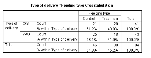
Here's an example of a crosstabulation of feeding type versus type of delivery. Feeding type is the treatment variable and type of delivery is a demographic variable in this example, so my guidelines would seem to suggest putting both of these as rows. You can't do this, and the reason I put the demographic variable as the columns is that I wanted to look for covariate imbalance between the treatment and control group. You can see that the percentage of C-section deliveries is slightly higher in the treatment group. It's hard to get to excited, though about a shift from 46% to 53%. Normally, you should pay attention to any percentages which double or are cut in half when you move from one row to the next. Smaller changes may be important, depending on your problem, but often those smaller changes don't have a practical impact.
When you look at these crosstabs, you may be thinking that they are missing something. These crosstabs don't tell you about the statistical significance of the changes. You're itching to see a p-value somewhere. Or you might worry about sampling error. You might want to compute some confidence intervals to quantify the amount of sampling error in your data. But resist that temptation, at least for now. You're heading for the deep end of the swimming pool, and you are better off staying in the shallow end for now.
There's plenty of time for the more complex stuff, but do try to do a thorough descriptive analysis before you start adding in p-values or confidence intervals.
For a relationship involving two continuous variables, you should draw a scatterplot. With a scatterplot, you have a choice of which variable to place on the horizontal axis and which to place on the vertical axis. Don't worry too much about this. If one of your variables is a treatment or exposure variable, you should try it first on the horizontal axis. You may find that demographic variables will work better on the horizontal axis. You should try any outcome variables on the vertical axis. If you don't like the way the graph looks, then switch the axes and try again.
Here is a scatterplot between duration of breastfeeding and a key demographic variable, age of the mother.
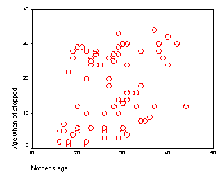
Notice that there is a slight upward trend in this data. Some young mothers do indeed breastfeed for a long time, and some older mothers quit early. But there is a tendency for older mothers to be better on average than younger mothers. Don't worry too much about statistical significance yet. It is just a piece of information that you need to keep in mind as you plan your data analysis.
More importantly, you should ask yourself if this relationship makes sense from a medical or scientific perspective. Why would older mothers do better than younger mothers. There are several possible explanations for this, and you should try to recall what you know about breast feeding from previous research and from your own experiences in the area. I, myself, am not an expert in breast feeding, and my only experience working on data in the area came 57 years ago.
For a relationship involving a categorical variable and a continuous variable, you should draw some boxplots.
A boxplot (sometimes called a box and whisker plot) is a graphical display of five statistics: You draw a box from the 25th percentile to the 75th percentile. Draw line inside the box corresponding to the 50th percentiel or median. Draw a thin line (whisker) from the 25th percentile down to the minimum value. Draw another thin line from the 75th percentile up to the maximum value. The size of the box represents the interquartile range and the length of the boxplot from one whisker to the other represents the range of the data. Most implementations of boxplots will try to identify outliers in your data set. Any data value more than 1.5 box widths above the top of the box or more than 1.5 box widths below the bottom of the box are beyond the inner fence and are highlighted individually. Any data value more than 3 box widths away are beyond the outer fence and are considered extreme outliers. I dislike the use of inner and outer fences and of highlighting individual outliers. The rules for these fences are too liberal, in my opinion, and end up highlighting points that really are not all that extreme. I prefer a boxplot that always draws the whisker all the way to the minimum and maximum values, no matter how extreme they might be. Any extremely long whisker is more than enough evidence of outliers. You might argue that there is value in knowing whether there is one outlier or three, but I don't see the value of this as being worth all the extra complexity.
[[Boxplot]]
Here's a box plot examining the duration of breast feeding versus the intervention.
[[To be continued]]
![]() This page was written by
Steve Simon and is licensed under the
Creative
Commons Attribution 3.0 United States License. Need more
information? I have a page with general help
resources. You can also browse for pages similar to this one at Professional Details.
This page was written by
Steve Simon and is licensed under the
Creative
Commons Attribution 3.0 United States License. Need more
information? I have a page with general help
resources. You can also browse for pages similar to this one at Professional Details.