A mosaic plot is a graphical display that allows you to examine the relationship among two or more categorical variables.
The mosaic plot starts as a square with length one. The square is divided first into horizontal bars whose widths are proportional to the probabilities associated with the first categorical variable. Then each bar is split vertically into bars that are proportional to the conditional probabilities of the second categorical variable. Additional splits can be made if wanted using a third, fourth variable, etc.
Here is an example of a simple mosaic plot. There is a publicly available data set on the mortality rates aboard the Titanic, which are influenced strongly by age, sex, and passenger class. If you wanted to compare the mortality rates between men and women using a mosaic plot, you would first divide the unit square according to the overall proportion of males and females.
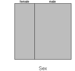
Roughly 35% of the passengers were female, so the first split of the mosaic plot is 35/65. Next, split each bar vertically according to the proportion who lived and died.
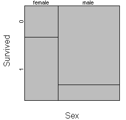
Among females, 67% survived (coded as 1 on this plot) and 33% died (coded as 0). So the female bar shows as 67/33 split. Among males, only 17% survived, so this bar shows a 17/83 split. The strong disparity in mortality between men and women is demonstrated by the lack of alignment of two vertical separating lines. If the survival rates were identical among men and women, the mosaic plot would look like this:
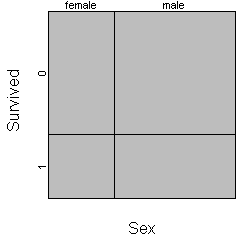
Most implementations of the mosaic plot offer as a default a small margin around each cell to make the graph easier to read.
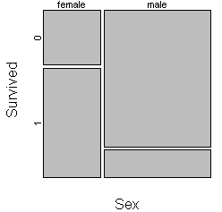
You should consider carefully the choice of which variable to split the unit square first. Here is the same mosaic plot where the unit square is split first by survival status and then by gender.
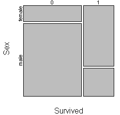
This plot shows you that males were the majority of the deaths and the minority of the survivors. As a general recommendation, variables that represent an exposure or treatment status should usually represent the first split and variables that represent an outcome should represent the second split.
You also have the option of turning the plot sideways by splitting the unit square first horizontally and then vertically.
Here is a mosaic plot looking at the relationship between passenger class and mortality.
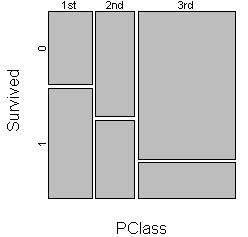
Notice that the survival rate is best among first class passengers and worst among third class passengers.
You can add a third split to examine the influence of the combination sex and passenger class on mortality.
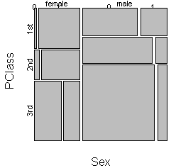
This graph is worth staring at for quite a while. Notice that the mortality rate climbs very sharply for females when you move from first to third class. The rate climbs among males as well, but not as sharply. Also notice that females are found among 1st class passengers in numbers that are disproportionately large relative to their overall numbers. In contrast, more than half of the males were found among the 3rd class passengers.