StATS: Univariate Model Based Clustering (April 18, 2006).
Back in 2001, I attended an excellent short course on a new approach to
cluster analysis taught by Adrian Raftery and Chris Fraley at the Joint
Statistics Meetings. Their approach, model based clustering, examined the
fits of mixtures of normal distributions. This approach is useful for
unidimensional and multidimensional data and has many advantages over other
clustering approaches like hierarchical clustering and k-means clustering.
While I greatly enjoyed that class, I never had need to use this approach
until just recently. So I dusted off my old notes and worked out a few simple
examples to refresh my memory. I want to present some of these examples here
on this weblog.
The univariate mixture of normal distributions is very simple and easy to
display the results. I downloaded a file from the DASL
-
The Data and Story Library (DASL). Matthew Hutcheson, Mike
Meyer, Cara Olson, Paul Velleman, John Walker, Cornell University. Accessed
on 2006-4-18. (Teaching resources, Datasets) [Excerpt] DASL
(pronounced "dazzle") is an online Library of datafiles and stories that
illustrate the use of basic statistics methods. We hope to provide data from
a wide variety of topics so that statistics teachers can find real-world
examples that will be interesting to their students. Use DASL's powerful
search engine to locate the story or datafile of interest. lib.stat.cmu.edu/DASL/DataArchive.html
associated with the
Clustering
Cars Story. this file includes measurements on 38 1978-79 model
automobiles. The data file has the following variables:
- Country: Nationality of manufacturer (eg. U.S., Japan)
- Car: Car name (Make and model)
- MPG: Miles per gallon, a measure of gas mileage
- Drive_Ratio: Drive ratio of the automobile
- Horsepower: Horsepower
- Displacement: Displacement of the car (in cubic inches)
- Cylinder: Number of cylinders
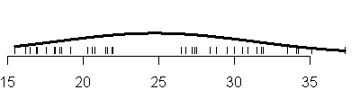
I wanted to look first at the mpg column by itself. Here is a rug plot of
the data.
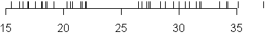
Notice that there are some gaps in the data that might indicate that the
mpg data comes from a mixture of two or possibly three different
distributions. In fact, the DASL website alludes to three possible groups of
cars:
large sedans (Ford LTD, Chevrolet Caprice Classic), compact cars (Datsun
210, Chevrolet Chevette), and upscale, but smaller, sedans (BMW 320i, Audi
5000).
You can run model based clustering using the mclust library of R. Here's
the code to get the data into R and to draw the rug plot.
library(mclust)

 cars.data <- read.csv("cars.csv",header=T,as.is=T)

 par(mar=c(2.1,0.1,0.1,0.1))

 plot(range(cars.data$MPG),c(0,0.15),type="n",xlab=" ",ylab=" ",axes=F)

 axis(side=1)

 segments(cars.data$MPG,0,cars.data$MPG,0.15)
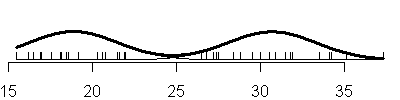
When you fit a mixture of univariate normal distributions, you have the
option of mixing normal distributions with equal variances (the E option in
mclust) or allowing each distribution in the normal mixture to have its own
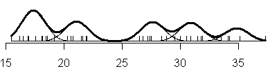
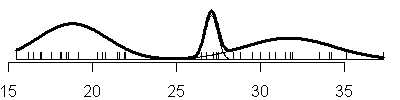
variance (the V option in mclust). Here is the sequence of mixtures from 1 to
6 assuming equal variances (E option).

The code that created these plots is shown below.
par(mar=c(2.1,0.1,0.1,0.1))

 mpg.mclust.e <- EMclust(cars.data$MPG,emModelNames="E")

 x0 <- seq(min(cars.data$MPG),max(cars.data$MPG),length.out=1000)

 e <- summary(mpg.mclust.e,data=cars.data$MPG,G=1)

 nt <- rep(0,1000)

 plot(range(cars.data$MPG),c(0,0.15),type="n",xlab=" ",ylab=" ",axes=F)

 axis(side=1)

 nt <- dnorm(x0,mean=e$mu,sd=sqrt(e$sigmasq))

 lines(x0,nt,lwd=3)

 segments(cars.data$MPG,0,cars.data$MPG,0.02)

 for (k in 2:6) {

  e <- summary(mpg.mclust.e,data=cars.data$MPG,G=k)

  nt <- rep(0,1000)

  plot(range(cars.data$MPG),c(0,0.15),type="n",xlab=" ",ylab=" ",axes=F)

  axis(side=1)

  for (i in 1:k) {

  ni <- e$pro[i]*dnorm(x0,mean=e$mu[i],sd=sqrt(e$sigmasq))

  lines(x0,ni,col=9)

  nt <- nt+ni

  }

  lines(x0,nt,lwd=3)

  segments(cars.data$MPG,0,cars.data$MPG,0.02)

 }
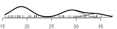
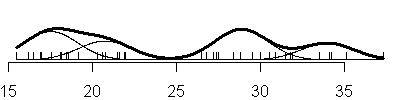
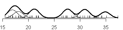
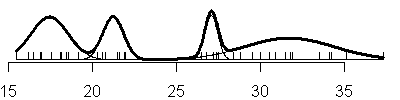
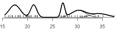
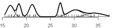
Compare this to the sequence of fits when you allow the variances to be
unique in each component of the normal mixture (V option).
Here's the code that produced these graphs:
mpg.mclust.v <- EMclust(cars.data$MPG,emModelNames="V")

 x0 <- seq(min(cars.data$MPG),max(cars.data$MPG),length.out=1000)

 v <- summary(mpg.mclust.v,data=cars.data$MPG,G=1)

 nt <- rep(0,1000)

 plot(range(cars.data$MPG),c(0,0.15),type="n",xlab=" ",ylab=" ",axes=F)

 axis(side=1)

 ni <- dnorm(x0,mean=v$mu,sd=sqrt(v$sigmasq))

 lines(x0,ni,lwd=3)

 segments(cars.data$MPG,0,cars.data$MPG,0.02)

 for (k in 2:6) {

  v <- summary(mpg.mclust.v,data=cars.data$MPG,G=k)

  nt <- rep(0,1000)

  plot(range(cars.data$MPG),c(0,0.15),type="n",xlab=" ",ylab=" ",axes=F)

  axis(side=1)

  for (i in 1:k) {

  ni <- v$pro[i]*dnorm(x0,mean=v$mu[i],sd=sqrt(v$sigmasq[i]))

  lines(x0,ni,col=9)

  nt <- nt+ni

  }

  lines(x0,nt,lwd=3)

  segments(cars.data$MPG,0,cars.data$MPG,0.02)

 }
Notice that adding another component to the normal mixture does not always
result in adding a new mode to the data. For example, under the three
component model with the equal variances option, the largest two components
are so close together that there is not a distinct separation between the two
distributions. Instead, the larger normal distribution turns the nice bell
shaped curve into a hunchback.
also notice that with the V option, you see a mixture of both narrow and
broad bell curves. Notice, in particular, the huge shifts in variation in the
three component model.
Whether you choose a common variance for each component or allow a
different variance is a choice that depends a lot on the context of the
problem. In this particular application, we have no reason to believe that
economy cars should have the same variation as large sedans, so the V option
looks more attractive. The disadvantage is that you have to estimate a larger
number of parameters in this model.
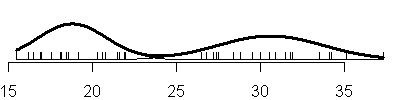
How many components should there be in the normal mixture? That's a hard
call. The large gap around 25 seems to indicate that there are at least two
different groups here, and a similar but smaller gap might be present around
33 mpg or possibly even 19 mpg. So we should give some consideration to there
being three or even four clusters.
The mclust library offers a statistic, BIC, that can help us choose a
rational number of mixture components. BIC stands for Bayes Information
Criterion, and it examines the likelihood under the various models and it has
a pently for models that are unduly complex. You can also use the BIC to
decide whether to use the simpler equal variances mixture (E option) or the
more flexible but more complex V option.
Here is a plot of the BIC values
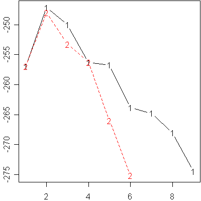
and here is a table of those values
          E
 V

 1 -256.9093 -256.9093

 2 -247.1326 -247.9348

 3 -249.9914 -253.2358

 4 -256.2769 -256.2545

 5 -256.6972 -265.9905

 6 -263.8528 -275.1297

 7 -264.7732 NA

 8 -268.0281 NA

 9 -274.4309 NA
I find that these BIC values are hard to read, so I look at how far each
value is from the maximum and round to the nearest integer.
   E  V

 1 10 10

 2  0  1

 3  3  6

 4  9  9

 5 10 19

 6 17 28

 7 18 NA

 8 21 NA

 9 27 NA
Notice that the program refused to fit 7 or more components with the V
option, because there is not enough data to estimate the mean and standard
deviation of all those components. As a general rule, you want to choose the
largest BIC (in this case, the BIC that is the least negative), but anything
within 2 units of the best BIC is still a serious competitor. Any BIC value
more than 10 units away is not a credible alternative. Using those criteria,
we have fairly strong evidence of two components in this normal mixture, and
there is little difference between the E and V options in a two component
model. A three component model might merit some consideration, but a single
component or four component model is about at our limits of credibility.
Notice that the BIC values for the E and V options are identical at the
single component model. This just reminds you that allowing different
variances for each component is essentially the same as forcing the variances
to be equal when there is just a single component.
 This work is licensed under a Creative Commons Attribution 3.0 United States License. It was written by Steve Simon and was last modified on
04/01/2010.
This work is licensed under a Creative Commons Attribution 3.0 United States License. It was written by Steve Simon and was last modified on
04/01/2010.
This page was written by
Steve Simon while working at Children's Mercy Hospital. Although I do not hold the copyright for this material, I am reproducing it here as a service, as it is no longer available on the Children's Mercy Hospital website. Need more
information? I have a page with general help
resources. You can also browse for pages similar to this one at