StATS: Reporting serious adverse events (created 2006-02-03).
The FDA held a meeting on March 21, 2005 soliciting opinions about how adverse events should be reported to Institutional Review Boards (IRBs).
Some of the testimony provided to FDA can be found on the FDA website and in various spots on the Internet, mostly in PDF format.
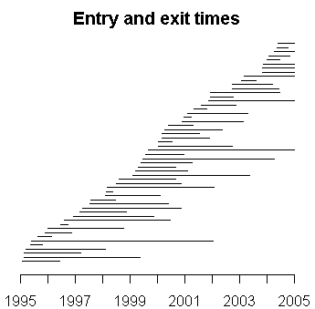
This is something I have been interested in, but have not had the time to work up the details. It seems to me that any system for reporting adverse events has to have information about the accrual of patients into the study. Here's a simple graph that shows the entry and exit times in a research study. It's not exactly a study of adverse events reports per se, but the example is close enough that I can use to illustrate the general concepts.

The accrual rate appears to be more or less constant, though some patients appear to stay in the study for only a short period of time. In this example, the treatment being studied is peritoneal dialysis, and patients can leave the study when they get a kidney transplant or when they die.
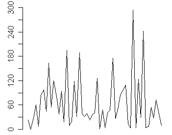
You can get a more accurate picture of the accrual rate by looking at the date gaps, the number of days between successive recruiting of patients. So if the first patient is recruited on January 2 and the second on January 16, the date gap is 14, meaning that you had to wait two weeks between patients. The date gaps for entry times in this study are
 23   0  28  61   7  85  97  45
            163  55

            120  81  37  94  18 195  10  19 119  31

            189  39  32  39  23  36  41 126   1  48

  4  41  47 175  27  50  83  95 109  13

  4 294   4 124  29 242   4   7  55  28

             73  38  10
The average number of days between recruitment is 64.5 days, which tells you that a new patient enrolls about every other month. You could detect whether patient accrual is slowing by looking at the trend in date gaps.

An upward trend would imply that recruitment is slowing down, since you have to wait an increasing amount of time between successive patients. In this particular example, there is no obvious trend.
Now although it is important to track the rate at which we are accruing patients, the value of this type of display is far more important when you look at adverse event reports. The following graph shows rates of infection for these patients. Each vertical line represents a separate infection event.

There looks to be some evidence that infection rates are slowing down over the past few years. You can look at the date gaps for this data as well.
 40 180 138  98  60  28 365  14  33  14

             23  76 144   5  44   4  14  19 136 128

             11   6   6  19  39   0  20  59
            32   5

             38  99 363 573   8 130 109   2
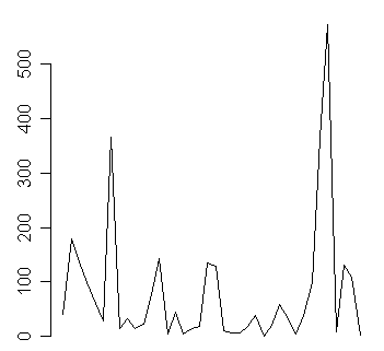
The first and second infections occurred 40 days apart, and the last two infections occurred two days apart. A plot of these date gaps is instructive.

Notice several dry spells when we waited a year or more between successive infection events. Notice also in the middle of the plot where it seems like new infections were popping up left and right, sometimes less than a week apart.
The tricky things about these graphs is recognizing what shift and trends are trivial and which are important. Some variation is to be expected, but when you see 363 days between infections followed by another 573 days between infections, you might suspect that something is going on. The large date gaps early in the process also have a possible explanation. Patient recruitment started out slowly and only after two years did the number of patients in the study tend to stabilize (in other words, the rate at which patients entered the study was matched by the rate at which patients left the study).
There are other important issues, such as monitoring the rate at which patients drop out of a study that also lend themselves well to an approach like this.
I believe that a statistical control chart should be used with data like this to determine when the process of producing infections (or any adverse event) has changed. It turns out that the management of these patients did indeed change in the middle of the study, and there is some evidence that this led to a lowering of the infection rates.
A statistical control chart would apply well established rules (eight consecutive points on the same side of the center line, or one point outside the 3 sigma limits) to determine when the process demands attention.
I want to examine issues such as the use of log transformations on charts like these, how best to handle multiple events on a singe day, and how best to adjust for the varying number of patients being studied, as well as the tendency for some adverse events to occur more frequently the longer the patient is under study.
Previous weblog entries on this topic:
Further reading